WordPress.com websites ( as opposed to self hosted WordPress websites) are hugely popular. WordPress makes it very easy to get started and have a website up a running in no time at all, with essentially no technical know-how. Because of this they are an easy choice.
But getting a WordPress.com website to look and behave exactly as you want, can sometimes be a challenge when that technical knowledge or even just technical confidence is missing. The last thing you want to do is mess up your site!
I recently worked with Debbie Prather who was facing exactly this scenario with her WordPress.com website 742ILoveyou.com. She had a definite vision of how she wanted her site to look and perform and with the success of her articles there was a real need for her site to look more professional.
She reached out to me to help.
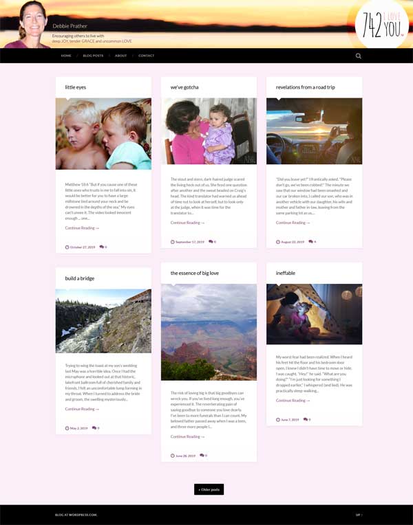
I actually forgot to screenshot the site before I started which is a shame but here is her site after I worked my magic.

I switched out the template being used to one that was more professional and added a branded header to the site which included a simple logo and tag line The home page was reconfigured to feature a grid view of the latest 6 blog posts. Follow buttons were added to the blog section and a new contact page added.
Overall the website is now much more appealing, easier to use and has the tools for readers to easily engage.
This is the review Debbie left for me on Google.
” I’m so very pleased with Indigo Image and the timely, professional way in which the improvements I requested were made to my website. I love the results and would highly recommend this company!”
If you have a WordPress.com website that needs taking up a notch I am happy to help. You can contact me HERE or call 636-795-7988


