So yesterday I talked about the launch of a new website mrbison.com and how we had taken the opportunity to recode it as a responsive web site.
But what does that mean…what is a responsive web site?
Simply put, it is a site that will give the visitor an optimal viewing experience regardless of what device they are using to access it- desktop, laptop, tablet or phone. And as I am all about graphics let me show you in pictures exactly what I mean.
Here is the site on a 24″ desk top monitor

Here it is on an iPad – both portrait and landscape orientation

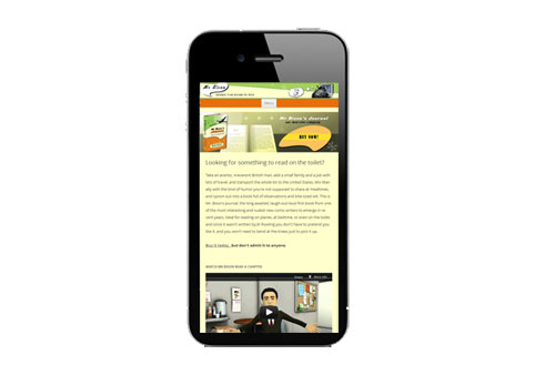
and here it is on an i Phone

The way the site is coded means it automatically “responds” to what ever device it it viewed from. Here are some of the things that happen
- Automatic adjustment the overall width of the site
- Re sizes all the images – see how the entire width of the header graphic and call to action banner are visible whatever the device
- Adjusts the placements of page elements – on the phone the elements that were displayed horizontally ( the block of text and video) are now displayed vertically
- Optimization of the navigational tool. If viewed on a phone a clunky navigational bar would detract from the site content. Instead the user is presented with a menu button, which, if selected, will display a drop down menu.
You don’t have to view the site on all of these different devices to see this responsive nature in action, simply visit the site and re-size your browser window…getting smaller and smaller as you do.. see how the site changes?


