Its all very well getting a ton of traffic to your web site but are your visitors doing what you want them to do, or quickly bouncing off your site? If you don’t have some serious “call to actions” in place chances, are they are wandering around aimlessly or worse still hitting that back button and leaving your website all together.
What is a call to action?
Simplistically, it is a set of actions you would like your users to carry out, for example signing up for a service, filling out a contact form or subscribing to a news letter. It gives your visitors focus and is a great way to measure how your site is performing.
Lets look at a couple of “call to actions” in operation.
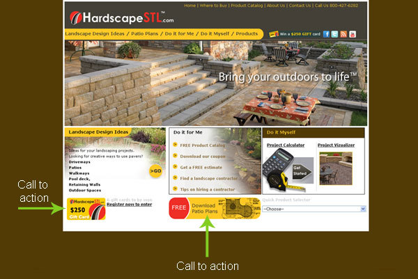
The website for hardscapestl.com, an excellent resource for landscaping ideas and a fine oiled lead generation machine.
The home page offers a number of routes into the site depending on visitors needs but two recently added components are highlighted with splashes of red to create primary call to actions; register to win a gift card and Free download of patio plans.
The gift card call to action leads to a simple sign up form.
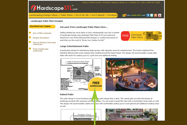
The Free patio plan button leads to this page which offers a number of plans to download with a call to action for each plan.
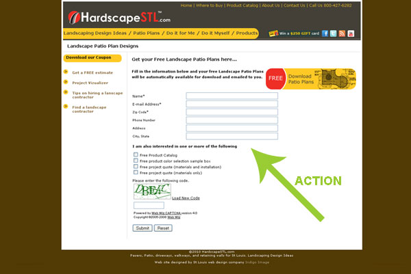
When the visitor has selected their plan they are taken to this page
and need to fill in a form to download their plan. The visitor gets a free plan and hardscapestl.com get an excellent qualified lead to follow up on.
A win win for both.
Does your website have call to actions?
© 2011 Chicago web designer


