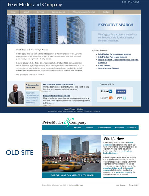
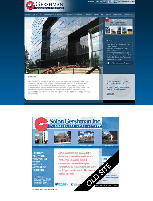
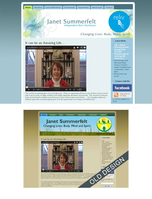
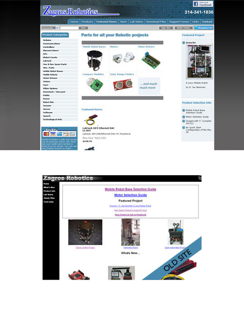
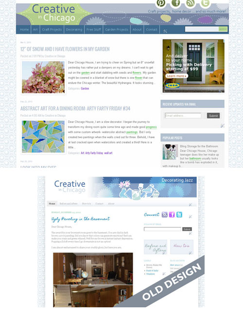
There is something very satisfying about looking at before and after transformations regardless of the medium. Think about the TV shows ” What not to Wear”, HGTV’s “Devine Design” and even “Hoarding-Burried Alive” They are all about transformations – making something or someone look and feel better.
Now as a website designer I can’t make a site “feel” better but I can make the user experience more enjoyable and less fraught.
Amateurish to Professional
Site visitors will form an opinion of your site within the first 3 seconds of looking at it. It is important to make those seconds count with a professional look/feel.
Drab to Fab
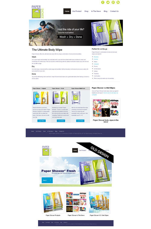
A simple shift in color palette and a few graphic tweaks can make a site go from drab to fab. This site was transformed into a more fresh and invigorating experience, which was much more appropriate for the products it promotes.
Getting the visitor to do something
A call to action or getting a visitor to engage and do what you want them to, in this case donate.
 Content Reorganization
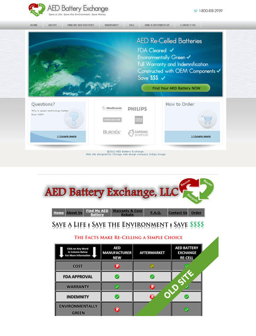
The bigger the site the more important it it to have a well thought out navigational system ensuring your site visitors can find what they are looking for quickly and with the minimum of effort.
Don’t Make Me Think
If your visitors have to work too much when on your site, then you have a problem-they will be hitting that back button. The same is true if they don’t understand what you are offering as was the case with the original Paper Shower web site.


