While doing a little inspirational surfing today for a new web site I am creating for a St Louis medical practice, I stumbled across a number of web sites that specialize in just this sort of thing, huge collections of inspiring web design. These type of sites can be useful for spotting the latest design trends and it got me thinking about the pros and cons of going with a particular prevalent design trend I noticed.
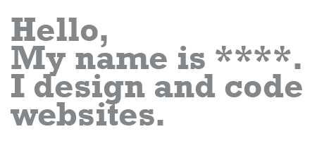
Here is an example of that trend, one many web designers are using on their personal sites.
A simple statement which acts as a strong introduction to their web site.
Pros:
A nice bold “don’t make me think” approach to getting your message across.
Cons:
This element was a “think outside the box” for the first designer who used it but now it is so over used, it’s effect is completely devalued. It is no longer novel and any one using it is “going with the crowd” and not differentiating themselves.
Design trends are a natural evolution in web design, aren’t we all glad that “framed” websites and flashing banners are a thing of the past!
2010 © St Louis Web Designer


