Free Valentine Cards

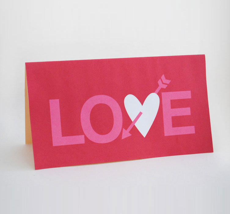
As a graphic designer I can get quite disheartened when buying greeting cards… there is just so much junk out there. So I have taken to designing my own and because I am sure a lot of you have the same issue when buying cards I am  sharing this latest Valentines card  with you for FREE .


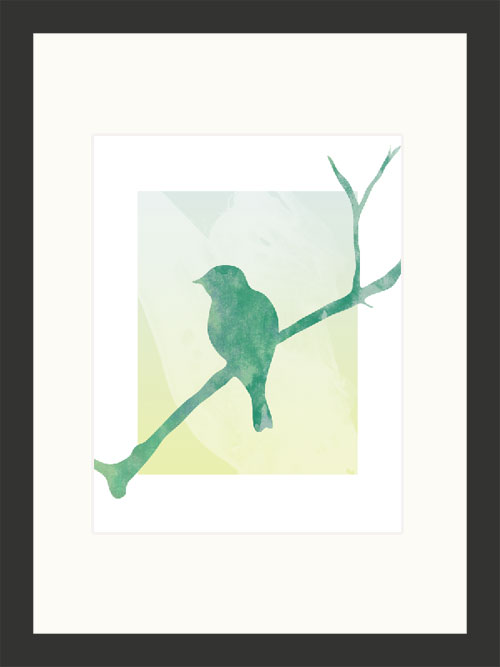
free valentine card

I have created the same design with three different color schemes. Just click on the design you would like, to download a pdf. Simply print on a decent card stock and you will be good to go.

free valentine card red free valentine card purple free valentine card gray

Heinzen Smith Properties Signage

I love it when clients send me photographs of designs  in their final product form.

This is a sign design I created for Chicago home builder, Heinzen Smith Properties. The sign encompassed a range of brand image elements I developed during the design of their web site.

It has been beautifully mounted between two black posts and is currently erected on the construction plot of a new home.

Chicago small business lawn sign design

Graphic Design for a Car Rear Window

Earlier this year I shared a post about the design of a car graphic for client Janet Summerfelt.

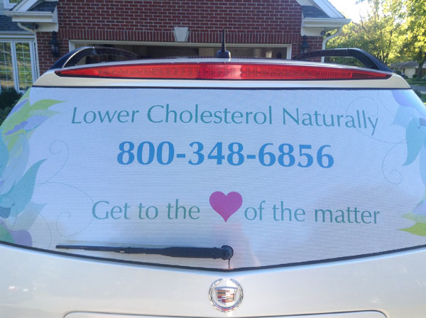
I followed up with her recently and was delighted to hear she was thrilled to bits with her rear window graphic. She sent me this photo

car decal design chicago

It is always tricky to render  a design that is going to be applied to a 3d surface, but as you can see from the proofing mockup I prepared prior to printing,  it was spot on.

rear window car graphic design

Thanks for sharing this photo Janet!

Using Brand Image Elements Consistently

I talked yesterday about the elements of Brand Image and how building a style guide can help ensure your brand image elements are used in a consistent way thus ensure a strong brand image.

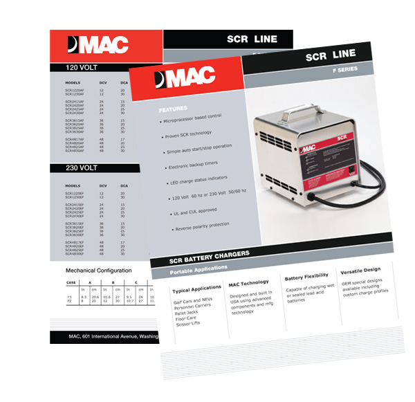
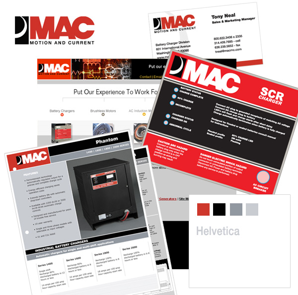
Well here is a great example of using brand image elements consistently, in this  piece of work I completed recently for MAC. The look and feel of this  product sheet fits in beautifully with the rest of their promotional pieces, website, business card etc. by using a predetermined color palette, typeface typesetting, layout and logo treatment.
Product Literature graphic design
Collection of other graphic design pieces produced for MAC
mac brand image

Free printable birthday cards: Vectors

I get rather disgruntled sometimes when I go to buy a birthday card and I find nothing I like, is it just me?

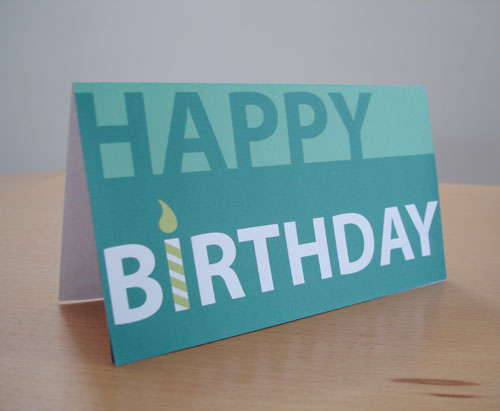
So I have put my graphic designs skills to use and created my own birthday card which can download for free.  I actually have this card on my personal blog ” Creative in Chicago” and was recently picked up by About.com, making it their number one choice in a list of 20 free birthday cards.

Free birthday card

The card comes in four color combinations and works well for men, women and teens. Click on the one you like and download the pdf.  Print it out on some good quality card stock and you are good to go.

green free birthday card

Free birthday card

free birthday card

free birthday card

© 2011 Chicago web designer

Free Halloween Cards

I have been deep in a very corporate web design project for the last few weeks but today have turned to a far more frivolous  graphic design project, Halloween card design

You can download these free cards, print them out using your desktop printer on some good quality card stock for an easy scary card. Click the image you’d like, for a printable pdf .

© 2011 Chicago Web Designer

Is your brand image consistent?

I am working on a couple of branding projects at the moment, one is creating everything from scratch ( see the start here)  and the other is a brand consistency project.

Is your brand image consistent? Do your customers have the same experience however they interact with you. From visiting your web site, to paging through a brochure or even receiving and invoice, all these interactions offer an opportunity to convey your unique message. Lack of consistency creates confusion and sends conflicting messages to your clients.

For example your web site projects an air of professionalism and trust through design, a well thought out color palette, fonts, imagery and excellent copy. Does that image carry through to your brochures, folders,  flyers or whatever other marketing pieces you use, or have they been hastily put together with no thought as to what they communicate?

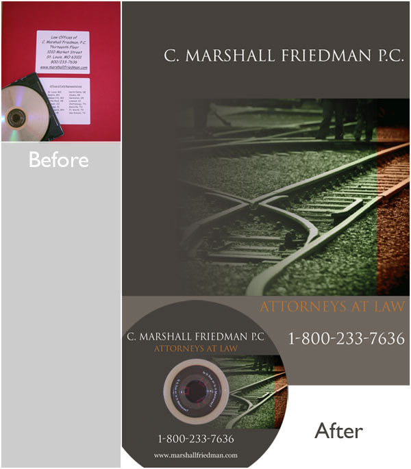
Here is brand consistency in action, from web site through to presentation folder and DVD labeling the client is getting the same message.

Professional website

DVD folder design

Interested in how we can give your collateral material a more branded and polished look? Checked out our Branding Services.

©: 2011 Chicago web designer

A Teenage Chicago Penthouse, in my Basement!

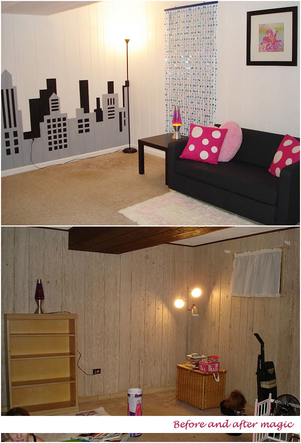
Who doesn’t love a before and after comparison, I do them for web sites quite a lot, ( here here and here)  to showcase how a few design tweaks can make a huge impact on the appeal of a site. But today I am going to show you how I used my graphic design skills and tools to transform a very dingy, quite disgusting Chicago basement room into a light and airy teenage “penthouse” hang out.
basement penthouse

My canvas for this room was horrible wood paneling which has the texture of drift wood but nowhere near as pleasant. I primed then painted everything white, it took 3 coats before it looked good.

Then came the fun bit.

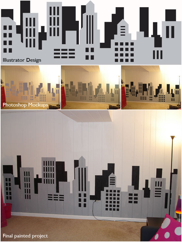
To be certain the skyline idea was going to work in terms of scale and look/ feel, and what colors looked best, I did a little Illustrator and Photoshop mockup.

First I designed the skyline in Illustrator. It was then imported  into Photoshop and superimposed  a photograph of the wall I intended to paint. ( I used the multipy function and distorted the illustrator graphic to fit the wall dimensions) After a bit of color tweaking, playing around with different shade of gray we settled on a simple black and  gray color palette.
painted skyline

Because of the rough nature of the paneling my initial plan to carefully tape off and paint the skyline failed so I ended up painting the whole thing free hand. If you look carefully I did not stick religiously to the illustrator design but it was enough to point me in the right direction. It turned out pretty well.
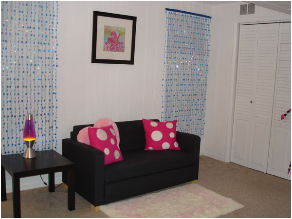
I have a bit more work to do on the furniture on the other side of the room… more painting which I will share soon!

© 2011 Chicago Web Designer