We recently launched a new web site for Metamorphi– a st Louis home builder.
They were after a simple brochure type website which showcases the properties they have developed ( check out the impressive before and after gallery)
We recently launched a new web site for Metamorphi– a st Louis home builder.
They were after a simple brochure type website which showcases the properties they have developed ( check out the impressive before and after gallery)
The website for a Chicago wedding officiant I gave a sneak peak to a few days ago is now live.
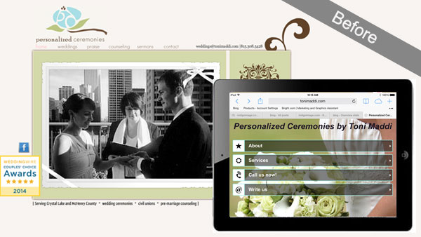
This was a re-design project of an original site that had been created on Wix…an easy to use website creator but lacking in functionality and true internet marketing (SEO) capabilities. Here is a quick snap shot of the site prior to redesign, note the mobile version looks completely different from the desktop version.
Client, Toni Maddi , was very keen to keep the ability to update the website herself but really wanted a site where she could have full control of SEO. WordPress was the natural answer and it was this platform we used to build a fully responsive website for her wedding officiant business.
We created a very clean looking template design and updated the color palette a little. Toni had lots of fabulous photographs of wedding ceremonies she had conducted and these were used liberally throughout the site. All the pages were optimized for the search engines and we built specific landing pages for the locations and areas she serves.
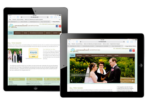
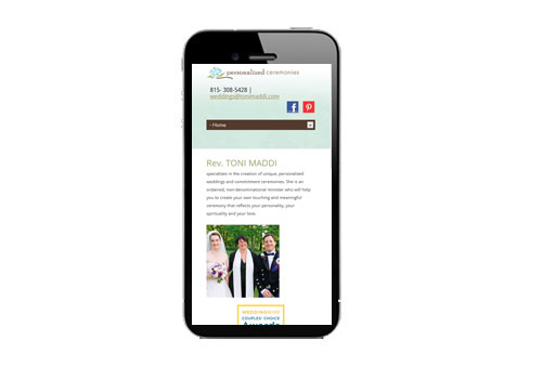
The template was coded to respond to whatever device was being used to view it giving the visitor a consistent experience regardless of device they were using.
Here it is on an ipad
and again on an iphone
The site has been live for less than 24hrs but I have just heard from Toni that she has already received an inquiry through it!
Read more about this wedding officiant web site on our website design portfolio
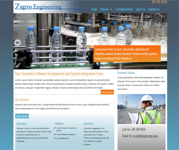
Here is another website we currently have in the works for St Louis based Zagros Engineering.
Every web project we undertake follows a very methodical process
The Zagros Engineering website is currently in the development stage, the framework of the site has been coded and we awaiting content from the client.
It is not quite ready to go live, but here is a quick sneak peak at the new web site we have been working on for a Chicago wedding officiant.
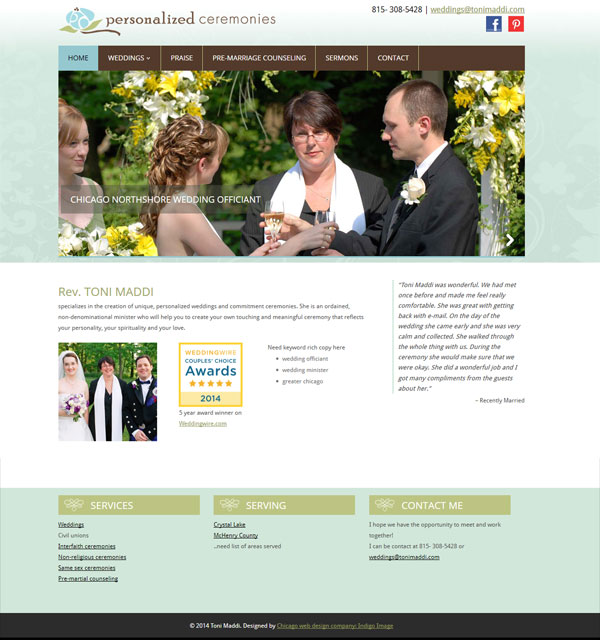
I am just waiting for a little more content then we will be able to pull the trigger and get this website on the road.
I am currently working with Chicago Wedding Officiant, Toni Maddi, on the creation of a new website for her business Personalized Ceremonies.
Toni is looking for a responsive website that will improve her rankings in the search engines. I am building on the WordPress platform..the site will be launched in the next few weeks.
We have work with businesses all over the country on web and graphic design projects, but it is especially rewarding working with businesses based in our local vicinity. Our newest client, Paper Shower, is located right here in Lincolnshire IL .
Launched yesterday was a redesigned version of their web site papershower.com
Paper Shower offers a range of unique body wipes which combine a large wet wipe with a dry towelette and are great for active people who are looking to freshen up on the go – bikers, runners, while camping, hiking and traveling or even on the golf course.
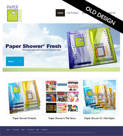 There are several reasons for the need to redesign a web site and the old Paper Shower site fulfilled quite a few.
Firstly the site was making the visitors work too hard to understand the product, it was only after clicking through from the home page that the concept of the product having both a wet and dry towelette became obvious.
Secondly, almost no consideration had been made as to who the product was being marketed towards – it was too generic.
Lastly the site was not at all optimized for the search engines, the home page itself was a collection of images and as a whole had very little keyword rich copy. Ranking in the search engines was poor and traffic was minimal despite great PR coverage the product has had over the last few years.
Understanding the issues facing the old site helped us create a strategy for the re-design and re-launch of the new site.
Competitive Analysis
Any SEO project needs to kick off with a through understanding of the online competition. We took an in depth look at other body wipe websites and our analysis resulted in the compilation a list of favorable key phrases.
Web Content
We wanted to address several things with the web content
We started with the creation of a set of web banners that incorporated the product and an outdoor scenario or an occasion where the product would be useful. Each banner also carried the phrase Wash > Dry > Done, which was elaborated on with keyword rich copy underneath which quickly and easily explained the product.
The home page was updated to include more details of the product range and examples of who may find the product useful. We used video and client testimonials throughout the site for easily digestible communication.
For better engagement with the target audience we created a set of landing pages
and also added a blog
We are in the process of completing the internet marketing of the site but are confident that the re design and optimization will result in increased traffic and sales.
Read more about Paper Shower in our web design portfolio.
© 2013 Chicago web designer
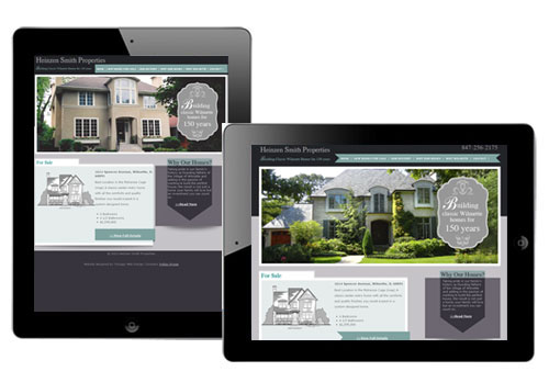
Client Margaret Smith, of Heinzen Smith Properties, has a 150 year family history of building homes just north of Chicago. Each house is custom designed and blends beautifully with existing homes in the Wilmette area.
Margaret contacted us with lots of ideas for her web site and we have been able to translate those ideas into a site that perfectly captures what she wanted to achieve.

After developing a color palette inspired by a slate roof with weathered copper gutters, we designed a home page which gives site visitor a quick glimpse of some of their most eye catching homes and focuses attention to New Homes for Sale. We were spoiled for choice when it came time to select photographs as the client provided so many stunning homes to pick from. Not wanting waste an opportunity to showcase them further, we carried them through to the inner pages of the site and cropped them to center on doors as a “welcoming” gesture.
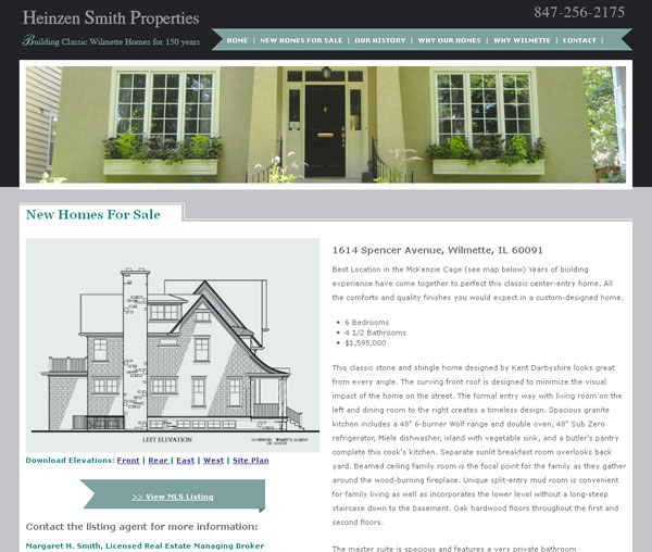
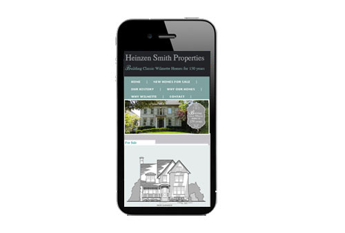
The site was also designed and coded as one that is fully responsive – see here for an explanation of responsive web design
Here it is on a desktop
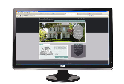
On an ipad in portrait and landscape orientations
And finally an iphone
You can visit the site at heinzensmith.com
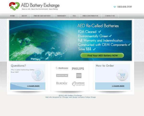
Launch today is a freshly re-designed website for AED Battery Exchange aedbatteryexchange.com. Located in the far north suburbs of Chicago, they are leading the way in re- celling batteries for Automated external defibrillators and wanted a web site which truly matched their innovative product.
Also on their want list was a professional looking site which was easy to navigate and appealing to their target audience.
We created a very clean look and feel, the home page featuring an eye catching Call to Action banner to “Find your AED battery”.
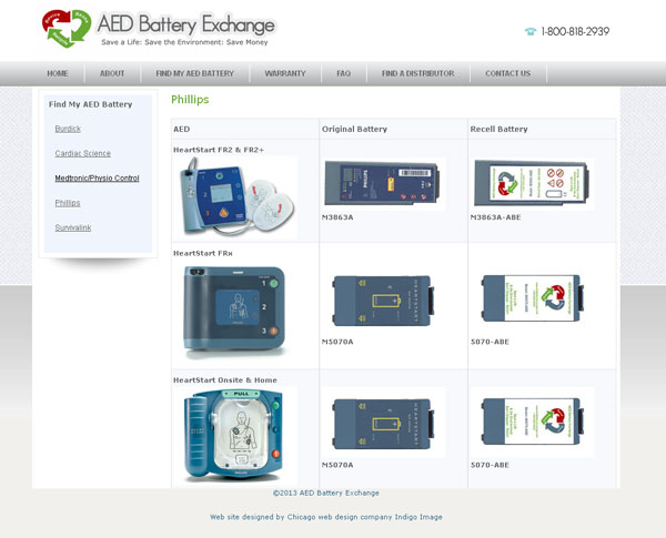
They batteries were categorized in terms on manufacturer and featured images which can be enlarged so the user can clarify the correct battery.
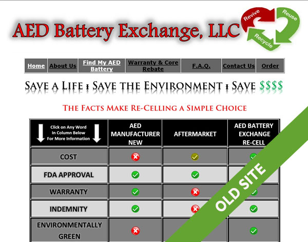
The site is definitely a step up from their old one
Here is another project which showcases the consistent use of image branding elements as I talked about in my post Brand Image Tips for Small business Owners.
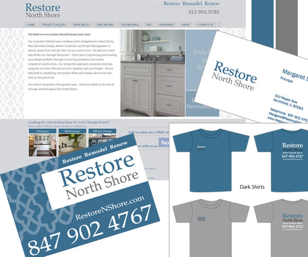
I started working with Restore North Shore, a Chicago remodeling company, a few years back …creating a set of basic brand image elements for them … logo, color palette, type face selection. These element were then integrated into a website and more recently I have created Lawn signs, Car Magnets and t-shirts, working from the elements I originally established.
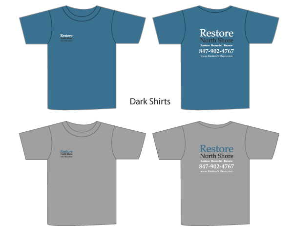
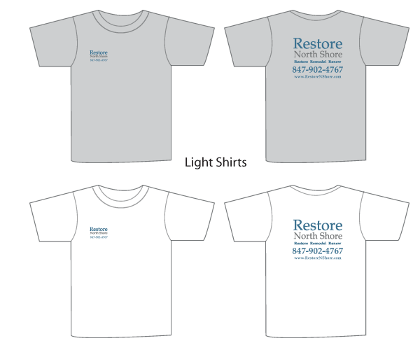
And here are the branding elements all working together, delivering a strong and consistent look for this small Chicago business.
If you would like help building a branded image for your small business we are happy to help, learn more about our branding services or contact us today
As a web and graphic designer my “design” eyes never seem to rest. If I am out and about driving, I am reviewing and critiquing logos on the sides of vehicles, if I am waiting at a clients office for a meeting to start I am analyzing the patterns in the carpet or on the wall coverings. Just sitting here as I type I can see patterns every where from the wood grain on my desk to the grill of my computer speakers. I am constantly absorbing design all around me; patterns, textures, shapes, color palettes, color combinations, type faces … to many it may sound exhausting …but to me it’s not!
Even at 30,000 feet the “Chicago web designers eye” is primed and ready. As I peered out of the window on a recent flight to Vegas I was greeted by an amazing patchwork of shapes and contours that had been highlighted by a sprinkling of snow. How cool is that!
