I talked yesterday about the elements of Brand Image and how building a style guide can help ensure your brand image elements are used in a consistent way thus ensure a strong brand image.
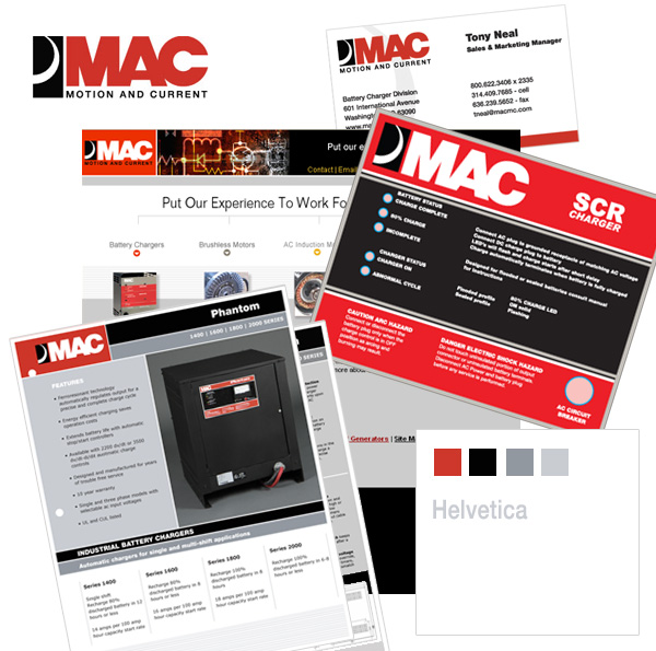
Well here is a great example of using brand image elements consistently, in this piece of work I completed recently for MAC. The look and feel of this product sheet fits in beautifully with the rest of their promotional pieces, website, business card etc. by using a predetermined color palette, typeface typesetting, layout and logo treatment.

Collection of other graphic design pieces produced for MAC


