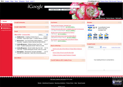
Last week Google implemented changes to iGoogle. While some of the functionality aspects are good (like giving full gmail operation within the realms of the iGoogle page) the new navigation placement is not.
They have switched from top tab navigation to a left side bar navigation, and in essence have lost the cleanliness of design which is one of my favorite elements of the Google brand.
This is how my iGoogle page looks now.

I have held off writing this for a few days, giving myself time to acclimatize to the new layout, but almost a week later I still don’t like it. And I am not alone click here
I hope that in future developments Google offers different layout options.


