Creating a text alert for a new order from WooCommerce

I recently built an eCommerce website using WooCommerce and a functionality my client was looking for, was the ability to receive a simple text message that they had a new order. WooCommerce automatically sends out an email when a new order is generated but my client didn’t want to be a slave to checking their inbox…a fair enough request I thought!

My first approach was to use a SMS plugin but it appeared there was no free way to achieve this simplest of tasks. So I got creative!

Creating a text alert for a new order from WooCommerce without using a plugin

  1. Start by creating a unique email address through your hosting provider. It can be as obscure as you like e.g textalert@company.com…the only emails this account will receive will be from WooCommerce.
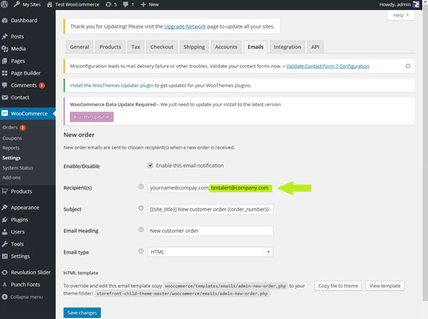
  2. Log into your WordPress dashboard and navigate to WooCommerce  > Settings > Emails  > New Order. Add your newly generated email address.wooCommerce text alert
  3. Log into your newly created email account. The email account I used was powered by SmarterMail and through their settings I was able to set up an Event with an Action that would trigger whenever the inbox received a new message – ie an order had been generated. The way you do this will depend upon the email provider but SmarterMail makes the process very easy. The clever part comes in the configuration of the Action.  All cell phone numbers have an email address associated with them, all you need to determine what it is. is the cell phone number itself and the cell phone carrier.
    e.g a cell phone number of 123 456 78910 with verizon would have an associated email address of 12345678910@vtext.com.The Action should be configured to send a simple text message to the email address associated with the cell number

It has proved to be be a simple and effective way to receive text notifications of new orders

eCommerce website for Body Wipe Company

Launched today is a brand new e commerce website for Body Wipe Company

body wipe company website

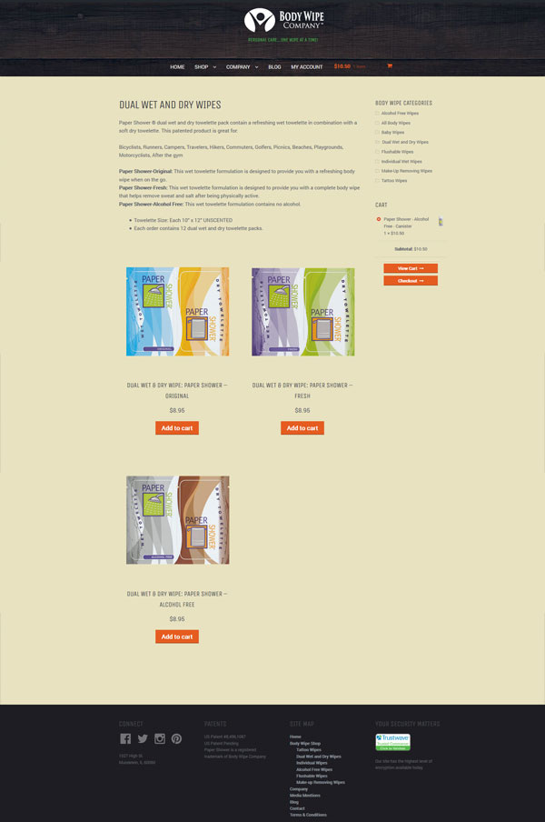
The site sells all sorts of body wipes including a brand concept in wipes – Tat Towels. These wipes are specifically designed to moisturize and enhance older tattoos making them POP!

body wipe company ecommerce

The site has a hip look with no fluff. It was designed to keep the shopping experience as streamlined as possible, enabling shoppers to get in and out  quickly, with minimum clicks and fuss. It even gives them multiple options when it come to payment – credit card, Paypal or even payment through Amazon.  The site is of course mobile friendly.

Visit it at https://www.bodywipecompany.com/

body wipe shop ecommerce

The Dance Workshop Website

Creating a new website for your small business can be a daunting task … what sort of look/type of functionality is going to work best for you, what is your budget and how do go about selecting a web design company? Generally, the first step is to take a look at what other similar business are doing…just to get some ideas and your own creative process rolling. If you find a site you absolutely love, it doesn’t do any harm to contact the web design company who created it – many design companies include a “designed by” link at the footer of the site…these are often quite small.

This is exactly how we connected with one of our newest clients, The Dance Workshop, a dance studio located in Monroe CT. They had seen a site we created for a Chicago based dance studio and reached out to us, the rest is history!

This week sees the launch of their new WordPress website.

dance-workshop-wordpress-website-mobile
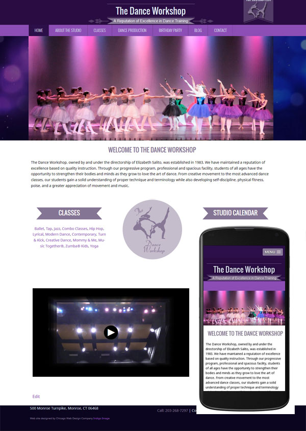
One of the main things they wanted to achieve with their new site was the ability to update it and this was easily achieved by building on the WordPress platform. We created a completely new look which offers and engaging experience to the user with plenty of photographs and information and is of course mobile friendly.

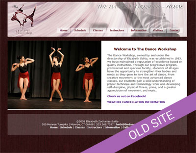
It is always interesting to look back and see the improvements..here is their original site.
dance-workshop-old-site


Updated Website for Chicago Therapist

As a web designer, one of my most satisfying projects are fixer uppers – sites that have usability issues, lack a professional feel or are missing out on creating that great first impression.

When David Cohen, a Chicago Addiction Therapist, contacted us, his site could definitely be classed as a fixer upper.  It lacked that professional feel, made the user work too hard to understand his services and on top of that, was performing poorly in the search engines.

Time to work some magic!

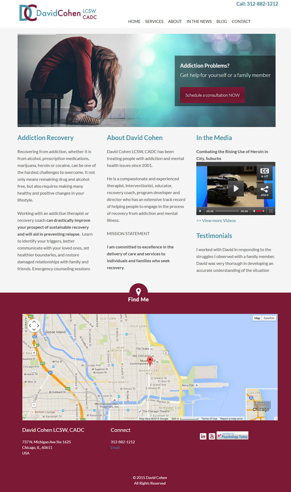
My first objective was to improve the user engagement and I did this by completely reworking the content.  On the home page I added a slide show with well defined call to actions, encouraging users to schedule an appointment. It was also really important that the home page offer a snap shot of the type of help David offers with substance addiction and copy was added to that effect.

chicago therapist website

The inner pages of the site were given a similar content and engagement make-over, including the News page…David is very active in the media and has regular mentions in the press.

chicago-therapist-website-2

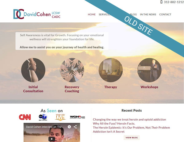
And with all good make-overs or re-designs to is always interesting to take a look back to see what we started with.

chicago-therapist-old


If you have a website that needs improvements please don’t hesitate to contact us for a hassle free no obligation evaluation.

New Website offering Online Interior Design Service

Launched today is a new website, Interior Designs 2GO – an online interior design service. The site is the brain child of HGTV kitchen Crashers designer, Suzanne Falk.

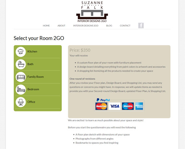
online interior design service chicago

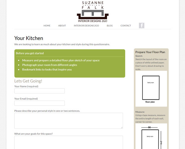
Users need only measure and photograph their space, answer a room specific questionnaire. A professional designer will interpret it all and create a new custom look for their room.

online-interior-design-service-website-chicago-2

online interior design service chicago

The design of the site was kept clean and simple and the process of purchasing the service, short and sweet.

The site was built on the WordPress platform and is mobile friendly.

New website for Northbrook Dr

We recently launched a new website for a Naprapathy doctor, Dr Daryl Newman – www.chainreflex.com

Based in the North Shore area of Chicago, Dr Newman offers unique treatments and programs to help patients move better and feel better. Naprapathy is a non invasive method for treating and managing pain, everything form back aches to carpal tunnel and Dr Newman combines treatment with custom exercises unique to a patient’s problem.

He also offers customized fitness training – Chain Reflex, and wellness programs including weight loss, pre and post natal and sports nutrition.

North shore naprapatic web site

Given that most people do not have a clue (me included when I first met Dr Newman) what naprapathy is, we approached the creation of the website based on how treatment could help specific problems. The home page features a slideshow with distinct patient scenarios leading to targeted call to actions.  We also included a section titled “How can we help you” with more scenarios such as ” I am in pain and looking for relief”.  As the visitor delves deeper into the site a better understanding of what naprapthy is and what to expect are gained. The site is sprinkled with an amazing set of testimonials that speak volumes of the skill Dr Newman offers.

The design is clean and uplifting reflecting how patients feel after a treatment session. It  is built on the WordPress framework which will allow Dr Newman to easily update, he is also going to be writing a regular blog – a great way to market a site.

pain-treatment-northbrook

It is also completely mobile friendly.

Visit it a www,chainreflex.com

Mobile Friendly WordPress Websites

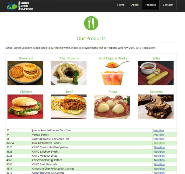
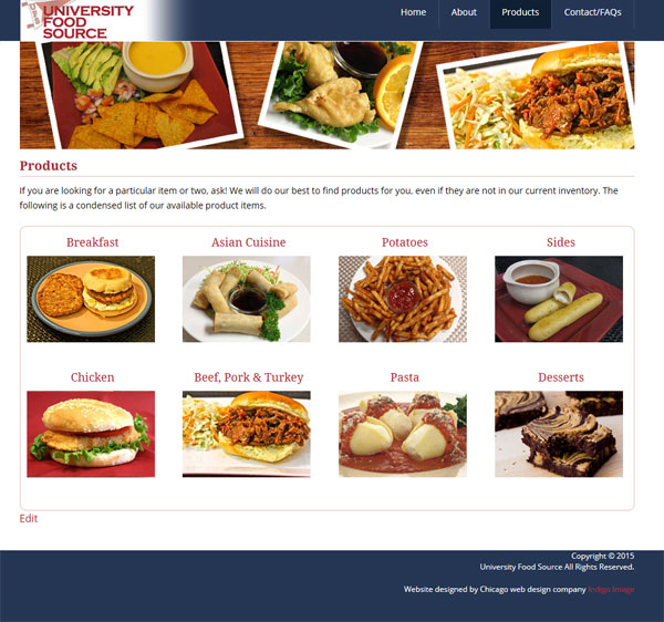
Last week I launched three new web sites… and they were all related to food., what more I have another three foodie websites in the works. Is this why I always seem to be hungry at the moment? I have already blogged about new mobile friendly web site for a Deerfield personal chef, but today it is the turn of a pair of wholesale food distribution site, School Lunch Solutions and University Food Source.

Both sites act as online catalogs for an inventory of wholesale food, one is geared towards the schools and the other the University market.

We built them on the WordPress platform which will allow the client to easily update products and nutritional information, up to this point it has been a cumbersome process!

The look and feels were similar.

Here is School Lunch Solutions

school lunch solution mobile freindly web site

school-lunch-solutions-website-inner

and here is University Food Source

university food Source mobile freindly website

university-food-source-website-inner

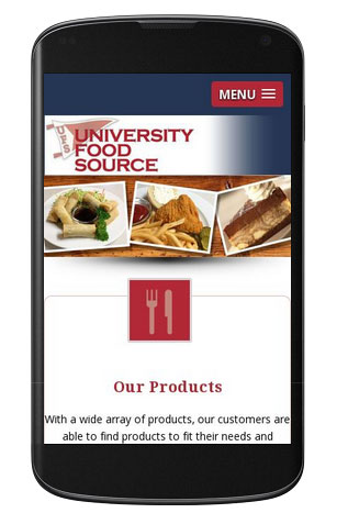
Both sites are mobile friendly.
ufs-mobile

New Website for Chicago Consulting Company

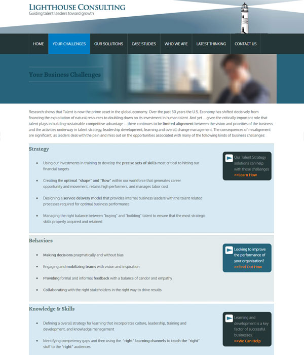
Launched today is a new website for Lighthouse Consulting, a Chicago based business consulting firm.
Lighthouse consulting Chicago business consultant
We designed a clean look and feel incorporating a slide show on the home page which was inspired by guiding light sources and drives users to inner sections of the site that are applicable to their particular challenges.

The architecture of the site was designed specifically around the challenges business owners face.

Lighthouse consulting: business challenges facing Chicago business owners

The site is responsively coded and powered by WordPress.

New WordPress Site for Chicago Interior Designer

Last week we launched is a brand new wordpress web site for Chicago interior designer, Suzanne Falk.
wordpress website interior designer chicago
Suzanne works with a wide range of clients, from  homeowners, to  businesses and she is also currently focusing on a project for the DIY/HGTV network.

The websites launches her new product “Kitchens 2 Go“, a shopping list to DIY your own designer kitchen. She is offering complete shopping lists for traditional, transitional and urban chic styles, in both warm and cool color palettes.

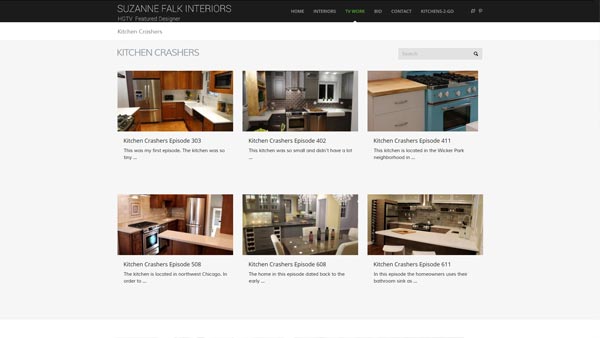
It also features a selection of her TV work, including episodes of HGTV’s Kitchen Crashers’s

wordpress website interior designer chicago

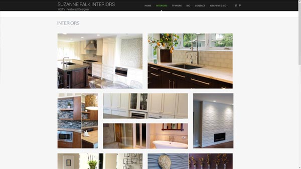
Many of her stunning interior design projects are showcased in a large portfolio.

wordpress website interior designer chicago