Web Design Updates for Indigo Image

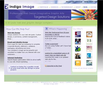
Back in February I mentioned our web site was undergoing a freshen up. Client work always comes first so it has taken until the middle of April to roll out the changes. But today is the day!

While the overall design has not dramatically changed we have focused on usability issues. Our home page now features our RSS feed and a dynamic portfolio navigator. The entire portfolio section has been reworked and all logo and graphic design pieces are presented as a slide show format for easy viewing.

The portfolio has been split into the following sections

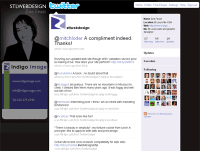
We have also taken the opportunity to update our blog template and create a custom background for the STLwebdesign Twitter page
New web site for Saint Louis Associates in OBGYN

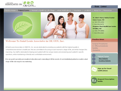
Launched this afternoon is a brand new web site for Saint Louis Associates in OBGYN.

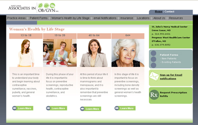
Presented with a clean and fresh look/feel, the site information is organized in well structured categories, from “Practice Areas” to “Woman’s Health by Life Stage”. The user is able quickly to hone in on their information of interest.

Home Page

associates

Woman’s Health by Life Stage

associates1
Visit the site at www.snowdenmd.com

Google Launches a new Web Browser: Chrome

I am a huge fan of Google and was delighted today to see they are launching a completely new web broswer, built from the ground up.
They have produced a comic which describes in layman terms the features of their new system. The browser is due for launch today and I will be keeping an eye on the official Google blog for that magic download link.

The new browser includes:-

  • Tabbed browsing where each tab gets its own process, leading to faster and more stable browsing. If one tab crashes, the whole browser doesn’t go down with it.
  • A distinct user interface that places tabs on top of the browser window instead of right below the address bar
  • An “incognito” mode that lets you browse the web in complete privacy because it doesn’t record any of your activity
  • A new JavaScript engine built from the ground up for speed
  • Malware and phishing lists that automatically update themselves and warn you of bad websites
  • A default homepage that displays your most commonly used sites and other personalized information

Website Design: First Impressions count.

What kind of impression does your web site make, especially in those critical first few seconds? Are you engaging your users to explore further or sending them away? Recent studies show that if a web site has not captivated a user within 4 seconds then they will abandon your site.

Here are a few things to consider.

  • How quickly does your main page load?
    What pops up first? How quickly can you begin to read any text? It’s critical for the most eye-catching elements to load first and near the top of the page. The page can then continue and finish loading while the visitor is checking out what’s loaded first.
  • Is it clear what your web site is about and generally what’s offered from a quick scan of the page?
  • Is the navigation clear and obvious so your visitors can quickly see where to find your products or services or are you forcing your user to think to much?

So is your web site meeting these simple criteria or failing and sending your traffic away.?
It doesn’t matter how much effort you put into search engine optimization, pay per click programs, internet marketing etc. If the first impression or your site is lacking your visitors will go else where.

A web site makeover: Tiger Tables

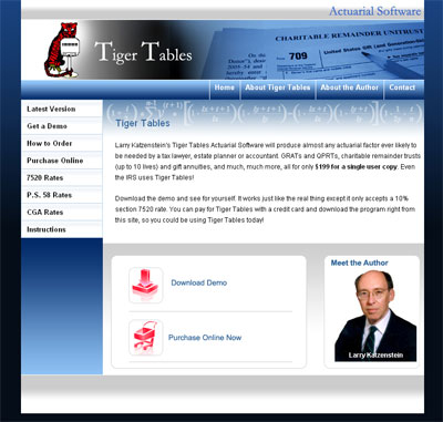
Last week saw the launch of a new web site for tigertables.com.

Tiger Tables is in the business of selling actuarial software and offers a demo version for evaluation. Delivering an easy “don’t make me think” approach was our focus during the design phase, and we utilized bold navigation on the home page to attract users to try the demo or buy the product.

The overall site design was targeted for a more upscale, professional look compared to the original site.

Business owner Larry Katzenstein had this to say:

Thanks again for all your help. I love the way my new site looks.”

Pixel Perfect Coding

Two of my projects last week moved out of the design phase and into the coding phase.
It is during this phase that the non functional design created are sliced up and reconstructed into into fully functional web pages albeit void of content. Content population comes next.

During this intial coding phase our pages are tested, tested and tested again to ensure they perform well across all user platforms and browsers. In a perfect world all browsers would render a coded page exactly the same way …but this is not the case. Browsers can introduce gaps and spaces into a design. A web design which displays seemlessley when viewed with internet Explorer can have gaps and spaces when view with Firefox.

We employ a standard of pixel perfect coding …a design will display seemlessly whatever browser it is viewed on. We achieve this though the slicing logic used in cutting up our designs and careful coding with hacks where necessary.

Your web site…is it time to re design?

Re-design is a natural cycle of having a web site. What worked well …say eight years ago, may not be performing up the mark for you today. While many changes can be made by a little web maintenace here and there, there comes a time when only a full scale redesign is going help you accomplish your objective.

But how do you know when that time has come? Here are four tell-tale signs that the time has come to re-design.

  1. Your Business has grown or changed
    While any good web site will be designed so it can accomodate moderate business growth, if your business is booming and you have extended your service offering it is likely that your original web site is not doing you justice. The same goes if you have changed the direction of your business.
  2. Outdated Design
    You only get one chance to make a first impression and if the overall look/feel of your site is radically “behind the times” you can lose credibility. If your site features animated clipart, is coded as frames or looks like a “Front Page template you are the victim of an outdated design!
  3. Your information lacks organization
    If you have been adding to your site over the years it is likely that your navigation has become a little confused. Making your visitors “think” when navigating will not engage them to the same extend as a well thought out navigation and information structure.
  4. Poor Performace in the Search engines
    Poor rankings in the Search Engines can be a result of not optimizing your site well. Poor search engine ranking can also be a result of bad design choices or coding on your site. Make sure that your site isn’t designed using frames and that the text is coded in HTML. Flash sites are also more difficult to optimize for Search Engines.

If any of these senarios describe your web site contact us at info@indigoimage.com to see how we can help bring you up to date in the web world.

Blog widget: The web poll.

Blogs are becoming an increasingly popular marketing tool for companies, both big and small. They allow you to update your readers with company news, offer tips, tricks, promote products. The list is endless.

Blogs can now also be enhanced with widgets.Widget are small applications which have a specific function to perform on a blog or web site.For example some widgets allow you to show videos play music, and while this might not be relevant to a business blog there are plenty of widgets out there that are.

For example a web poll widget.

Widgets like increase the interactivity with your readers just that one step further. They require little technological know how to add…cut and paste some code and your are ready to go.
What’s more most of them are free.

Image Optimization: Improve the load time of your web site or blog

For the average web site or blog most of the load time is a result of the images on the page, the bigger the image files, the longer it takes for the page to completely download.

To improve download time, professional web designers will go though an image optimization process where the images on a site are fine tuned via a balance of file size vs image quality.

The following picture of some nice juicy fall apples illustrate the process. The settings used to save the image were adjusted but it is not until you look at image 4 that a noticable degredation appears. In this case Image 3 would be selected having the best combination of low file size and image quality.

Although we use professional graphics software to optimize there are plently of free ulitilies available to do the hard work for you. My favorite is Net Mechanic ..here you can upload your image and it is presented in varous optimized forms. Pick the image that best suits your need, right click and “save picture as”.


Image 1 : file size=14.1 Kb

Image 2 : file size=8.66 Kb

Image 3 : file size=4.58 Kb

Image4 : file size=3.02Kb

Graphic Design Portfolio Updated

I recently had a call from a lady who had visited my site. She was looking to create a new web site but told me she had spent many hours trying to find a company to work with but had not liked any of the sites she had visited …until she visited indigoimage.com and hence the call.

This one phone call alone speaks volumes about having a good online presence and standing out from the crowd.

I have been working on the organisation of the portfolio aspect of the site recently and today launched a reconfigured version of the graphic design portfolio. The portfolio is now spit into logos (five galleries) Business Cards & Lettersheads, Brochures and Newsletters and 2 galleries of corporate design.

The portfolio has been updated with some new projects and the new configuration should make it easier to visitors to home into their intrest area faster.