The Future of typefaces in webdesign

Note if you are reading this post via a RSS reader please visit the actual blog post

OK here is a little pop quiz today.  Spot the difference between the follow two blocks.

Block A

Logo design, web design, website designer, graphic designer, St Louis website designer, Chicago website designer, SEO, internet marketing, corporate branding, email template design, brochure design.

Block B

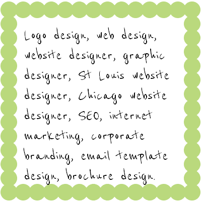
font image

Did you spot anything? No? Correct! That’s because visually there is no difference at all.

Now try and select the type in each block. It’s easy in Block A but impossible in Block B. That is because block B is an image but block A is pure HTML with a little CSS styling. Just like your cursor, a search engine is blind to the words in block B but has 20/20 vision to the words in Block A.

The typeface used to generate these blocks is not one we would usually see on a web site. We web designers have had to stick to a small family of web safe fonts to ensure that the copy of a site can be read no matter what computer or platform you are using. Any use of a font outside this small family means that we have to use a “blind to search engines ” image.

However thanks to Google Font Directory the world of web safe fonts is coming to an end. The directory currently contains just a small number of more usual typeface that can be easily integrated into a web site, like Reenie Beanie above. It is not widely used yet but I predict the number of typeface added to the directory will rapidly grow.

Advantages

  • Smaller files sizes
  • Easier and faster to update than pure images.
  • More search engine friendly
  • Much bigger family of “web safe fonts”

2010 © St Louis Web Designer

Website in progress for St Louis Ophthalmology Practice

Starting a new website project is always an exciting time, creating a blank Photoshop file and making pixels do their stuff. Thinking about how to engage the site visitor, designing a navigational tool that is intuitive, employing the KISS principal ( keep it simple stupid), selecting a color palette, choosing imagery and putting it all together in a way that is appealing and functional.  And that’s just the design phase. I love my job…does it show?

We are currently in the design phase for a new project for a St Louis Ophthalmology Practice. All the design work gets posted online for the client to review and critique, a  fundamental element in our design process. With their feedback the design will evolve into the winning concept that meets all the requirement we established in the definition stage of the project. It is a tried and tested methodology that works.

clinical web site

We are still making a few final tweaks to the design. Next we will move onto the development stage of the project. Here the static design will be rendered into a form which can be understood by web browsers. We go from the creativity of Photoshop to the technicalities of coding.

The project is scheduled for launch late summer.

2010 © St Louis Web Designer

New Website for Chicago Headhunting Company

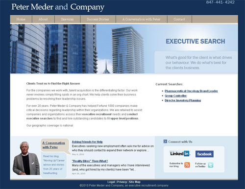
There is nothing like kicking off a Monday morning with the launch of a project. Today sees the release of a new web site and brand image for Chicago headhunting company, Peter Meder and Company.
Chicago headhunter peter meder web site

We began working with Peter about a month ago. He wanted a very professional and polished looking web site and was interested in integrating his  blog and networking tools such as Twitter, Facebook and Linkedin. We created a clean crisp look and feel enhanced by an amazing set of photographs ( taken by Peter himself) with call to actions on the home page to current headhunting searches,  social media connections and his blog.

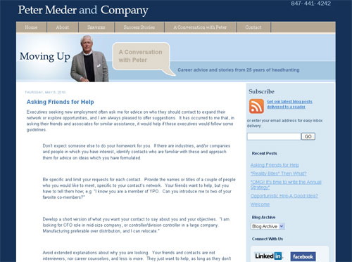
The blog, “Moving up -A conversation with Peter,  career advice and stories from 25 years of headhunting” has been live for a few months but just using a standard blogger template. To ensured it flows seamlessly with the rest of the site we created a custom template, with navigation to the main site and branded with the Peter Meder and company brand elements.

peter meder blog

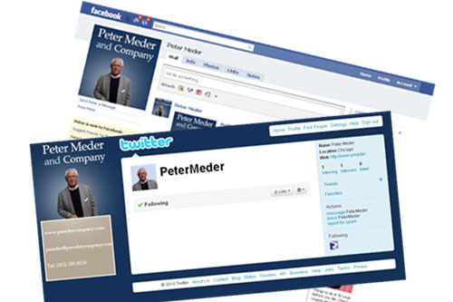
Twitter and Facebook accounts were also given the brand image.

peter Meder socail media

We are just finishing up on a stationery set to complete the brand makeover. As I said before full image branding are my favorite design projects and I am looking forward to the opportunity to working with more Chicago based clients!

2010 © St Louis Web Designer

Pro Bono web design

I feel it is important to give back to the community and try and take on one pro bono design project a year. I get plenty of opportunities over my desk and selecting the project is not always easy.

However this week one popped up I could not ignore. Linda Hansen of the Burns Recovered Support Group contacted me to see if I would be interested in reworking their web site. They offer a fantastic summer camp for burn victim children and  a wealth of support for burn survivors. So over the next few weeks I will be working with Linda and her team to bring their web site up to scratch.

2010 © St Louis Web Designer
St Louis web designers tip of the day: Protect your Computer

This week has seen some quite spectacular storm roll through St Louis. I had the misfortune of having my house stuck by lightening Tuesday night. Aside from the ear splitting bang, the strike blew a chunk out of my garage, tripped every fuse in my fuse box, and fried my phones and DSL modem to the land of complete non function. A nearby tree was also stuck and now bears an impressive scar.

After dealing with all this commotion yesterday it got me thinking about the computer “what if’s”. Here is a handy list of three easy tips to help prevent a catastrophic storm induced disaster.

  • If you know a storm is on its way unplug your modem, and not just from the electrical outlet,  unplug the cable providing your signal. If I had done this I would have saved myself the inconvenience and expense of a new modem.
  • Always use a surge protector for your equipment.  I have used surge protectors with a battery back up in the past. They are really useful for sudden power outages but in my experience they have a short lifetime. I  just use a standard protector and obsessively save my work as I go along.
  • If the worse comes to the worse and your computer gets fried during an electrical storm do you have your data backed up? There are plenty of options available these days from online services to stand alone hard drives.

Anyone else have any tips?
stike by lightening

2010 © St Louis Web Designer
Life of a web designer

I have been running my own business for 10 years now and can truly say I have found my career passion. Along the way I have experienced some fab and not so fab things, met some great people, listened to some bizarre business ideas and  been exposed to a huge variety of businesses.

Here are a few things I have encountered

Exposed to

Industrial sized washing machines, a huge freezer warehouse, news helicopters, machines that make corrugated cardboard, building stripped down to the studs ready for rehab, luxury multi million dollar homes,  engineering plants and an online TV station to name a few.

Met with

Doctors, lawyers, authors, wedding planners, photographers, entrepreneurs, realtors, software developers, IT professionals, constructors, publishers, fitness trainers, small business start ups and many more.

Most bizarre business idea

A guy who truly believed he could make a million bucks from selling an everyday office supply bent into a peculiar shape.

Most inappropriate prospect

It is never ok to undo you pants and proceed to “break wind” during a meeting!

The life of a web designer is never dull!

2010 © St Louis Web Designer

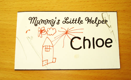
One of my most memorable business card designs

Fabulous design elements, creative use of color, usual shape, some funky die cutting?

No!

This is one of my most memorable business card designs. I discovered it yesterday during a spring clean, it is tatty and scribbled on but has a great story associated with it.

business card

This card was created about 9 years ago and featured the artwork of my then 3 1/2 year old daughter, Chloe. I was going to a late afternoon small business trade show to do a little networking but had no sitter so decided to take my little one along. I thought it would be fun to make her some business cards to hand out.  She drew me a picture which I scanned, quickly put together this unique card and printed a bundle out on my desktop printer.

Her cards were a huge success and contacts I have today from back then not only remember them but still have them. How many business cards do you have from 9 years ago?

2010 © St Louis Web Designer

Web Design Trends.

While doing a little inspirational surfing today for a new web site I am creating for a St Louis medical practice, I stumbled across a number of web sites that specialize in just this sort of thing, huge collections of inspiring web design. These type of sites can be useful for spotting the latest design trends and it got me thinking about the pros and cons of going with a particular prevalent design trend I noticed.

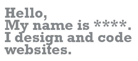
Here is an example of  that trend, one many web designers are using on their personal sites.

A simple statement which acts as a strong introduction to their web site.

Pros: 
A nice bold “don’t make me think” approach to getting your message across.

Cons: 
This element was a “think outside the box” for the first designer who used it but now it is so over used, it’s effect is completely devalued. It is no longer novel and any one using it is “going with the crowd” and not differentiating themselves.

Design trends are a natural evolution in web design, aren’t we all glad that  “framed” websites and flashing banners are a thing of the past!

2010 © St Louis Web Designer

How can I update my web site?

If you are a web site owner you know how important it is to keep you web site fresh and up to date… not only for your site visitors but also for the search engines. The more often a site is updated the more often a search engine spider will visit which will in turn effect the page ranking of your site.

We offer web site maintenance on a hourly basis, via web site maintenance contracts, or can configure customer sites so they can be easily self maintained by an online editor.

The online editor option is a great approach if a web site need to be frequently updated.

The system we use has the following benefits

  • No knowlege of HTML required
  • Secure login
  • Easy, Fast Editing If you know how to type a letter in Microsoft Word, you already know how to edit your website.

    -edit text

    -upload images

    -add links

    -add pages

  • Save Time and Money. No more waiting for someone else to make edits for you
  • Convenient. Edit your website directly in your browser, on any computer, anywhere