We have a summer intern

Throughout the month of July we have a new addition to our office, a summer intern.

She is technically savvy and artistically gifted but comes to us with no knowledge of web design. However her eagerness to learn is energizing and the fact she has a blank slate when it comes to the world of web design is a plus, as we can point her in the right direction to how things should be done.

We have got her started on an HTML tutorial and she has dived right in, she is coding by hand which is the best way to learn.

Welcome aboard Chloe!

© 2011 Chicago Web Designer

Free Vector Pattern: contemporary design

A few weeks ago I had an email from a packaging designer asking if they could incorporate this winter theme vector in the packaging for a set of Christmas bowls.  We exchanged a few emails and I agreed it would be perfectly okay to go ahead and use the pattern. I really appreciated the honesty of this designer ( Vibeke Star of  porsgrund.com) requesting permission upfront to use the design! It makes a refreshing change from those who think it is not a problem to swipe stuff from this site.

So in celebration of all those honest designer out there here,  is another pattern for you, a contemporary little number I like to call bubble alert.

Enjoy!

©: 2011 Chicago Web Designer

QR codes : What how and why

Undoubtedly you have these strange pixeled squares popping up all over the place. What are they and what can you do with them?

What is a QR code

qr codeQR stands for Quick Response and they are  read by a QR reader app you can easily download to your cell phone. The app decodes the graphic and reveals the information they contain.

QR codes can point to a specific url, share phone numbers, text , send a text message (SMS),  share a vcard or vcalendar,  share social media profiles or  give Google maps location information,

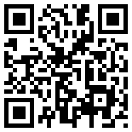
This QR code points to my web site https://www.indigoimage.com

Creating a QR Code

Creating a QR code couldn’t be simpler. There are a number on free online generation site such as Kaywa which allows you to generate a URL, text, phone number or sms QR code, or QRstuff which gives you more options on which information you would like to share. QRstuff also offers a subscription service which give you access to high resolution QR codes suitable for printing.

Why use QR Codes

Simple reason because they make life easier, no more pen and paper to jot down information. With a quick scan the information you want to convey is electronically stored. QR codes offer another avenue with which to engage with your customers.

Where to use QR Codes

  • Business cards
  • Marketing material such as brochures and flyers
  • T shirts
  • Real estate signs
  • Promotional freebies
  • Product labels
  • Store fronts

©: 2011 Chicago Web Designer

Words from the Wall of Shame

Here is some interesting feedback I have received from A wall of shame for website testimonials   and I thought I’d spend 5 minutes sharing it with you today. There were not many apologies but plenty of excuses.

  • ” We didn’t mean to use your testimonials, they were just filler text on our web site” from a company who stripped out my company name and added their own.
  • “The content has been removed. This is not a business website and did not intend to create profit from displaying it– so it’s ok to steal if you don’t plan of making any money?
  • “A copy writer produced the content for our website”
  • “Go Daddy has shut me down and I want you to help me get my site back online” …umm why?
  • “I’ve learned a valuable lesson”
  • “They are not so great testimonials that I want to keep them for life.” This made me laugh
  • “I am not a Cyber thief but a TALENTED website designer who creates real stuff for the client and take due regards from them in return
  • “We do apologize for this action and have since removed them and fired the designer that did this. Again we do apologize for this as we had our own testimonials.”
  • No idea how this happened,  I have asked our web supplier in India to fix the issue.”

My plan of action in cases like these is always to contact the site owner first. If they ignore my requests I will then approach their hosting companies and  a file a DMCA. This can result in the sites getting shut down.


© 2011 Chicago Web Designer

Wall of Shame : Website Testimonials

With over 10 years in the web and graphic design business, we have amassed a fine collection of testimonials from our clients, heart felt words that reflect the quality of our work and the level of our service.

Funnily enough we frequently come across those same testimonials on other people’s sites. How could that be? Did the magic testimonial fairy wave her wand and give them duplicate versions? Did multiple satisfied clients just miraculously happen to come up with the same words, accurate down to the last detail? We routinely contact people and ask that these testimonials be removed, and you would be amazed at the explanations that people come up with for how they ended up with multiple identical testimonials to us. You would also be amazed at the unrighteous indignation exhibited by some of these same firms when they are outed for having these duplicate words on their site.

We list below some of the websites in question, and leave it to you, the reader, to wonder what could have caused our hard-earned and genuine testimonials to somehow find their way onto other people’s sites. Far be it from us to question their motives, integrity or need in this matter.

Media Majik
3 testimonials
.>> View our testimonials on a screenshot of the Media Majik site.

Fast Web Designz
All 5  testimonials
>>View our testimonials on a screenshot of Fast Web Designs

Systemtek Technologies
5 of our testimonials
>> View our testimonials of a screenshot of Systemtek Technologies

SeizePro Design
2 of our testimonials and even kept the client names intact.
>> View our testimonials on a screenshot of SeizePro Design

Mpire Solutions
three testimonials on their site and 2 are ours.
>> View our testimonials on a screenshot of Mpire Solutions

Compuask Group
2 testimonials from our site.
>> View our testimonials on a screenshot of Compuask Group

Nexxpoint
All 5 testimonials on their web site are from us
>> View our testimonials on a screenshot of Nexxpoint

360 Scenes
At least 2 of the testimonials
>> View our testimonials on a screenshot of 360 scenes

Moynahan Multimedia
1 testimonial  used on many pages of their site
>>View our testimonial on a screenshot of Moynahan Multimedia

Pittsburgh IT Solutions
1 testimonial
>> View our testimonial on a screenshot of Pittsburgh IT Solutions

Technical CAD
1 testimonial
l>> View our testimonial on a screenshot of Technical Cad

Website Design City
2 stolen testimonials
>>View our testimonials on a screenshot of Website Design City

Best Coder
2 testimonials from our site
>>View our testimonials on a screenshot of Best Coder

BML Design
1 of our testimonials
>> View our testimonial on a screenshot of BML Design

Crystal Eye Design
1 testimonial
>>View our testimonial on a screenshot of Crystal Eye Design

Hire Web Developer
1 testimonial
>>View our testimonial on a screenshot of Hire Web Developer

Iqra Creation
1 testimonial
>> View our testimonial on a screenshot of Iqra Creation

Outsource Website Development Company
2 testimonials
>> View our testimonials on a screenshot of Outsource Website Development Company

Vikas Kapoor
A whopping 7 testimonials.
>> View our testimonials on a screenshot of Vikas Kapoor

BrightZone Design
2 testimonials
>>View our testimonials on a screenshot of BrightZone Design

Simple
All 3 of the testimonials on their site belong to us. They even “forgot ” to remove our company name.
>> View our testimonials on a screenshot of Simple

Prosites Online
all 3 of the testimonials on their site belong to us including 1 for Pro Bono work
>> View our testimonials on a screenshot of Prosites Online

SpinWeb Creations
tA estimonial I received for pro bono work
>> View our testimonial on a screenshot of Spinweb Creations

SmartHo
2 testimonials
>>View our testimonials on a screenshot of SmartHO

WebTotal
2 testimonials
>> View our testimonials on a screenshot of WebTotal

May 2012 …the latest offenders

stolen testimonialsIdea RGV
All 4 testimonials on their site
>>View our testimonials, displayed on the footer of every page , on a screen shot of Idea RGV

AM2 Internet Design
1  testimonial used on multiple pages of their site
>>View stolen testimonial on a screen shot of AM2 Internet Design

A freelance web designer
All three testimonials on this freelancer’s site belong to us
>>View three testimonials on a screenshot of this site

Sylvester Marketing Group
Both testimonials on their site >>view stolen testimonials on Sylvester Marketing Group


Prestige Web Innovations
one testimonial
>>View screen shot of stolen testimonial


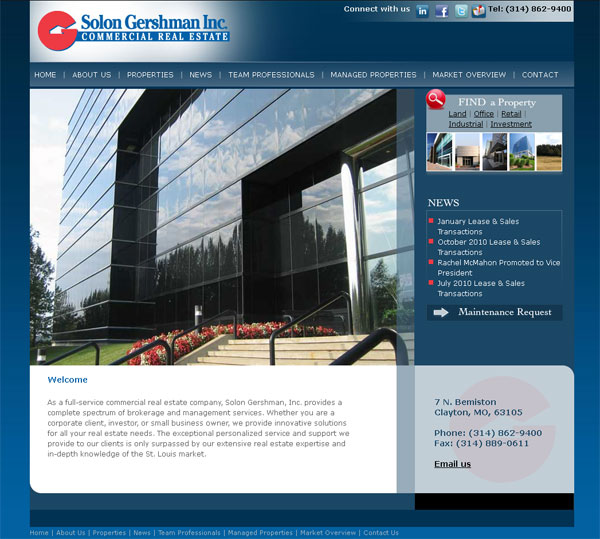
New website for Solon Gershman Inc

Launched today is a re-designed web site for Solon Gershman Inc, a St Louis commercial real estate company.

New web site for Solon Gershman

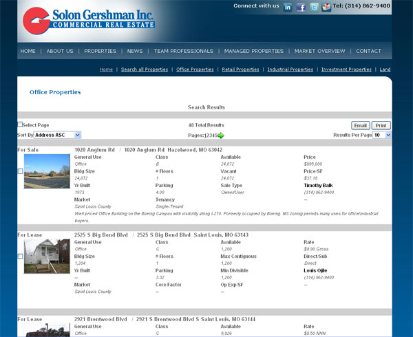
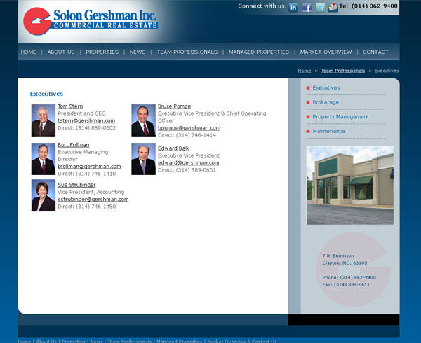
We completely reworked their old site, creating a fresh new professional look which is easier to use and consistent throughout. The home page features a slide show of properties with easy access to property search tools and the latest company news. The  site  integrates data from a 3rd party property listing service and offers the site visitors a seamless experience.

Solon Gershman website


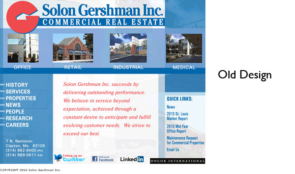
Just in case you were wondering here is what the old site looked like.

©: 2011 Chicago web designer

Using Twitter to solve problems

Twitter is a great platform for getting problems solved. A quick tweet about an issue and more likely than not you will get an answer, saving you time and aggravation.

Here are a couple of examples of how my Twitter friends have helped me out.

  1. GoDaddy coupon fail
    I was having real trouble applying a coupon to items in my GoDaddy cart. Any coupon I tried was immediately rejected.
  2. twitter conversation problem solved

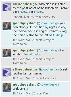
  3. Firefox 4.0
    I upgraded my browser to Firefox 4.0 but the default position of the Home button was causing me aggravation!
    twitter_conversation

Look at the time frame of response from both of these, within minutes I had answers to the issues I was facing.  For both of these tweets I used hash tags at the end of the tweet. This can help get your problems noticed faster as many hash tags are monitored. In the case of@goodguydan he was not a follower of my tweets but was monitoring the hash tag #Firefox.

© Chicago web designer

A Teenage Chicago Penthouse, in my Basement!

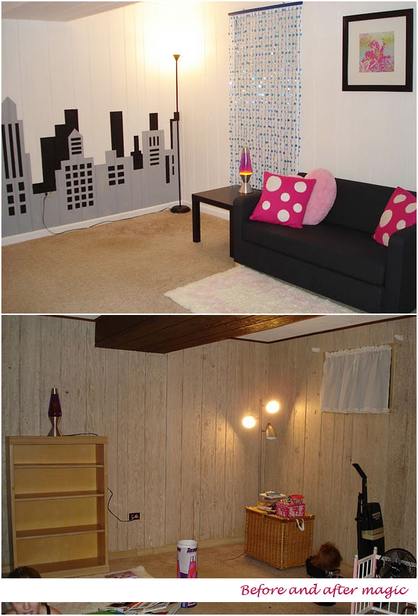
Who doesn’t love a before and after comparison, I do them for web sites quite a lot, ( here here and here)  to showcase how a few design tweaks can make a huge impact on the appeal of a site. But today I am going to show you how I used my graphic design skills and tools to transform a very dingy, quite disgusting Chicago basement room into a light and airy teenage “penthouse” hang out.

basement penthouse

My canvas for this room was horrible wood paneling which has the texture of drift wood but nowhere near as pleasant. I primed then painted everything white, it took 3 coats before it looked good.

Then came the fun bit.

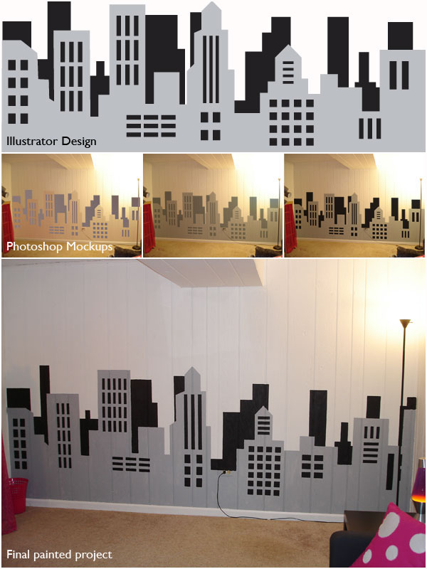
To be certain the skyline idea was going to work in terms of scale and look/ feel, and what colors looked best, I did a little Illustrator and Photoshop mockup.

First I designed the skyline in Illustrator. It was then imported  into Photoshop and superimposed  a photograph of the wall I intended to paint. ( I used the multipy function and distorted the illustrator graphic to fit the wall dimensions) After a bit of color tweaking, playing around with different shade of gray we settled on a simple black and  gray color palette.

painted skyline

Because of the rough nature of the paneling my initial plan to carefully tape off and paint the skyline failed so I ended up painting the whole thing free hand. If you look carefully I did not stick religiously to the illustrator design but it was enough to point me in the right direction. It turned out pretty well.

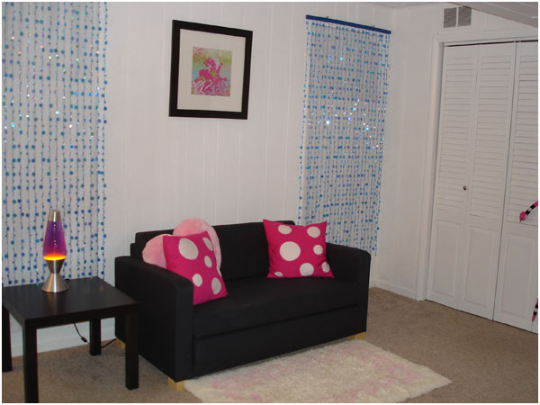
I have a bit more work to do on the furniture on the other side of the room… more painting which I will share soon!

© 2011 Chicago Web Designer

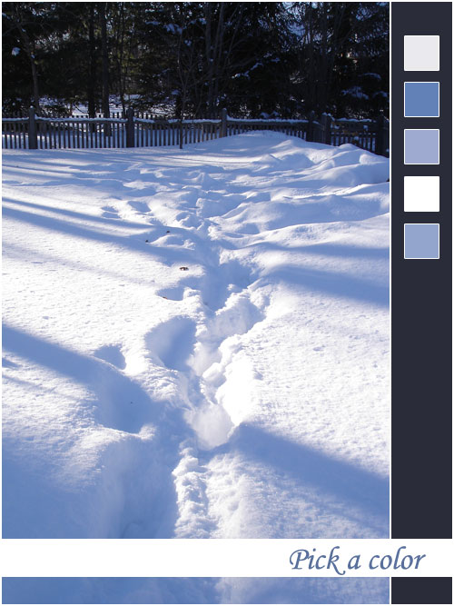
What color is Chicago Snow?

It is hard to escape the abundance of snow in the Chicago area at the moment. Ask most people what color is snow and the answer will be white. Ask a graphic designer and the answer will be, “white but also  think soft grays, delicate lilacs and even dramatic blues.”

As a web and graphic designer color is one of my favorite “tools” Here are the colors I see in snow.

©2011 Chicago web designer