A great web site design testimonial

Today’s post speaks for itself.
“I worked with Zoe when I started the entire branding initiative for our business. We needed to have our webpage up very quickly. Zoe obtained a very good understanding, very quickly, of what made our business different and how we wanted our site to look. She worked with me closely for three weeks so that we could have our site up as soon as possible. I couldn’t have been more impressed with our end result. She did a great job and is a true professional. I have (and would) recommend her to anyone seeking a webpage designer.”

Megan O’Leary
Software Assistants
www.theITfolks.com

A web and graphic design portfolio: A lead generator

I met with a potential client earlier this week, looking to create a logo and web site look and feel. A start up company, they have a great idea and a hefty business plan – a sure sign to mean that they really mean business.

It never ceases to amaze me the number of start up companies I meet who have no business plan just a vague idea. They want to start developing a brand image with no idea of who they are targeting, their competition, price structure and any of those other elements a good business plan will detail.

The start up company I met this week had found us via Google and had spent a considerable time going through our extensive portfolio. We had impressed them enough that they called and scheduled an appointment. A great example of our web and graphic design portfolio working as a lead generator!

This is not a web project

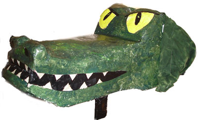
I recently turned my design skills to something other than web sites. It was an interesting project, the creative brief was to construct a crocodile costume for 4 dancers. The costume will be used in the production of Peter Pan by Wildwood Dance and Arts.

Here is the head (made of sculpture wire and pacier mache) which will be held by the lead dancer, the three other dancers will be draped in fabric and the 4th dancer has a tail.
It was a lot of fun to make!
croc

A web/graphic designer to do list

It has been over a week since I wrote a post so you’d think I would be loaded with topics to write about. It appears not.

I have a pretty heavy work load at the moment with:-

  • Nine web sites in various stage of development – clients ranging from Attorneys to Doctors, retailers to printers.
  • Two print projects – A tri fold brochure and business card design.
  • A web usability design project
  • An email template project
  • A couple of web banner

I think I need a weekend!

What happens to Pixel and Vector graphics when they are enlarged.

Here is a graphic which illustrates what happens when you do an idential enlargement on pixel generated and vector generated circles.

The pixel generated graphic goes all blurry and not too nice at all. The vector one however stays crisp and clean.

Now imagine you want your logo enlarged 20 times and put on a banner on the side of a building. Which format would you want your logo to be in … pixel or vector?

Any logo we develop is always generated in the vector format so it will perform however you want to use it.

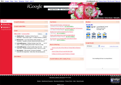
i Google Updated

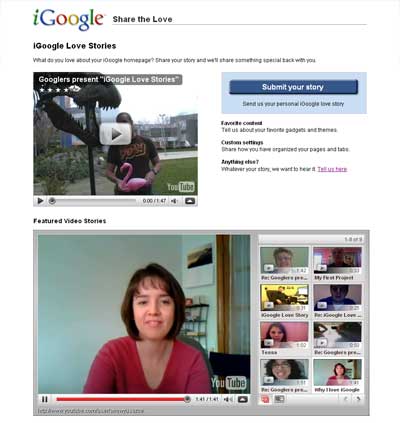
Last week Google implemented changes to iGoogle. While some of the functionality aspects are good (like giving full gmail operation within the realms of the iGoogle page) the new navigation placement is not.

They have switched from top tab navigation to a left side bar navigation, and in essence have lost the cleanliness of design which is one of my favorite elements of the Google brand.

This is how my iGoogle page looks now.

I have held off writing this for a few days, giving myself time to acclimatize to the new layout, but almost a week later I still don’t like it. And I am not alone click here

I hope that in future developments Google offers different layout options.