The Evolving Web Site

“A good web site is never complete – it is a user interface that evolves over time with changes to better serve your visitors.”

Is your web site built to adapt as your business transforms?

All of the websites we create are robust enough to accommodate this need to change, whether it is something as simple as updating a logo, adding a new service or taking advantage of new internet technology.

Here an example of what I mean.

Interior Designs 2 Go

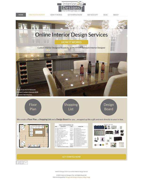
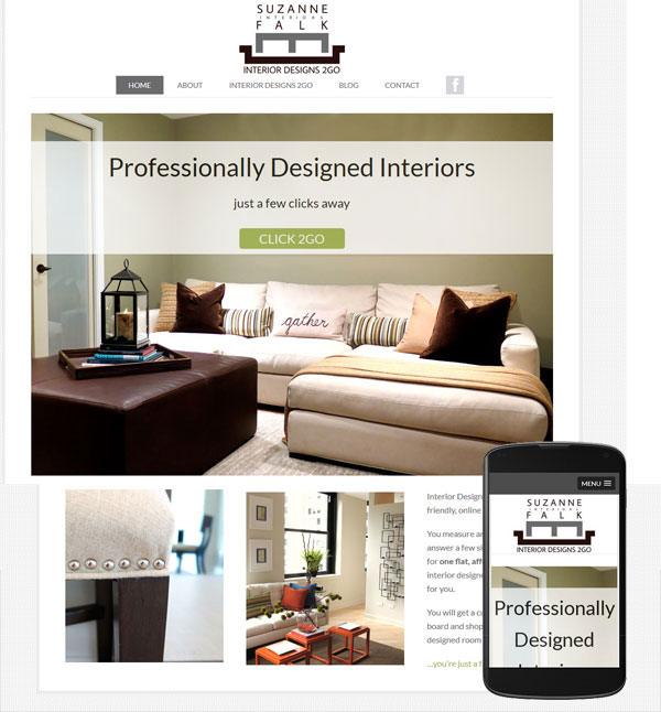
This site we created for Interior Design 2 Go has undergone design and “call to action”  tweaks and “under the hood” tinkering

This is what the site looked like when it was first launched.
wordpress website interior designer

and here it is today.

evolving-interdesigns2go

It has a new logo, accent color, home page layout and does a better job at illustrating the service being offered.


Making your Website Mobile Friendly

A client recently contacted me with a problem they were having with their site. They had  understood the need to be mobile friendly but had taken the approach of having all mobile users directed to a stand alone third party app. The problem was it  had been built for them by a company that had now gone out of business and they were unable to make any changes.  Mobile users visiting their site were be directed to an app which had outdated information, including that all important telephone number! Considering now that mobile devices make up for more traffic than desk top devices, this was turning into a huge problem for them.

My solution to their problem was two fold.

  1. Firstly I stripped out all the code in their site that was causing mobile visitors to be directed to the defunct app, better to reach a site with correct information even if it isn’t mobile friendly..
  2. Secondly I did some major “under the hood” work on their WordPress template, converting it to a template that responds beautifully whatever device is being used to view it.

roberg-tax-solutions-mobile-website

The design of the desktop version of the website stayed almost identical …they were more that happy with that aspect of the site and didn’t want to change it.

Mobile friendly problem solved! Check out their new mobile friendly responsive web site

What is Responsive Web design

So yesterday I talked about the launch of a new website mrbison.com and how we had taken the opportunity to recode it as a responsive web site.

But what does that mean…what is a responsive web site?

Simply put, it is a site that will give the  visitor an optimal viewing experience regardless of what device they are using to access it- desktop, laptop, tablet or phone. And as I am all about graphics let me show you in pictures exactly what I mean.

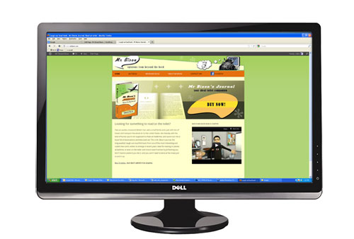
Here is the site on a 24″ desk top monitor

Responsive webdesign in action

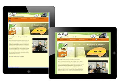
Here it is on an iPad – both portrait and landscape orientation

Responsive design on ipad

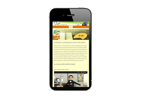
and here it is on an i Phone

responsive design on iphone

The way the site is coded means it automatically “responds”  to what ever device it it viewed from. Here are some of the things that happen

  • Automatic  adjustment the overall width of the site
  • Re sizes all the images – see how the entire width of the header graphic and call to action banner are visible whatever the device
  • Adjusts the placements of page elements – on the phone the elements that were displayed horizontally ( the block of text and video) are now displayed vertically
  • Optimization of the navigational tool. If viewed on a phone a clunky navigational bar would detract from the site content. Instead the user is presented with a menu button, which, if selected, will display a drop down menu.

You don’t have to view the site on all of these different devices to see this responsive nature in action, simply visit the site and re-size your browser window…getting smaller and smaller as you do.. see how the site changes?


Can you read this secret message?

I came across this recently

Can you read this


It is amazing how the brain can quickly become wired to comprehend something that seems so alien.

So in the spirit of making your brain work, I have designed a little  teaser. Can you read this secret message?

can you read thisIt requires a little thought and as a  hint you will need to print it out …you can download it  here

Comment if you solve it.

© Chicago Web Designer

Indigo Image – The anatomy of a company name

Selecting the name for a company can be tricky business.

When we came up with Indigo Image ( 12 years ago now) we wanted a name that would convey creativity, give an indication of the nature of the business, stand the test of time and was available as a domain name. No small task.

The company name was the subject of my very first blog post 7 years ago

The Color Indigo

Blue, purple ?..Indigo is one of those colors often open to interpretation. It was named and defined by Issac Newton when he divided up the optical spectrum:- red, orange, yellow, green, blue, Indigo, Violet.
As a graphic/web designer it is my job to interpret the objectives of my clients and create an “image” which delivers results ..hence Indigo Image

Domain name availability was quite a challenge, even 12 years ago but we acquired a wide range of domain name extensions including

indigoimage.com,  indigoimage.org, indigoimage.net,  indigoimage.biz and indigoimage.us

The philosophy behind the name still hold true despite the huge changes in the internet we have seen over the last 12 years. The name Indigo Image  has stood the test of time.

© Copyright 2012 Chicago web Designer

10 things you didn’t know about the Chicago Web Designer.

I recently had my personal blog, Creative in Chicago, reviewed in an anonymous  review process. The reviews were great but it did get me thinking as to how much I share about myself. In general I like to keep my personal life to myself and am not one to share what I had for lunch on Twitter or announce my exact location via Foursquare.

But in the essence of giving a little more of myself I thought I’d share with you today 10 things you never knew about the Chicago web designer!

  1. First off my name is not Chicago Web Designer, it is Zoe Feast. It is amazing how often it is mispronounced. I  recently received a phone call from someone asking to talk to Zoo Fest!
  2. I originally come from the UK but became a US citizen in 2009 . I have yet to lose my English accent despite living in the States for over 15 years.
  3. I am passionate about what I do and love the ying/yang aspect of my job; putting on my creative hat for the design part and swapping it out for a technical one when it comes to coding a project.  I sometimes dream about coding which is the geek in me surfacing.
  4. If that wasn’t geeky enough I have a degree in Physics and a Masters in Engineering.
  5. My favorite type of project is building brand imagery from the ground up. Everything from a logo, to establishing a color palette and typefaces then putting it all together in an engaging website. Fun!
  6. I moved to Chicago 18 months ago and live in the North suburbs. For the first 6 weeks of so I was completely reliant on my GPS  … Arlington Heights, Buffalo Grove, Deerfield, Lincolnshire, Highland park and the other North Shore suburbs are now my friends!
  7. I am most productive in the morning and dynamic weather such a thunderstorms or wild winds really help me focus my creativity. Weird right!
  8. I work on a PC not a MAC
  9. A friend help me come up with the name of my company ” Indigo Image” . We were eating curry at the time.
  10. I cook from scratch nearly every night. I have eaten horse, kangaroo and ostrich but never snails.