Custom Cartoon Illustrations for your Website?

As a graphic and website designer sometimes my design tool of choice is simply a piece of paper and a pencil. This is especially so when a web site calls for custom cartoon illustrations, these work really well on websites targeted towards kids. The result is a very original feel to the graphics of the final site.

Here are some examples of custom illustrations I created for children’s author Cynthia Reeg. I let my pencil flow freely, scanned the drawings and imported them into Adobe Photoshop. Then they were brought to life with the magic of color.
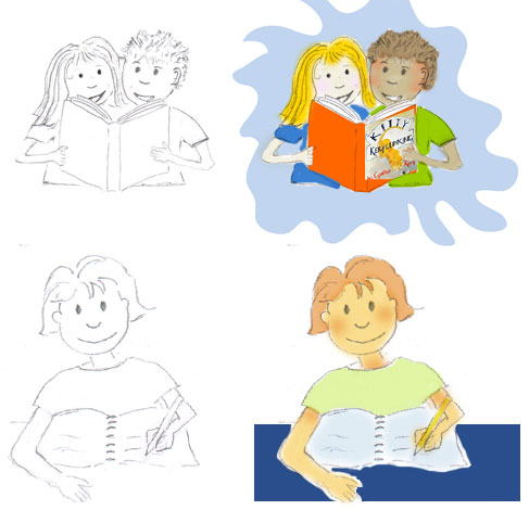
custom cartoon illustrations

The graphics for Cynthia’s site are incorporated into the template of the page, used as navigational elements and add interest to sections of the site. Although all different they have a very branded feel due to the hand drawn and colorization techniques used.

Are you looking for custom illustrations for your new or existing web site? We can help

© 2009 St Louis Web Designer

What happens to Pixel and Vector graphics when they are enlarged.

Here is a graphic which illustrates what happens when you do an idential enlargement on pixel generated and vector generated circles.

The pixel generated graphic goes all blurry and not too nice at all. The vector one however stays crisp and clean.

Now imagine you want your logo enlarged 20 times and put on a banner on the side of a building. Which format would you want your logo to be in … pixel or vector?

Any logo we develop is always generated in the vector format so it will perform however you want to use it.

The power of Adobe Photoshop Filters

One of the main tools of my trade is Adobe Photoshop.
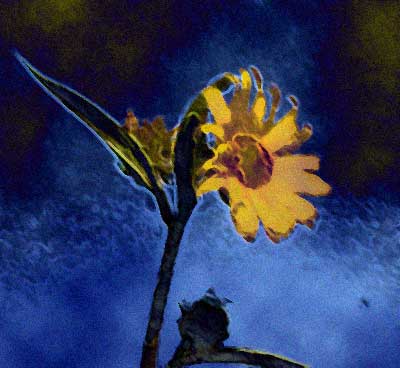
I encountered a little creative block while trying to think of something to write on my blog today and sat there doodling with photoshop. In less than 2 minutes this is what I had created …all done with standard abode filters. I used a smudge stick, accented the edges, applied a difference cloud and added some grain .. the only way I know this now is beacuse is by checked the history on the file I created.
Below this photo you will see the one I started with.

We are being published in a new design book!

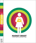
One of our web site has recently been selected to feature in a new design book, Market Smart Design. It will be published by Harper Collins in Spring 2009.

“MARKET SMART DESIGN Great Design Examples Created Specifically For Target Markets.
A smart, new graphic design bookfocusing on market segmentation.”

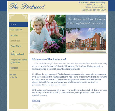
The site we created for “The Rockwood” , a senior living community, will feature in the Baby Boomers category.

During the entire design process we kept a high level of focus on the target audience of the site. It features an important usability option allowing a visitor to easily adjust the size of the type on the page.

We are delighted “The Rockwood” has been selected for publishing!

Color and mood: A rainy day pick me up.

We are facing another rainy day in St Louis today and greeted by a rather gray sky again this morning it got me thinking about color and mood. For me gray is most definately a mood downer. I like bright vibrant colors and a blue sky with bright sunshine is an instant pick me up.

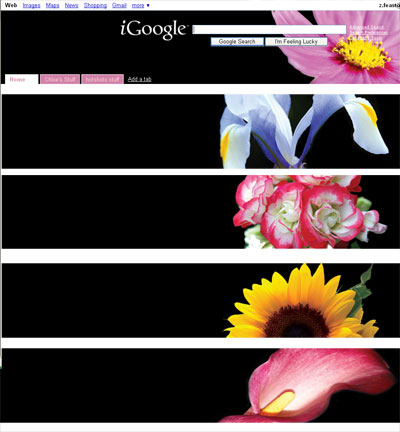
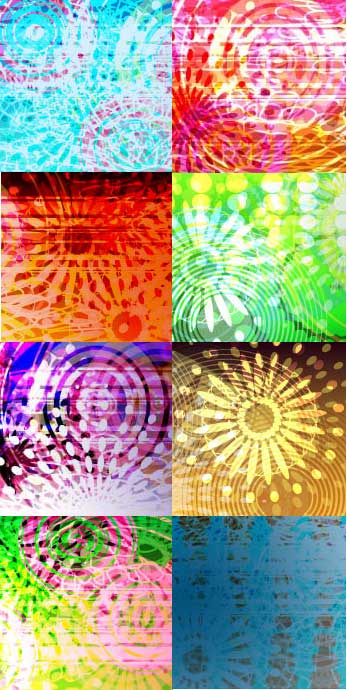
So if the St Louis weather is not going to cooperate today how about this for a digital pick me up. This was designed using Adobe Illustrator and is currently being incorporated into a dynamic iGoogle theme called color punch. It is not yet in the Google themes directory but you can get it via inthemes

If you are interested in Meaning and Associations of color read one of our previous posts

Our web and graphic design blog

We started our blog in June 2005 and nearly three years later are still going strong.

You may find this blog intresting if you are looking to hire a web or graphic designer, you are interested in web site usability and search engine optimization or are a web/graphic designer looking for some tips and tricks.

Today I am going to talk a little about the sort of subjects we cover here for any of our new readers. Each of our posts are given one or more label to categorize them so I thought it would make sense to talk about our categories:-

  • Design Snippets
    We cover subjects here that are useful to graphic and web designer. For example Meaning and associations of color, What is Ipsum Lorem and Favicons.
  • Eye of the St Louis Web Designer
    A picture speaks a thousand words and most of the photographs we feature in this section are of something that has given us inspiration, from a fabulous natural color palette to a great texture or pattern. As mentioned thoughtout these posts a designer’s eye never sleeps
  • FREE
    Who doesn’t like free stuff. We cover everything from free custom i google designs, the free definition phase or our projects to our much visited recipe for a garden deer repellant.
  • Graphic Design projects
    A showcase of graphic design projects, from brochures, letterheads, banners, menus, logos, newsletters, greeting cards and packaging.
  • Indigo Tips
    Tips to improve your productivity and internet experience
  • Internet marketing
    The ever changing world of  Search engine optimization.
  • Logos
    A showcase of our logo design
  • Project Progress
    We multi task big time and this section illustrates the current projects we are working on
  • Random Thoughts
    I think everyblog needs a section like this..a little bit of everything here..and as the title suggests …random
  • STL Marketing executive
    A category written by our guest writer. He shares perspectives drawn from his experience of branding, global business management and marketing in a B2B environment.
  • Web design Projects
    A showcase of our web design projects
  • Web Site Usability
    Considerations for giving your site visitors the experience you want them to have.

Another new theme for iGoogle

If you use iGoogle and your search page has a header that looks like this

did you know that Google now offers a directory of themes that allow you to customize the look of their interface?

They have just included a dynamic theme I created, which feature two boffins in a chemistry lab. The theme changes five times thoughout the day and follows the boffins as things go a little awry in their lab.

Click here to use this theme , if you don’t have one already you will need a free gmail account