New web site for Burns Recovered Support Group of St Louis

Remember this post ” Pro Bono Web Design” at the beginning of June? Well the web site for Burns Recovered Support Group is now live. Visit it here www.brsg.org

We went from an outdated this:-

to a slick, all singing and dancing this:-

A fresh new look and feel, the design of the site has  focused on getting the site visitor to where they want to go quickly and without making them think, via simple drop down navigation and bold buttons on the home page.  Built on the WordPress platform, the client is able to easily update the site, whether it is adding a new event or a batch of photographs. Burn camp 2010 is just three weeks away so stay tuned to see new photos of all the happy campers.

2010 © St Louis Web Designer

New Website for Chicago Headhunting Company

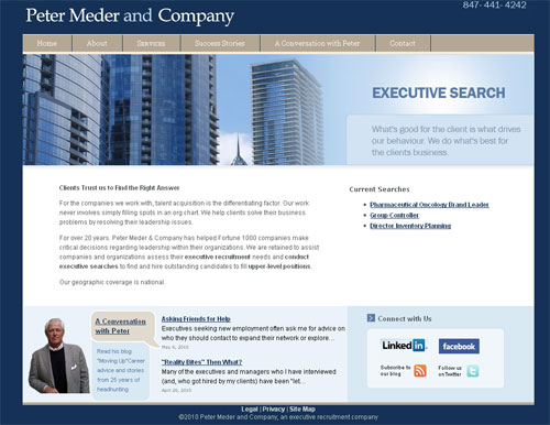
There is nothing like kicking off a Monday morning with the launch of a project. Today sees the release of a new web site and brand image for Chicago headhunting company, Peter Meder and Company.
Chicago headhunter peter meder web site

We began working with Peter about a month ago. He wanted a very professional and polished looking web site and was interested in integrating his  blog and networking tools such as Twitter, Facebook and Linkedin. We created a clean crisp look and feel enhanced by an amazing set of photographs ( taken by Peter himself) with call to actions on the home page to current headhunting searches,  social media connections and his blog.

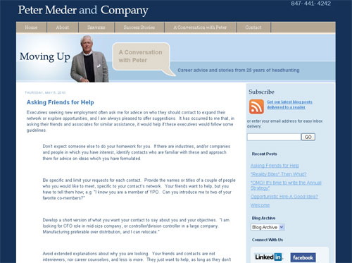
The blog, “Moving up -A conversation with Peter,  career advice and stories from 25 years of headhunting” has been live for a few months but just using a standard blogger template. To ensured it flows seamlessly with the rest of the site we created a custom template, with navigation to the main site and branded with the Peter Meder and company brand elements.

peter meder blog

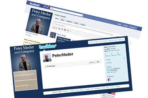
Twitter and Facebook accounts were also given the brand image.

peter Meder socail media

We are just finishing up on a stationery set to complete the brand makeover. As I said before full image branding are my favorite design projects and I am looking forward to the opportunity to working with more Chicago based clients!

2010 © St Louis Web Designer

Pro Bono web design

I feel it is important to give back to the community and try and take on one pro bono design project a year. I get plenty of opportunities over my desk and selecting the project is not always easy.

However this week one popped up I could not ignore. Linda Hansen of the Burns Recovered Support Group contacted me to see if I would be interested in reworking their web site. They offer a fantastic summer camp for burn victim children and  a wealth of support for burn survivors. So over the next few weeks I will be working with Linda and her team to bring their web site up to scratch.

2010 © St Louis Web Designer

A Website redesign mini makeover project

Over the years I have had my fair share of web redesign projects, in fact a quick look through my web design portfolio and I can count about 20 projects that are  re design efforts. The majority are for new clients but there a few long standing customers who I work with (and with much appreciation) again and again.

Web redesign is an expected cycle in the life a web site.  Sometimes a full scale project is the only way to accomplish your objectives (  Your web site…is it time to re design? ) but other times a small cost effective maintenance project will suffice.

This was the case with one of my long standing customers Fair Market Inc.

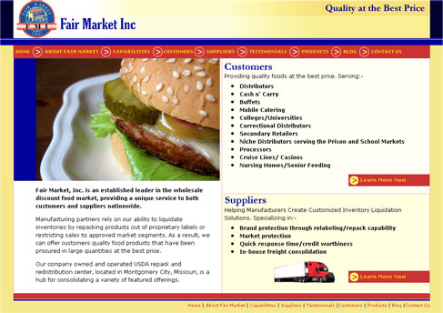
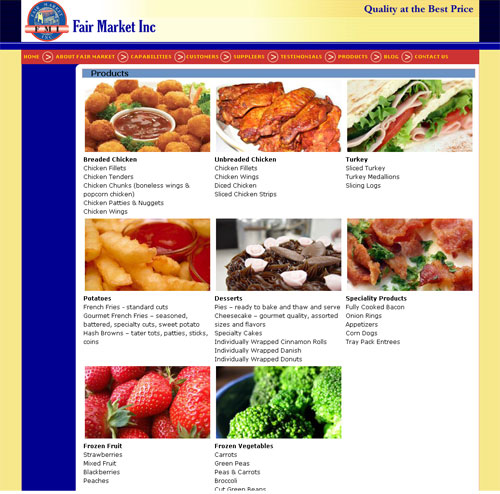
After a mini makeover, we re-launched their web site earlier this month, giving new copy and photographs a fresher more appealing look/feel completely reworking the home page and adding blog functionality. Although the content of the site is all new the basic framework remains the same, with the same approach to navigation.

The site however is fresher and nicely up to date all without blowing the bank.

Home page
 fmi website

Products page

 New fmi website

How about your site? Could it benefit from a mini makeover?

2010 © St Louis Web Designer

What makes a lead generation web site sucessful?

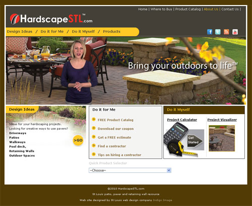
A few weeks back I announced the launch of hardscapestl.com . The site offers a wealth of information for those looking to beautify their yard with a retaining wall, patio or any other hardscape project. For the client it is a highly targeted lead generation tool.
The secret of success for these types of web sites is in the planning stage.

WHO?
Start by defining your user groups, give them names – it helps cement their unique attributes.
For the hardscape site we focused on three user groups:

  • Those just starting to think about backyard upgrade and in the market for design ideas. – the Designer
  • Individuals who are further down the buying path, know what they want and looking for someone to build for them. – the Do it for me
  • Hard core DIYers who want to build themselves. – the Do it myself

ENGAGE
Once you have your user groups defined how do you engage them. Each of your user groups are more than likely looking for different types of information.

  • For the Designer it was all about ideas and we created custom slide shows of pavers and retaining walls.
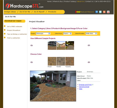
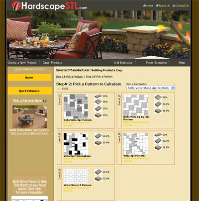
  • The Do it for me are itching to get their project underway. We provided information on finding and hiring a contractor and an excellent visualizer tool that enables them to view different products in situ.
  •  

  • The Do it Myself user is interested in the more technical aspects and a custom designed project calculator application allows then to get down to the details of their project.
CALL TO ACTION
For lead generation web sites you want to capture pertinent information about the users. Requesting information is a balancing act, making users fill in forms, and jump though hoops for every scrap of information on a web site is futile. They will be hitting that back button in no time and trying a different site. It is a give and take process, give away some information but request contact details for others.

“Download our coupon” was our main call to action on the hardscape site,  but we also tailored call to actions according to the user groups

  • The Designer was offered project design tools, with download offered for free and a simple online form to receive product samples.
  • Both Do it for me and Do it Myself we offered a free estimate

Understanding your user groups, how to engage them and capture their information is key in lead generation site.

    New web site for Atlas Restoration Specialists

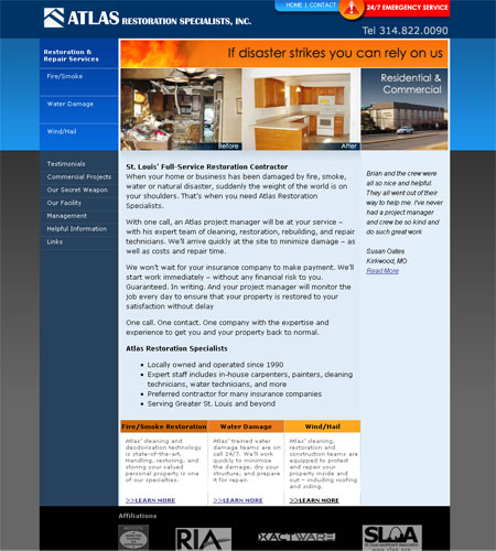
    If you have a house fire, get flooded or a tree falls through your roof then Atlas Restoration Specialists is the company to turn to.They are the St Louis experts when it comes to restoring your property to its former glory.

    Launched yesterday was their brand new web site where you can truly see the value of their work with some amazing before and after photographs. Learn more about their full service offerings, meet the team and even contact them directly through their pager.

    atlas web site

    2010 © St Louis Web Designer

    New website for St Louis Hardscapestl.com

    Launched today is a brand new website designed for HardscapeSTL

    St Louis, if you are looking for a new patio, retaining wall, paver driveway this is your one stop shop.The site offers loads of information from design ideas, how to hire a contractor, installation tips for those DIYers out there and even offers a  money saving coupon. It also includes tools to help you plan out and estimate your project and even a visualizer so you can check out a product in situ before you buy.

    I have a lot more to say about this site and will talk about some of the design elements next time, just wanted to get it out there!

    2010 © St Louis Web Designer

    Keeping your website fresh

    I have been working as a web and graphic designer for 10 wonderful years now (wow!) and in that time I have noticed a few trends in clients requests.

    The start of any year always brings in an abundance of requests for web site overhauls, it must be that “New Year lets get things in order” kind of thing.The revamps can be anything from simply adding  a few pages or swapping out photographs, to a completely new look and feel. It’s all about keeping the web sites fresh

    2010 has been no exception to the trend.

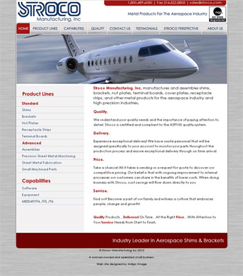
    This week we re-launched Stroco.com having given it a new look and feel and updated much of the copy.The site is built around a new color palette which is more in keeping with the products they manufacture and features a section of “product placement” photographs.

    Here is what the client had to say

    “We are so pleased with the website…it looks really sharp! Thanks again for all your help with getting this project complete!”

    There is nothing better than hearing these sorts of words from my clients!

    2010 © St Louis Web Designer