The Three Fold Power of Referrals

A fair chunk of my projects come from client referrals.  One of  my latest projects, Spring Willows Farm, was a referral from children’s author,  Cynthia Reeg ( thanks so much Cindy!).  What’s not to love about referrals, they are a powerful   win-win-win for all concerned.

The New Client

Hiring a web designer can be a daunting task. Where do you begin. A simple Google search for “chicago web designer” yields a whopping 2,610,000 results. Even if you just evaluate companies on the first 3 or so pages that can take a lot of time and can you be sure the companies are a good fit for your project in terms of expertise, experience and even budget. For a new client, a referral, or even a number of referrals can be invaluable time saver and pre-screening process.

The Referring Client

When referring, personal reputation is on the line.  The referring client is placing their trust in you to do not only a good, but a great job. Their experience  working with you has obviously been excellent and they want the same experience for the “new client” A few years back a client sent me a number of referrals and at the end of each project I’d let them know they were complete. Their response was always  “you make us look great”. Mission accomplished.

The Web Designer

A referral is the greatest form of flattery a client can give and is the ultimate validation that you did a great job for them.  It is a good solid lead that more often than not will lead to a new project. More clients = more potential referrals.

So there you have it the three fold power of referrals.

©: 2010 Chicago Web Designer

12 Months of Web Design

As the year rolls to a close I like to take a look back at the projects I’ve worked on over the year. On the work front it has been a busy year which has been amplified by relocating from St Louis to Chicago.  Moving is such hard work but I am loving Chicago!

Websites have dominated the work load over the last 12 months but we have had a fair number of logo and branding projects too.

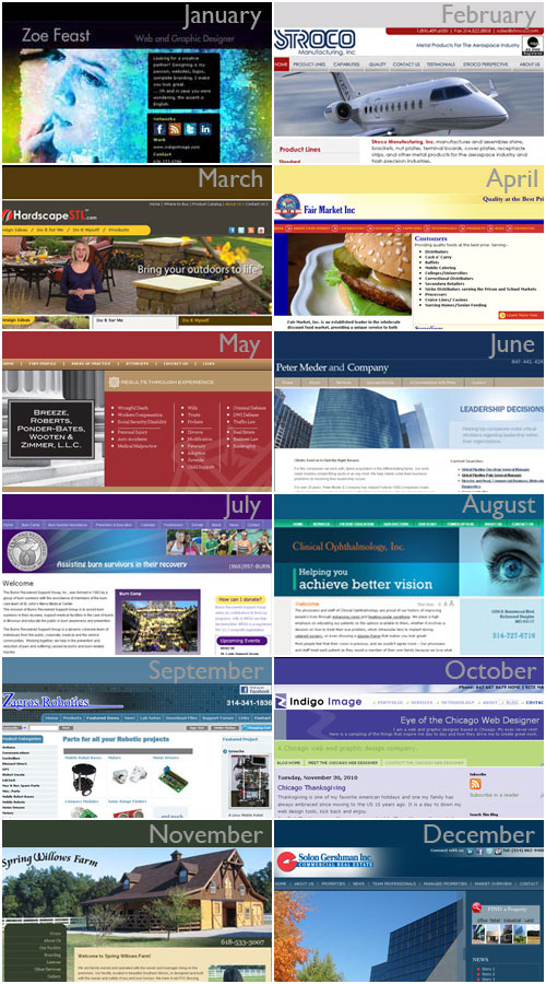
Here is a showcase of 2010 web sites

January: zoefeast.com

February: stroco

March: hardscapestl.com

April: Fair Market inc

May: Breeze Law

June: Peter Meder & Company

July: Burns Recovered Support Group

August: Clinical Ophthalmology

September: Zagros Robotics

October: Eye of the Chicago web designer

November: Spring Willows farm

December: Solon Gershman, nearing completion!

©: 2010 Chicago web designer

New website for Equestrian Farm: Spring Willows Farm

What better way to start the week than the launch of a new web site.
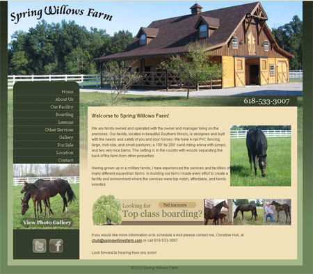
Introducing  Spring Willows Farm. Based in Centralia, Illinois, the farm provides a multitude of equestrian services from horse boarding, riding lessons, horsemanship and stable management lessons.

The design of this site was inspired by a great selection of client  photographs which feature prominently throughout and with the high class level of facilities they provide it was important that the web site reflect this. Visit the site or connect with them via Twitter or Facebook.

Here is what owner Christine Hull had to say

“Zoe,
Thanks you so very much for the wonderful job you did on the website. Working with you was a pleasure and I’m really impressed with the outstanding workmanship on our project. Great job!”

Happy client= Happy web designer!
©: 2010 Chicago Web Designer
New Website for Zagros Robotics

There is something very satisfying about a web redesign project. Take a look at this site we seriously revamped for Zagros Robotics.

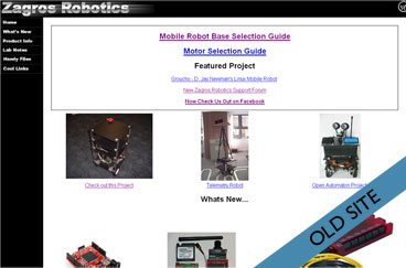
This is the before

old zagros website

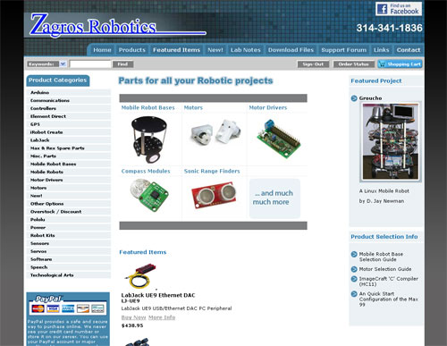
and here is the after

New Zagros web site

The site not only looks more appealing and easy to use but has the advantage of some major under the hood improvements too.

The original site incorporated a shopping cart (PDshop.net) and while this had been well configured in terms of categories  it was embedded into the static site with frames (yikes!…. a SEO nightmare). The shopping cart software was the basis of our redesign. We created and implemented  a unique template and used the custom page feature within the software to add all the “static pages” of the site. The frames were stripped away leaving a site that is much more friendly towards the search engines and is also a lot easier for the client to manage.

The end users win, the client wins and the search engines win! Success

2010 © Chicago Web Designer

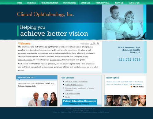
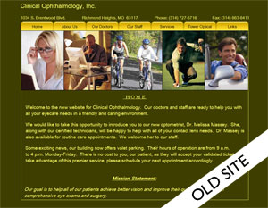
New Web Site for Clinical Ophthalmology Inc

Launched today is a new web site for Clinical Ophthalmology Inc of St Louis.

We completely reworked their old site,  creating a fresh new look which is easier to use and offers the site visitors lots more information. The site also features a text size adjustment tool to help those who need a larger print to read.

Just in case you were wondering this is what the old site looked like.


2010 ©: Chicago Web Designer

Top 5 Reasons for Redesigning a website.

We hear ” I need my web site redesigned” quite a bit these days.  While there are many reasons here are our top picks.

  1. I need my website to look more professional.
    Looks are everything and online you have just a few seconds to make that all important first impression. A well designed fast loading web site can do wonders to encapsulate your expertise and reach and engage your target audience.
  2. We need our content reorganized.
    If your site visitors are having click through page after page to get to the information they want, you are making then work too hard. A web site with intuitive navigation and well organized content = “a don’t make me think visitor”
  3. My web site is not doing what I want it to do.
    Whether you want your site to act as a lead generation tool,  a portal of information, or a selling platform, it is important to guide or funnel the site visitors exactly where you want them to go via “call to actions”
  4. I need to add some additional functionality
    Want to add a blog, additional pages, links to your social media networks? A well thought out web site will always be able to accommodate additional functionality without a complete redesign but sometimes there comes a point  when a redesign is the best options.
  5. I want my site to perform better in the search engines.
    The structure and design of a web site  bears a huge relation on how well a site performs in the search engines and a skilled web designer will know how to optimize all elements that make up a web site, for best search engine results.

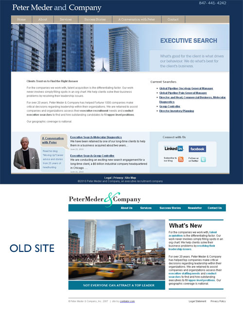
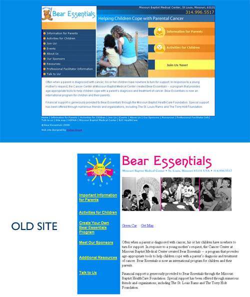
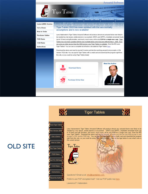
Now lets take a look at these  in action with three before and after web redesign projects.

Peter Meder and Company

We addressed all 5 reasons in the redesign of a web site for Chicago headhunter, Peter Meder and Company.  The new site has a much more professional look/feel and immediately imparts the nature of the business.   Visitors have easy access to the current position searches which is a huge time saver for both client and job hunter.


Bear Essentials

Content reorganization was the main driver behind our redesign of the Bear Essentials web site. We produced a much more appealing user friendly site with clear call to actions.


Tiger Tables

A more professional look was the order of the day for our redesign of Tiger Tables with clear call to actions.

Do you have a web site that could do with a makeover? We’d love to have an opportunity to talk with you.

Call us at 847 607 8679

2010 © Chicago Web Designer

A letter to Chicago from the Chicago Web Designer

Dear Chicago,

Hello! A week ago today I was packing up my St Louis web design business and today, here I am firmly planted in Chicago. It may be a while before I am fully unpacked but I am really looking forward to getting to know you, all your fabulous businesses and getting down to work as the Chicago web designer.

Here is what I do:

Web Design

  • Custom Web Site Design
  • Web Site redesign
  • Banner ad Design
  • Email templates
  • Blog Design, wordpress, blogger
  • Internet marketing ( SEO)

Graphic Design

  • Logos and corporate branding
  • Presentations
  • Brochures
  • Advertisements
  • Traditional graphic design

I have been in the web and graphic design business for over 10 years and am truly passionate about what I do.

One question, as a city you have a lot of nick names. Which one do you prefer, Chi town, ChicagoLand or the Windy City?

Yours Sincerely

The Chicago Web Designer

2010 © Chicago Web Designer

Website Design Testimonial

I always appreciate testimonials  from clients and this one from Burns Recovered Support Group for pro bono web design work almost has me blushing. Today I am blowing my own trumpet and without further ado …….

Dear Zoe,

The two words “thank you” seem inadequate at this time.

It amazes me… I wrote to you in May and explained that Burns Recovered Support Group is a small nonprofit and asked for your help – pro bono – in totally redesigning our web site

You kindly and graciously contacted me and said that you would be happy to do this for us as part of your commitment and concern to the “community at large”.

Much to my astonishment, here we are 2 ½ months later and our beautiful web site is now on-line.  You designed a user friendly site for our visitors to use.  You designed a visually attractive site for everyone to see.  You have taught this “barely computer literate” woman how to manage the site on her own!  I have already had people contact the office to say how great they think the site looks.

So, instead of two words…      THANK YOU, THANK YOU, THANK YOU, THANK YOU, THANK YOU…. and, many more “thank you’s”  You have given us a gift worth more than you can ever know.


Yours truly,

Linda Hansen

Executive Director

2010 © St Louis Web Designer