Before and After St Louis Financial Advisor Web Site

Hands up if you like looking at before and after projects? Me!

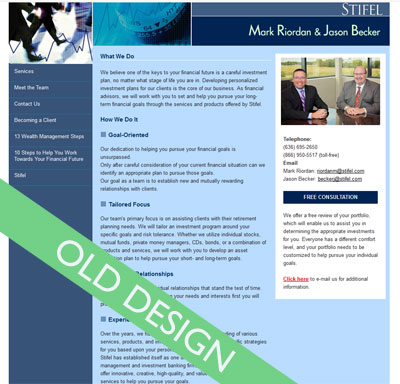
Here is a mini redesign project I did for St Louis financial advisors, Mark and Jason. The site before

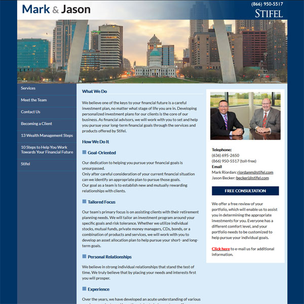
and after

I added a new logo, tweaked the colors, reworked the header and used a more modern font for the copy.

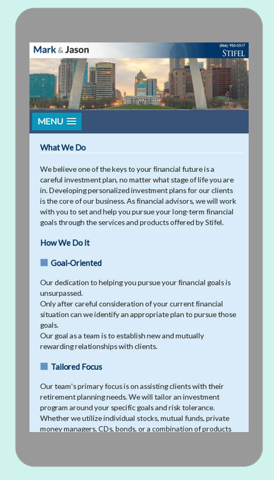
The result a much cleaner and inviting site… mobile friendly too!

Need Help with a Wix Website?

I market myself as “A Creative Partner for your Small Business” and if your small business website is built using Wix, I can help by making it not only look wonderful but perform seamlessly too.

The Wix platform offers a drag and drop interface and is described on their site as “easy for any person to create websites – no design skills needed”. While it certainly offers plenty of tools to make a site look pretty, you really do need an understanding of how best to present your content to engage your users and encourage them down certain paths. This is where tapping in on the experience of a professional web designer can help take your Wix website to the next level.

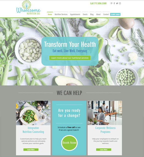
This was exactly what Malorie Blake,a registered dietitian based in York PA, was looking for her website Wholesome365.com

The re-working of her Wix site involved re branding with her new logo and complimentary color palette and font choices.

We also

  • Reorganized navigation for better content flow and usability and built out footer elements
  • Re-worked home page for improved information and call to action. e.g. Detailing major services and lead generation via a free phone consultation
  • Improved the design and added better call to action on inner pages of site e.g. Booking appointments or purchasing packages
  • Ensured design elements were consistent throughout site
  • Optimized pages and file names for SEO purposes

Here is the finished home page

wholesome nutrition wix website


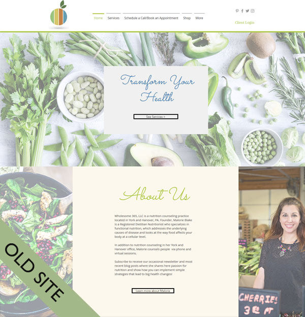
Compared to where we started from

As you can see the site is now far more focused on the user and how they can be directed to specific areas easily without having to think. The eye is effortlessly drawn in to the Call to actions

If you need help with a Wix website I am here to help. Give me a call at 636 795 7988 or contact me via email

WordPress Template Customization for Labor Ad Network

I have been in business a long time and have built hundreds of websites. Websites come and go, they get redesigned or disappear altogether but a site I built for Labor Advertising Network in 2005 was still in use. As you can imagine it was looking rather dated and lacked modern day functionality.

I have kept in contact with the client and last month got a call from them saying they were ready to bring their website to present day standards but were on a very tight budget. They wanted it converted to a WordPress website so they would be able to edit it themselves and also ensure the new site offered mobile friendliness to their users.

Recognizing their budget considerations, the most cost effective approach for them was to use a ready made WordPress template.

After installing and configuring WordPress on their server I selected the Twenty Seventeen template to customize. It is a very clean template, lends itself to small uncomplicated sites and is of course, beautifully mobile friendly.

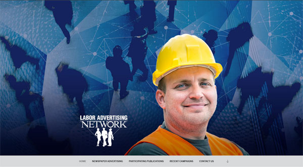
The Labor Advertising Network is a network is designed to help advertisers get their story across to the Labor community. This distribution network is conveyed in three custom designed graphics which feature in the huge banner area on the home page. Each banner features a different professional and they are randomized so a different one displays each time the home page is visited.


twenty seventeen larger banner

twenty seventeen larger banner

Here is the home page in action

labor ad network wordpress website

and the inner pages of the site were configured to display a custom header
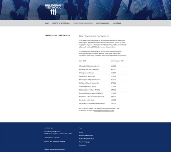
abor ad network twenty seventeen

A few lines of custom CSS added a color to the navigation bar and footer.

It’s always fun to take a look back, here is the old static site.
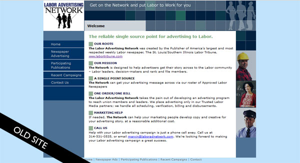
labor ad network old site

Their new site certainly brings them up to date.
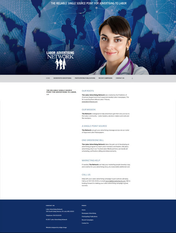
labor ad network wordpress websiteVisit LaborAdNetwork.com

New website For Children’s Author

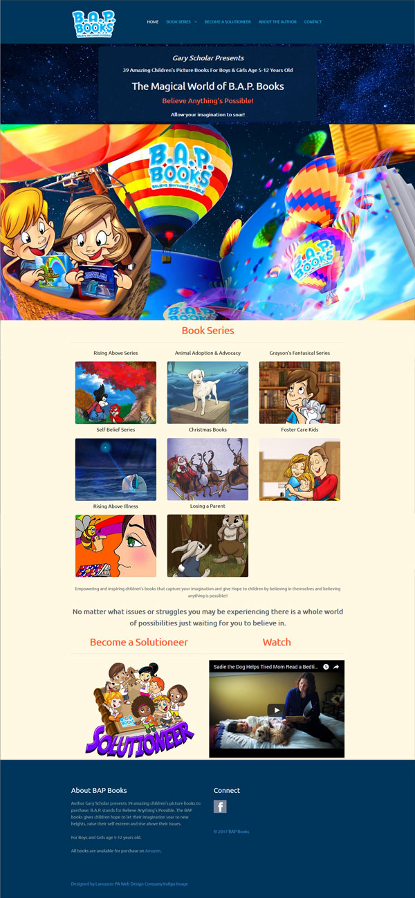
Launched today is a brand new website for children’s author Gary Scholar.

children's autor website

Gary has written a series of 39 children’s books – BAP Books – Believe Anything’s Possible. They address issues many kids struggle with such a bullying, illness and overcoming fear but also issues like losing a parent, adoption and foster care. All of his book are available through Amazon.

Gary first came across our web design services when we launched a website for a St Louis Children’s author in 2006. He kept our contact details on the back burner and touched base with us in the Fall last year. By that time we had relocated to Chicago which is where he is based. We had obviously made an impression for him to reach out after all those years!

The website we created for him is very colorful and designed to appeal to both children and adults alike. We categorized his books into 8 series and built the site around them

Built on the WordPress platform the website is mobile friendly and designed to easily accommodate further books.

Gary is thrilled with the site and this is what he had to say

“Zoe, thanks so much for being so professional, knowledgeable, creative and loving as you made my website come alive in such a wonderful creative way. You are an absolute joy to work with and I’m sure down the road I will be using your expertise again.”

New eCommerce Website: OperationHeatJac

One of the things I love about my job is learning about different industries and products. Over the years I have become acquainted with industrial washing machines, airplane parts and body wipes to name a few products and gained an insight into the world of interior design, senior living services and wholesale food. It is all fascinating.

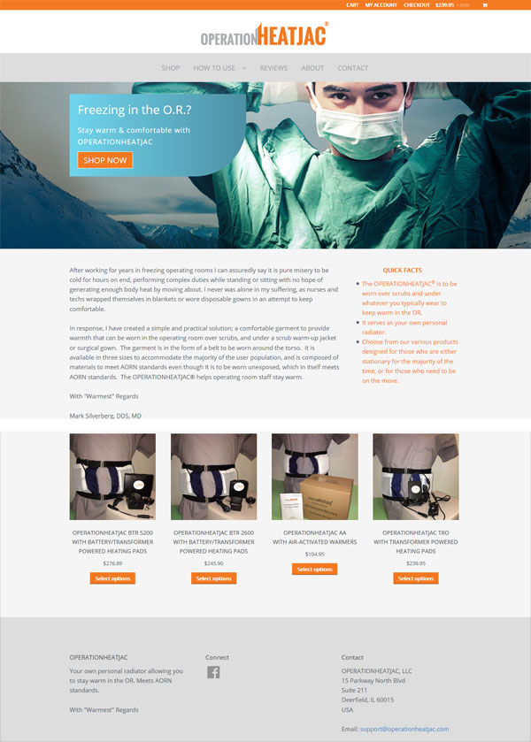
This learning journey continued when I began work on a project for OperationHeatJac. They approached me last year looking to develop an eCommerce web site to sell their very novel product – a personal radiator to be worn by staff in the operating room. I had no idea the OR was such a cold room. While the surgeons like to have the room freezing to help them remain comfortable while under stress and beat the heat kicked out by the lights, other staff members can really suffer.

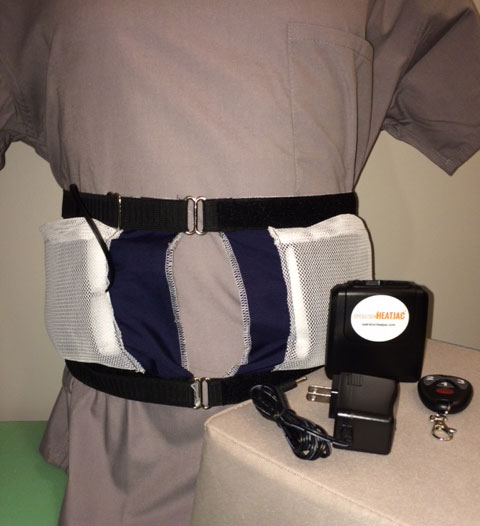
The product they developed is worn around the torso and acts as a personal warming device.

operationheatjac personal radiator

It can be powered in three different ways, by rechargeable batteries, a plug-in transformer or air activated warmers.

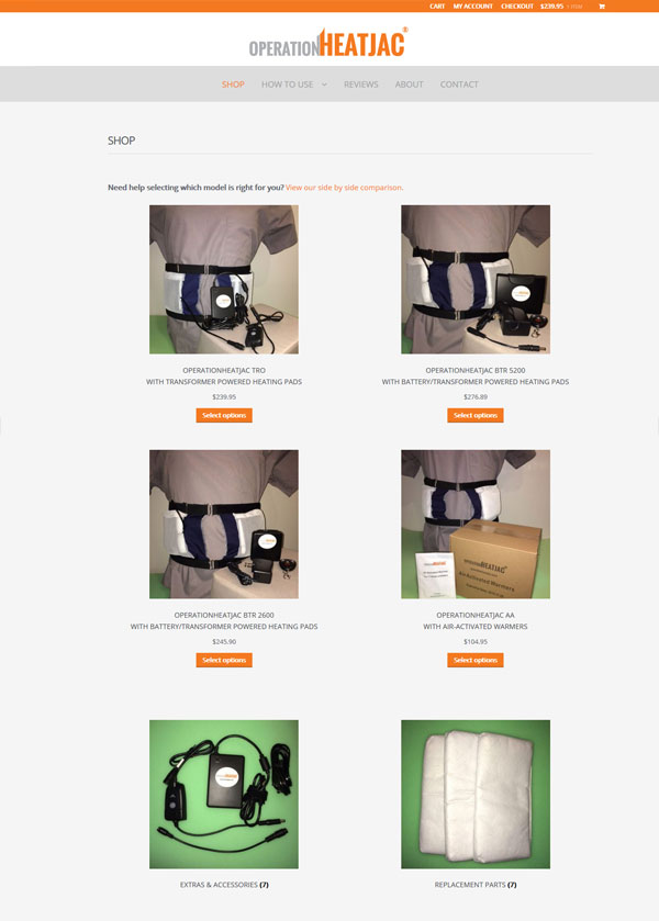
We kicked off the project with the creation of a logo for the company which I shared here and went on to develop a very clean look for the web site.

ecommerce web site

ecommerce web site

We provided everything to get this site up and running from domain name registration, hosting, SSL (Secure Sockets Layer) integration, web design and development and internet marketing. We even helped the client solve their photography issues by suggesting they purchase a dress form to display their products during the photo shoot.

The site is built on the WordPress platform and uses WooCommerce to provide the eCommerce functionality. Visit it at https://www.operationheatjac.com/

New website for Interior Designer

It’s a great compliment when I get repeat business from a client, particularly when I have just moved over 700 hundred miles away from them. As the Lancaster PA web designer, I will do whatever it takes!

I have been working with interior designer, Suzanne Falk, for a number of years now and helped to bring her vision of an online interior design experience alive, with the creation of Interior Design 2 Go. While the website offers a budget friendly approach to hiring an interior designer, Suzanne needed an additional portfolio site to feature her custom design work, particularly as she is currently getting quite a bit of attention in the media.

Launched today is her brand new web site –suzannefalkinteriordesign.com

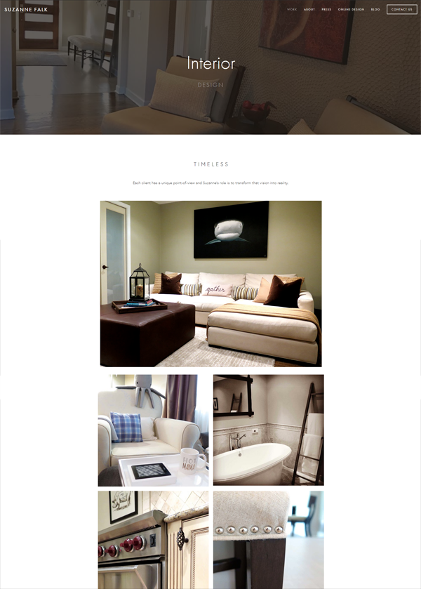
The site is a very minimalist but powerful presentation of her work.

interior designer website lancaster pa and is of course mobile friendly.
nterior designer website lancaster pa

Suzanne is delighted with it

“Wow, this looks amazing. So excited! You did a fabulous job, can’t thank you enough”

I am so grateful for my clients who continue to “follow” me around the country!

New Podcast Website for Kids

Launched this week is a brand new website for kids, CozyCornerPodcast.com

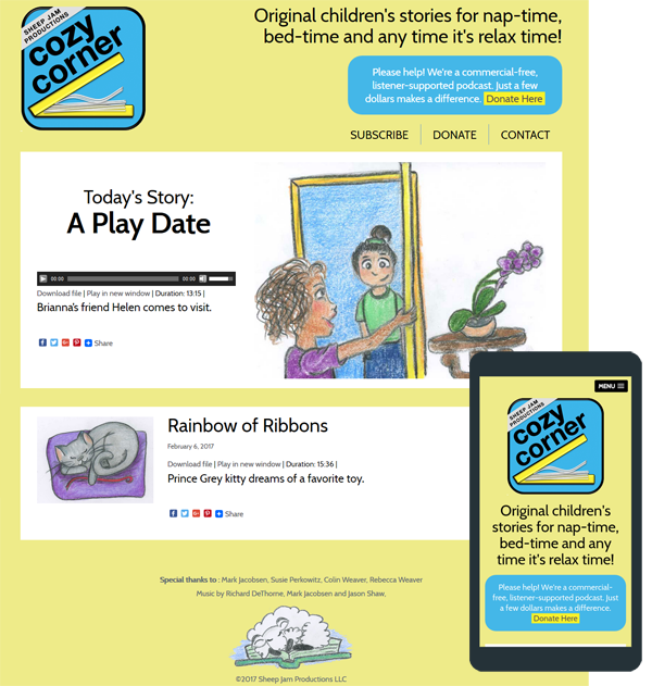
The site has a very simple design, created to appeal to pre-k kids and their parents. Each day it will feature a new audio story – all the stories are original and also include relaxation techniques designed to help the little listeners unwind and prepare for bed.

cozy corner podcast website

The stories are organized as podcasts enabling listeners to easily subscribe and use a multitude of devices to enjoy.

New Web site for Burns Recovered

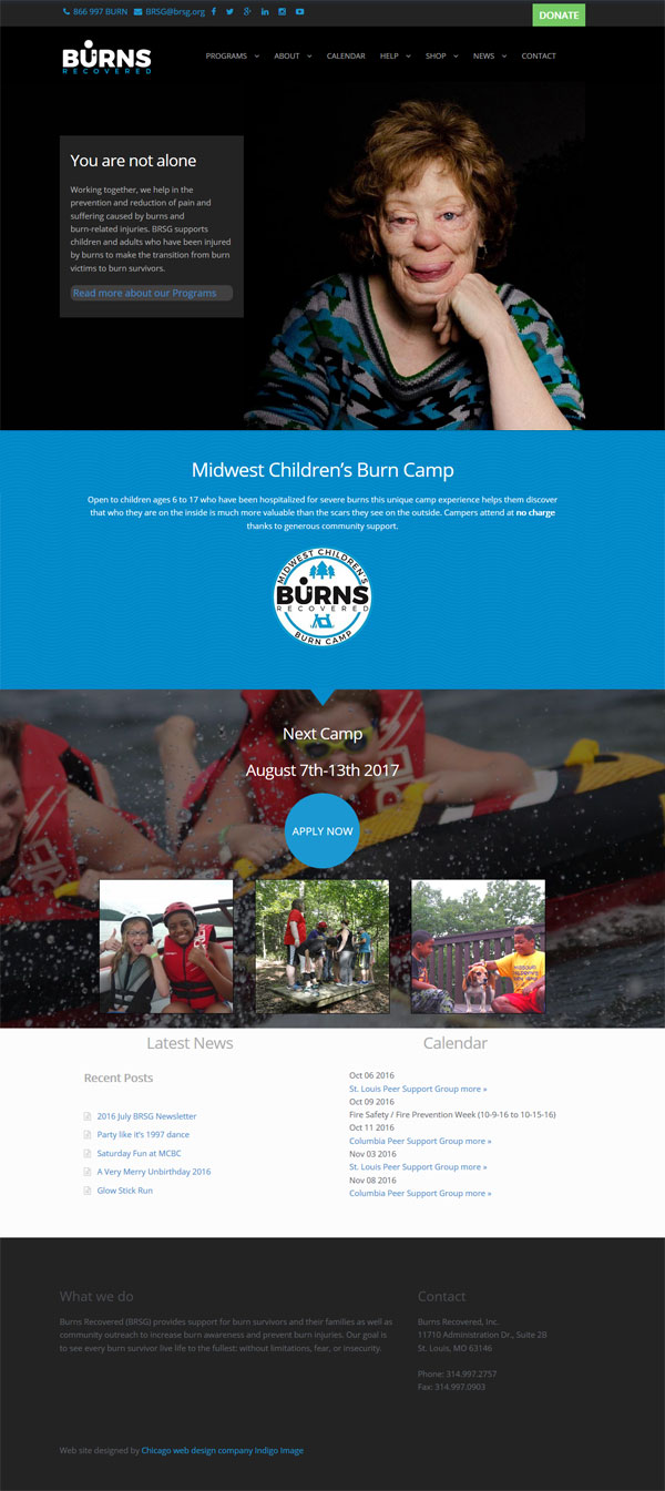
Launched this week is a brand new look for the Burns Recovered website
burns recovered non profit website

I have been working, pro bono, for this not for profit organization for the last six years. In that time I have help them move with the times, updating a very dated website and then making the web site responsive and even integrating a new logo.

This latest update was driven by the old website becoming very cluttered as it had become updated. The new look offers a much cleaner simpler look and features the stunning photographs from the book published by Burns Recovered “Beauty Is…” The site offers very clear call to actions and performs beautifully across all devices.

Here is what Lynn Heulsmann, Executive Director of Burns Recovered had to say

“Indigo Image created a dynamic, professional and engaging website for Burns Recovered/Midwest Children’s Burn Camp.  In addition to the site being desktop and mobile accessible, it is aesthetically pleasing  and we are thrilled with the outcome.”

New Website for Motor Appliance Corporation

We have been working with Motor Appliance Corporation for many years… mostly on the graphic design of technical products flyers and precision design of overlay stickers for their products.

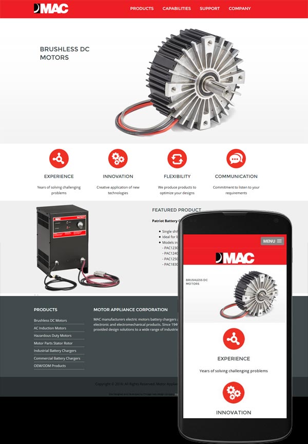
The re-design of their website was a project that had been on the back-burner for some time but just last week we launched a brand new shiny site for them. Visit it at macmc.com

macmc responsice website

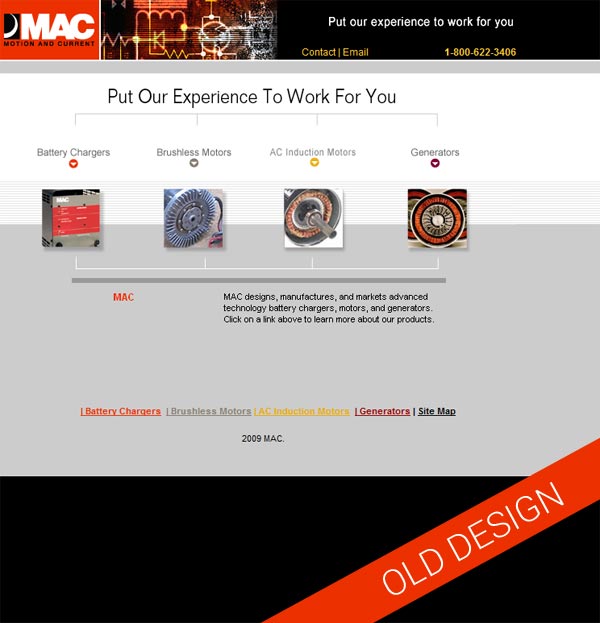
Web re-design projects are always really satisfying particularly when you take a look back. Here is the original site. It had served them well for many years but was looking rather dated and wasn’t working well on mobile devices

website redesign

The new website was built on the WordPress platform which will give the client much more freedom to self maintain. We offer full training on using WordPress in the form of screenshot videos in which we walk through a specific task. This approach works really well as they can be viewed and revisited as many times as as required.

The site itself is very clean, with power pops of red in keeping with the branding elements and is fully responsive.

New Website for Chicago Headhunting Company

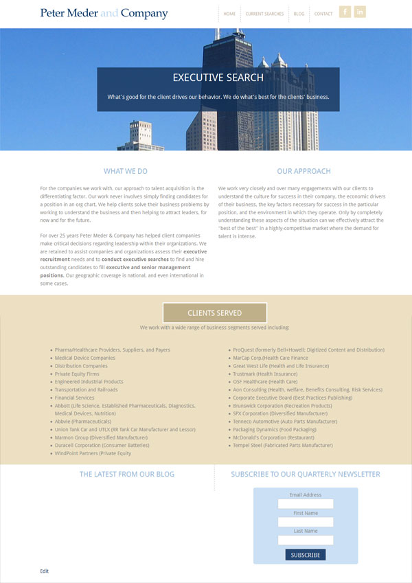
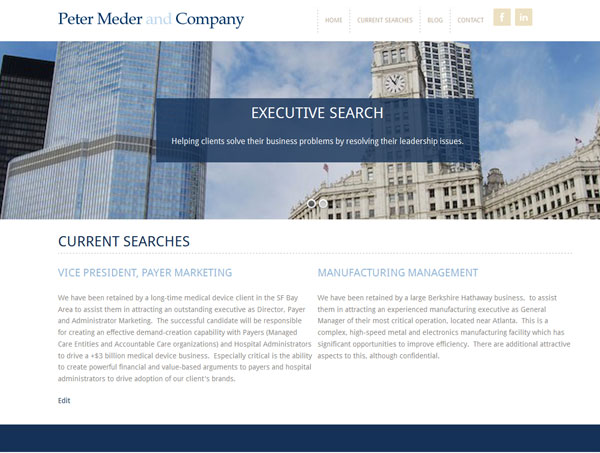
We have worked with Peter Meder & Company, a Chicago executive headhunting company, for over six years now. The original site we created had served them well, but was created before the popularity of smartphones … as a result it did not offer site visitors an optimum “mobile experience”.

The new site, launched today, gives the company a brand new look which is more up to date and visitors can now have a good experience from whatever device they are using to access the site, desktop to phone. Check it out at http://pmedercompany.com/

new website for chicago headhunter

new website for chicago headhunter