New Web Projects for 2021

2020 was a difficult year but 2021 is just rocketing along!

Here are a couple of websites I have launched so far.

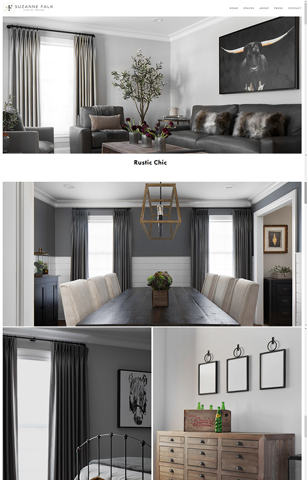
Suzanne Falk Interior Design

I have been working with Suzanne for quite a few years and it is always a pleasure when clients return to me again and again for work. This latest project is a redesigned project for her Chicago based interior design business.

Her website https://www.suzannefalkinteriordesign.com was built on the Squarespace platform
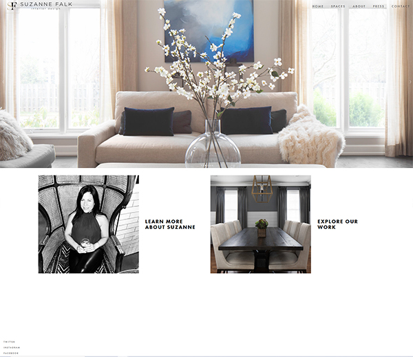
suzanne falk website

Toni Maddi

Toni is another repeat customer and has recently started a new business venture in tarot card reading and energy clearing. She wanted a website where her clients could book and pay form appointments online.

I created a calming but engaging look and feel and integrated full e commerce with appointment capabilities on the backend. New appointments are sent straight to her Google calendar.

Visit https://tonimaddi.com
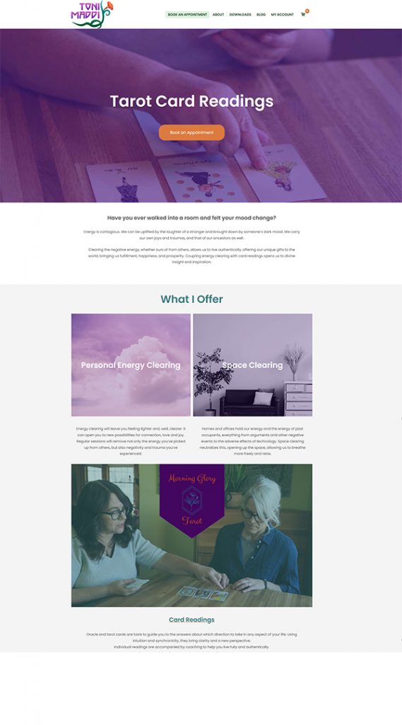
tarot card website toni maddi

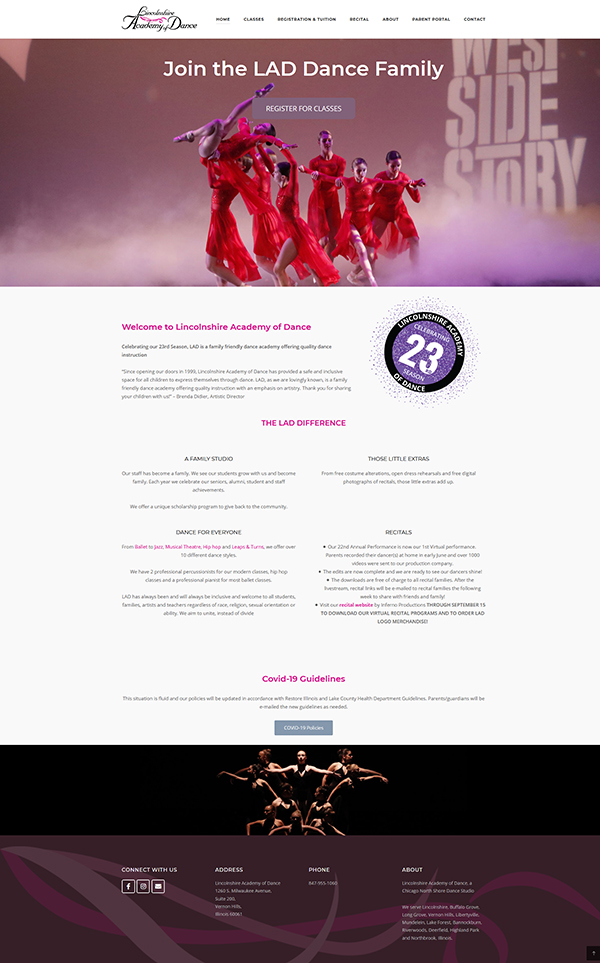
New Website for Lincolnshire Academy of Dance

We have been working with Lincolnshire academy of dance for 10 years and last week had the pleasure of launching a new and improved website that coincided with the start of their 23rd season .

The site is clean and totally responsive.

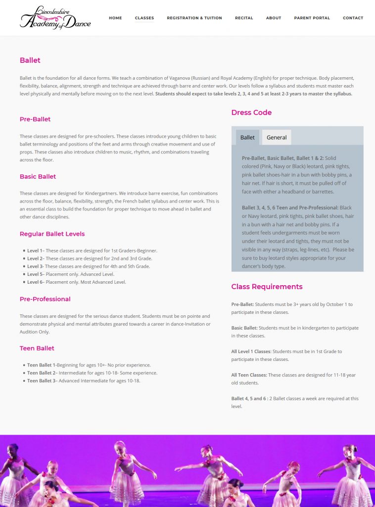
We put ourselves in the shoes of the parents and students using the website when thinking how to best organize the content, and came up with a tabbed system of presenting much of the information. This reduced bloat and scrolling of individual pages but pertinent information is easily and intuitively available.

For example all the dance classes have tabbed information on the dress code.

We are receiving many compliments on the website- thank you for everything!

Brenda Didier

Zoe Feast Surface Designer: New Website

As a hobby I have really got into surface pattern design over the last year or so and in that time have built up a substantial set of collections.

Surface pattern design is the creation of artwork ( generally repeating patterns) that can be applied to everything from fabric to phone cases, gift wrap to bathmats.

I use all sorts of techniques to produce my designs, creating repeat patterns from watercolor paintings, digitally using Adobe Photoshop and Illustrator and even on my ipad with an ipencil using a great app called Procreate.

My inspiration comes mainly from nature and I am a big fan of color

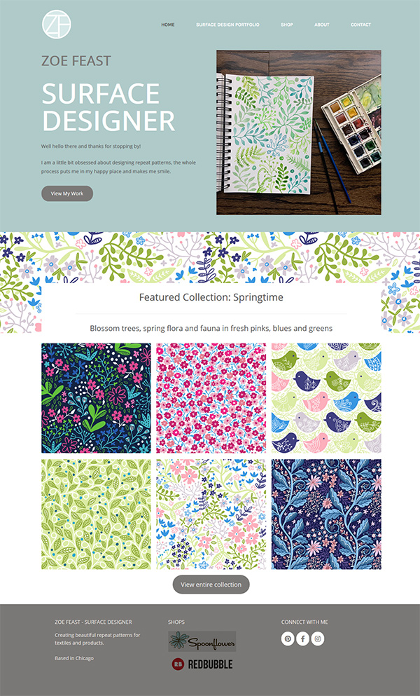
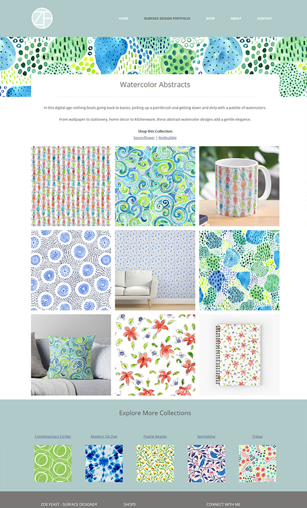
To showcase my pattern collections I have just launched a new website ZoeFeast.com. I kept the design clean and simple and let the patterns be the star of the show. The website is fully responsive.

zoe feast surface designer

Take a look at ZoeFeast.com

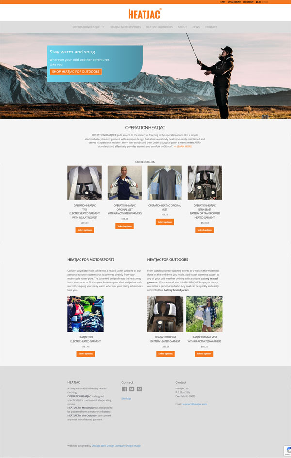
New Website for HEATJAC

We have been working with OperationHEATJAC, manufacturer of a unique heated garment for use in the O.R, for some years now. In that time they have extended their product offering to different markets. These changes have meant a slight restructuring of the business, which now operates under the name of HEATJAC with three divisions, OperationHEATJAC, HEATJAC for Motorsports and HEATJAC for Outdoors.

Time for a branding refresh!

We kicked off by tweaking the original company logo whose original design worked equally as well in a shortened version.

heatjac logo

The website was also refreshed to better reflect the three division with an updated home page, new navigation and dedicated division shopping pages. The site was also moved to a different domain heatjac.com

Visit it at https://www.heatjac.com

New website for Heartstation.com

I have said it before but I will say it again, web redesign projects are so satisfying. It’s something about breathing new life into the old and worn, giving it shape, presence and function to do battle in today’s business environment.

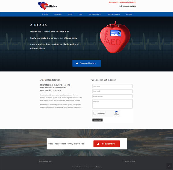
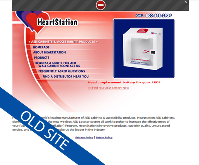
I have been working with Heartstation, providers of AED cabinets, for some time now and was delighted when they hired me to revamp their website which dated back to 2006! The internet technology available since that time has come a long way.

The redesigned site encompasses a bright,open look and feel with call to actions throughout. It offers a completely responsive experience for the user whether they are visiting from their mobile or a desktop.

Take a look https://www.heartstation.com

and here is a little reminder of their previous site

Are you a small business looking to redesign your website?
Call us at 636 795 7988
or email us

A Small Business Brand

Creating an effective brand image for your small business can “up your game” and let you compete with the bigger players in whatever arena you operate.

Are your customers having the same experience however they interact with you, or are they faced with mixed messages a mishmash of graphics and just general confusion?

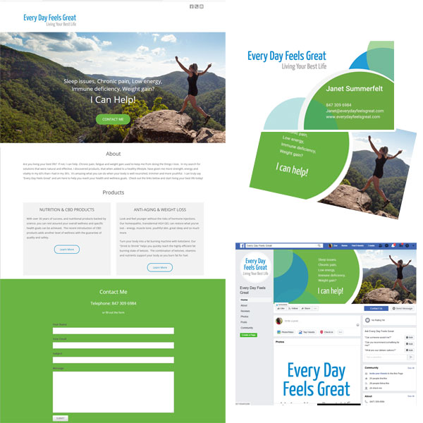
We have just completed a project for a Chicago based small business, Every Day Feels Great, who came to us looking to create a brand for their wellness business.

The project started with brainstorming a tag line which summed up what they want for their clients. Once the was established we worked it into a very simple text logo.

We then went on to design a business card, a simple one page website and graphics for Facebook.

Consistency is king here. The same color palette, imagery, graphics and voice ensure a flawless branded experience.

Check out the website at

https://everydayfeelsgreat.com/

New Website for St Louis Celebrant

Nothing says a happy customer than one who sends me referrals and this was how I ended up working with Lamira Martin, a referral from a fellow celebrant Ruth Hasser

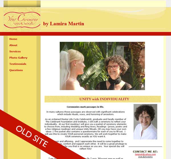
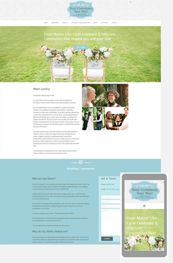
Lamira was looking to redesign the website for her Celebrant business, Your Ceremony, Your Way . It needed a fresh look and offer her visitors a better experience when accessing the site from a mobile device.

Redesign projects are always so satisfying, here is what the original site looked like.

website redesign celebrant

And here is the new site

celebrant wordpress website

Lamira was one happy client and here is what she shared on Google reviews

Zoe is an amazing website creator.
She listens – From my rambling, she was able to discern a theme, colors, font and images that resonated with my vision for my website.
She is patient – After the initial site was created, Zoe was open to any and all changes that I wanted.
She is kind – I never felt like the inexperienced techie that I am.
She is knowledgeable – Her recommendations, especially re: accepting payment and optimal search avenues were spot-on.
I highly recommend ZOE FEAST, website creator EXTRAORDINAIRE!!

Thanks Lamira for such a positive review, you were a pleasure to work with!

Food Photographers Website

The last few weeks I have been working on a new website for a A-Yo Kitchen, a York PA recipe developer and food photographer. This startup business is the brain child of Alysha Yoder, who has such talent when it comes to preparing, styling and photographing food. I was literally slobbering as each photograph got uploaded to my dropbox.

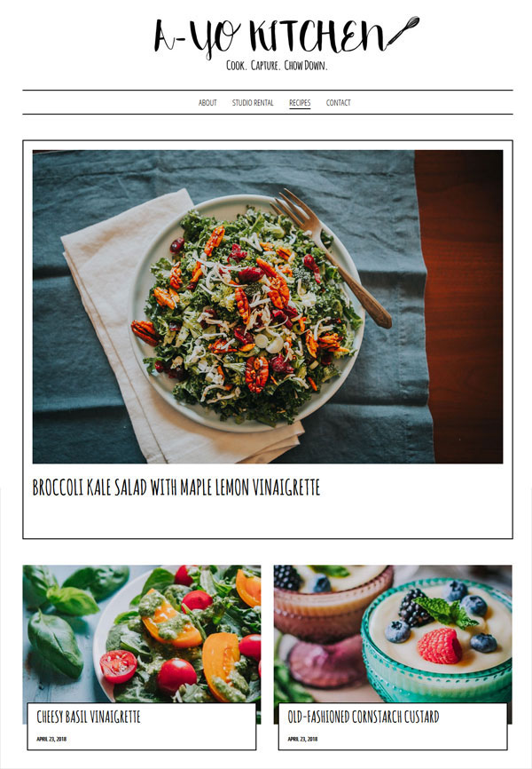
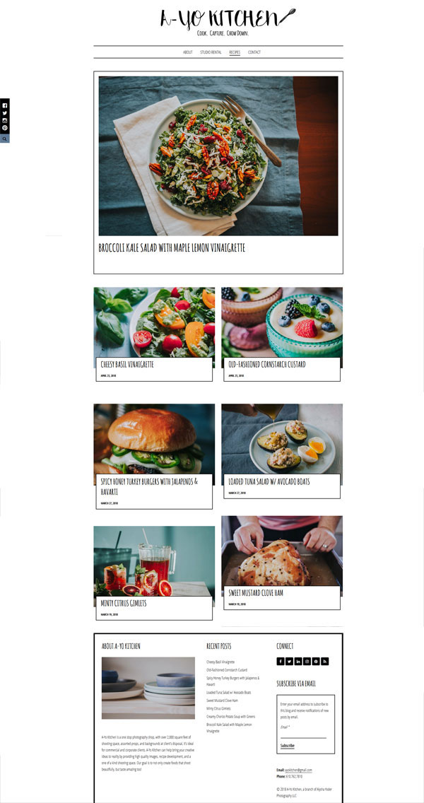
Alysha wanted a very minimalist look to her web site, where her photographs have the staring role. She had actually picked out a WordPress template before we connected and had dabbled with it on WordPress.com. However as with a lot of templates and the limitations faced when running a website though WordPress.com, she was unable to make it do exactly she wanted to achieve her vision. It needed the magic touch from a professional web designer!

The first thing I did was to get it off WordPress.com and set it up as a self hosted site. If you need multiple plugins and are after a particular functionality it is actually more cost effective to take this route.

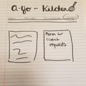
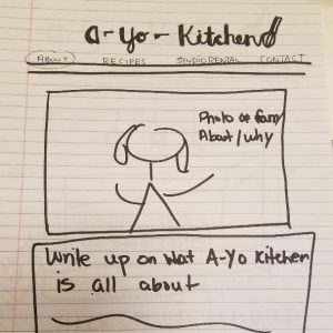
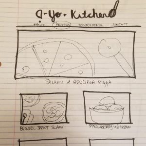
Working from Alysha’s sketches,

I brought the site to life. It is actually really useful when a client can provide sketches as it really helps clarify exactly what they are after.

ayokitchen website

ayokitchen

Take a look at it at ayokitchen.com, it will have you slobbering too!