Graphic Design for Battery Heated Clothing

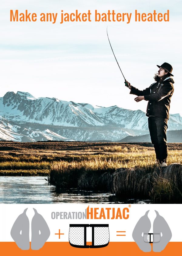
Getting your message across and helping customers understand your product, can be a challenge particularly when you are marketing something unusual. I am currently working on an SEO project for OPERATIONHEATJAC and their product certainly falls into this unusual category. They have developed a novel “personal radiator” garment which was originally designed for medical staff to wear in freezing cold operating rooms but is a practical solution to staying warm in any cold situation.

To create product awareness the current marketing approach is to focus on all those cold situations where the product is useful – not just in the O.R.

For social media use (Pinterest, Facebook and LinkedIn) I have created a set of graphics which simply explains the product.
battery heated jacket

Revamp for Online Country Decor Store

Giving a website a facelift is quite possibly my favorite type of web design work. As much as I love designing websites from scratch, there is something very gratifying about taking something that is a little worn and faded and injecting some much needed love into it!

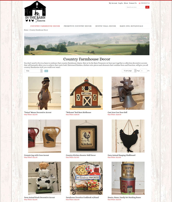
That is exactly what I have done with In the Barn Treasures, an online country decor eCommerce site. I mentioned them a few weeks ago, they are my first new local client since relocating to Lancaster PA.

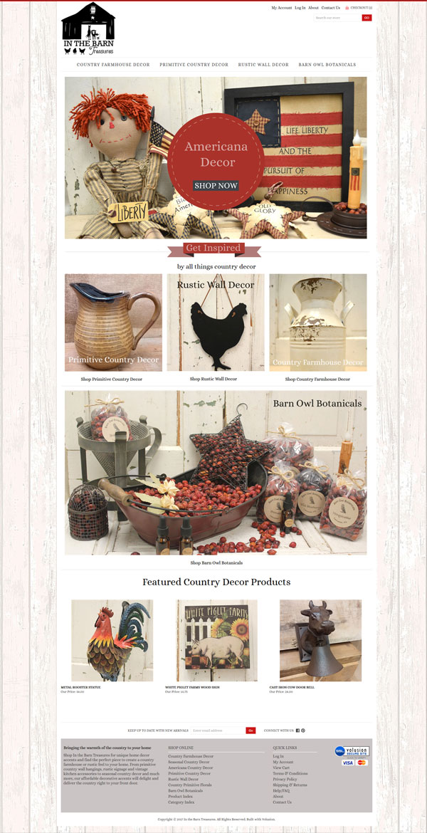
Here is the home page of their new site

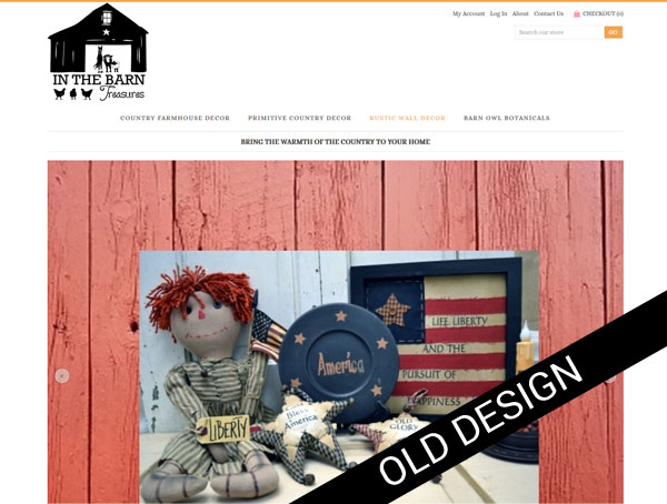
and before we dig into what I did lets take a quick look at the before

before in the barn treasures

Clearly there is a huge visual improvement but this project was not all about producing a better looking site.  We wanted to address a number of issue

Search Engine Optimization

We started with extensive of behind the scenes work addressing search engine optimization. The site is built on Volusion but was using none of it’s built in SEO tools. After a market analysis we pulled together a list of keywords and got to work enriching the site, renaming page file names, image names, and generally working in our key words wherever appropriate. Every single product in their catalog was optimized.

Visitor Engagement

Getting a user to do what you want them to do once they reach a site is a skill. First of all you need those few vital few seconds to convince them this is a site worth looking at, so a professional enticing look and feel is a must. Then “Call to Actions” come into play. We completely reworked the content of the home page, removing a slideshow that really achieved very little in terms of usability and replacing it with distinct call to actions which directs users to the newly reworked product categories

The objective here is to give a user quick visual prompts and not make them think too much!

We also added a featured product section which is dynamically driven.

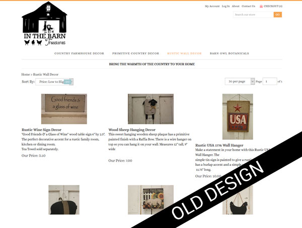
We continued improving user engagement on the category homes.The original site had tiny photographs which hardly enticed the user to click further. There was also a “landscape/portrait” mismatch.

We gave each category a simple graphic banner, a title..great for SEO and a brief introductory paragraph. Then working from the original raw product photograph we adjusted them for better exposure, resized them so all the photographs were now identical in size, gave the each a keyword rich name and uploaded everything again. The result, a much more appealing category home page with photographs that are big enough to entice further clicks.

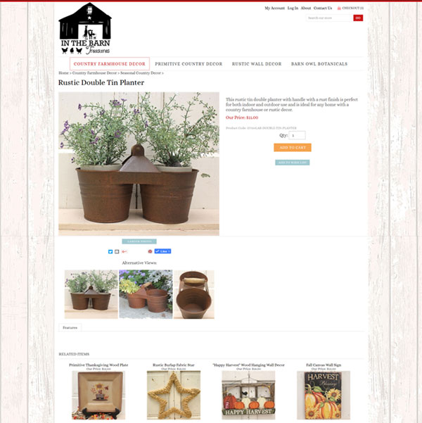
The product pages were also enhanced with much larger photos and keyword friendly descriptions of each piece.

in the barn treasures country decor product

Internet Marketing

Once the site was in ship shape condition from a usability and SEO standpoint it was time to re-launch it to the world. It has been submitted to all the big players (and lots of little players) in the search engine world and all the products uploaded to Google Shopping

We also created a number of social media profiles including Pinterest, Facebook, Scoop.it, Fancy, and  Wanelo

Check out the site at https://www.inthebarntreasures.com and browse through their catalog of wonderful country home decor products!

The Power of Before and After Photographs

We are all suckers for before and after transformations no matter what the subject.

Why?

Because before and after photographs engage. They grab attention offering potential and possibility and show us what can be done

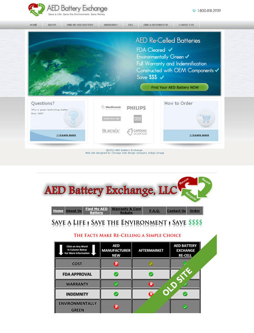
Take a look at these before and after photos

Cheap > Expensive

cheap-expensive

Amateur > Professional

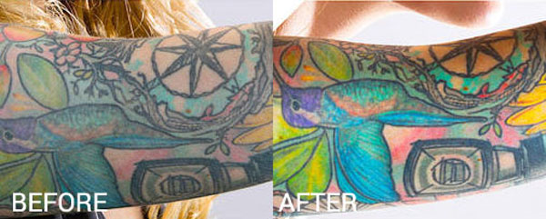
Drab > Fab

before after tattoo wipe

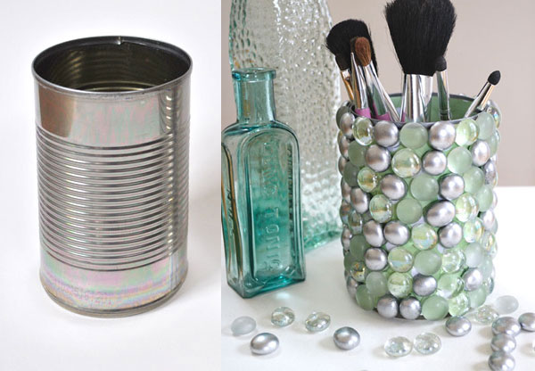
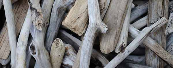
Trash > Treasure

before-trash
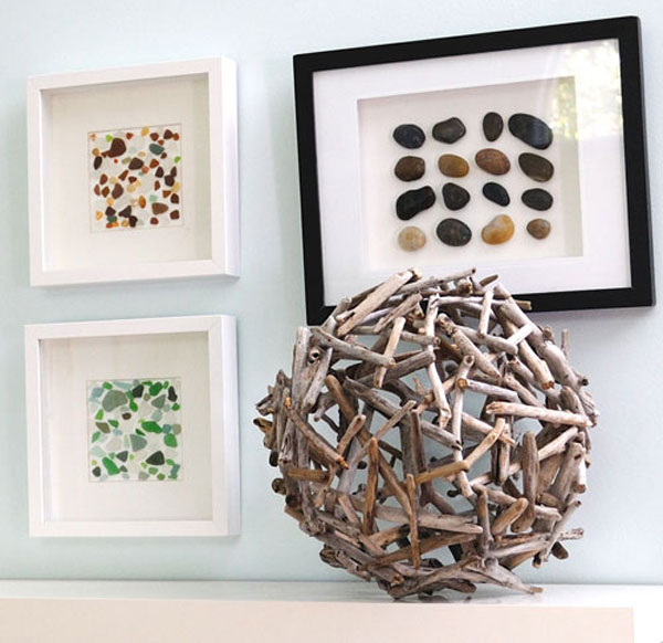
after-treasure

Without one word of copy we have told a story in each set of photos – so important in the micro attention span of today’s website users. We have offered a level of engagement to someone who has an outdated website and maybe looking for a re-design, someone who has a faded tattoo and even someone looking to create a piece of art from trash. Granted it is an odd mix to have on a single page but you get the picture.

Advantages

This engagement factor can lead to

  • A better understanding of a product which in turn can improve sales conversions
  • Impart a level of expertise
  • An improved connection with your visitors
  • The increased possibility of your content being shared on social media and all the upsides associated with that – increased traffic, better organic search engine placement, more quality back links etc.
  • Repeat visits to a website – visitors experiencing good interesting content on a site are more likely to return to it in the future

No matter what type of business you are in, before and after photographs are an excellent addition to your marketing efforts.

Including Before and After Photos in Your Marketing Mix

For products or services that result in a visual change – think web design, interior design, weight loss, fashion, makeup … the before and after photos are obvious – a screenshot of a website before and after re-design, a face with and without makeup, a sofa with and without pillows.

But say your business or service offers no real visual elements. How can before and after photos help and how do you go about creating them?

Here you can create scenarios which represent a situation with and without your product or service comparing Good (with service/product) vs Bad (without).

For example your are accountant who specializes in working with small businesses- how about a photograph of a shoe box messily filled with old receipts and invoices with the business owner pulling their hair out and another photo showing a neatly organized ledger and completed tax return with the business owner with a well groomed hair-do. A little creative thought can go a long way in dreaming up good before and after scenarios.


Creating Animated Pins for Pinterest

Pinterest continues to be one of the fastest growing social networks and if your services or products are very visual it can be a great internet marketing tool.

It is ever evolving and recently launched the support of animated gif pins, giving marketers another dimension to play with.

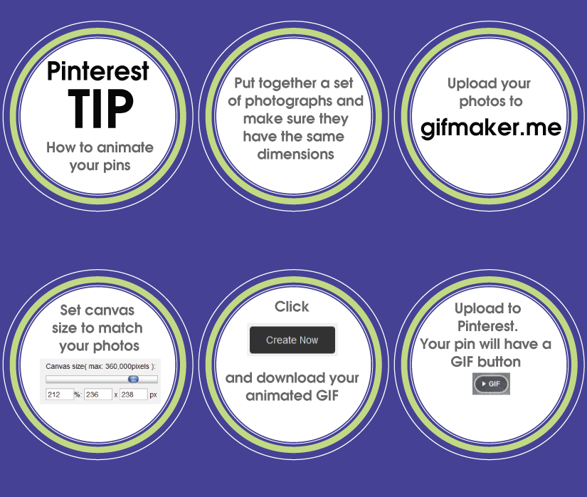
animate-pins

Creating an animated pin is an easy process.

  1. Start by putting together a collection of photographs. make sure all the photos have the same dimensions.
  2. Upload the photos to http://gifmaker.me/ making sure the order you upload them matches the order you would like to see them.
  3. Adjust the canvas size to match your photos and set the animation speed at a level that suits the nature of the animation.
  4. Click CREATE and download your animated gif.
  5. Upload to Pinterest. The animated Gif will have a small button automatically added. This allows visitors to click and watch your animation.

Here is the animated GIF of this tutorial on Pinterest. If you click it you will see the button

output_u2FwKl

Money Saving Tips for Your New Business Website: From Creation to Internet Marketing

If you are planning on starting a new business in 2014, getting up and running online is probably a high priority. With  budget concerns, many business owners will be willing to do as much as they can themselves. Here are some money saving tips to get started.

new buisness website money saving tips

  • Research and Register Your Domain Name
    When coming up with a name for your new venture make sure you also check out domain name availability. There is nothing worse than coming up with a great business  name to find the domain name is unavailable. Godaddy is a good place to do you research.
    Ideally you want one that is

    • Short and sweet
    • Can be easily communicated verbally – avoid weird spellings
    • Avoids hyphenation
    • Has the .com extension
  • Your Website
    If you are technically savvy you may want to have a go at building your site yourself- WordPress.com is a good place to start. But if HTML, CSS, SEO, templates, plugins, widgets and web hosting give you the shivers it is probably best to leave the creation of your website to a professional web design company.  Scope a few local web designers and when getting a quote be specific as possible in what you are looking for. This way you will help the designer come up with an accurate quote right from the start and not have to worry about hidden costs later into the project.
    Some areas to consider are-

    • The size of your site – sketch out a site map of all of the pages you would like, it doesn’t have to be perfect.
    • The functionality – do you need e-commerce, a blogging platform  or want visitors to be able to upload information. Think long and hard exactly what you want your visitors to do once they reach your site.
    • The look and feel of the site -will you need a logo and brand image creation
    • Do you want your web site to be responsive? – look great on a desktop. tablet, cell phone etc … full explanation of responsive web design
    • Do you want to be able to update the site yourself ?
    • Are there any third party tools that you want integrated into your site
    • Search engine optimization- to get your site ranking well in the search engines required a myriad of behind the scenes code enhancements.  All search engine optimization projects start with a researched  list of keywords and key phrases. Get a jump start on your list –a great tool for evaluating what phrases are worth targeting is Google’s Adwords click “Tools and Analysis” for a keyword planner.
  • Online Marketing
    Getting visitors to your site will require an online marketing strategy, many web design companies – including Indigo Image, can do this for you.   If you decide to tackle this yourself some of the basics you need to address are

    • Submitting your site to all the major search engine-  each search engine is slightly different
    • Creating quality links to your site from as many different sites as possible
    • Setting up social media profiles e.g Facebook page, Twitter account, Linkedin , Pinterest. Make sure you use a brand image consistent with your site across all social networks.
    • Engaging and promoting your business within your targeted social networks. It is much better to select a few social networks to focus on rather than dabble in all of them.
    • If your site has a blog write it as often as you can…to begin with aim for a post every day for maximum impact.
    • Promote any new content on your site through your social networks.
  • Website Maintenance
    Keeping your website fresh is important not only for returning visitors but also for your search engine rankings. Search engines will favor sites with frequent content updates compared to those with few.
    If your site has been built on a platform like WordPress you will be able ( if you are so inclined!) to update the site yourself.

Redesigned Website for Paper Shower

We have  work with businesses all over the country on web and graphic design projects, but it is especially rewarding working with  businesses based in our local vicinity.  Our newest client, Paper Shower, is located right here in Lincolnshire IL .

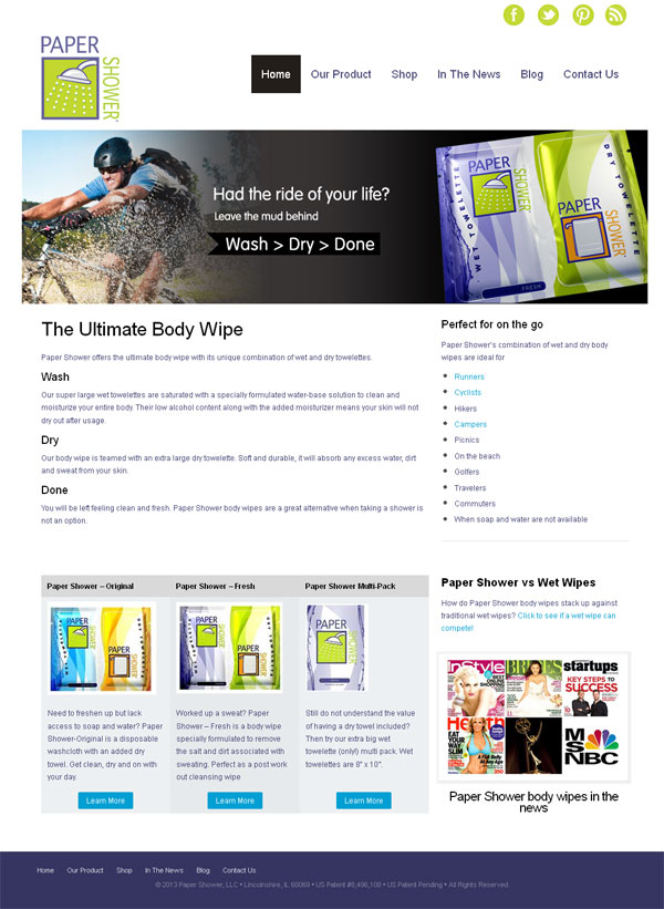
Launched yesterday was a redesigned version of their web site papershower.com

paper shower body wipes web site redesign

Paper Shower offers a range of unique body wipes which combine a large wet wipe with a dry towelette and are great for active people who are looking to freshen up on the go – bikers, runners, while camping, hiking and traveling  or even on the golf course.

Why Redesign?

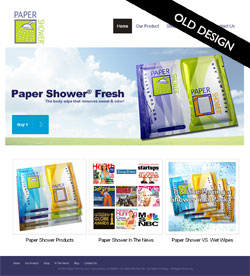
website redesign lincolnshire ilThere are several reasons for the need to redesign a web site and the old Paper Shower site fulfilled quite a few.

Firstly the site was making the visitors work too hard to understand the product, it was only after clicking through from the home page that the concept of the product having both a wet and dry towelette became obvious.

Secondly, almost no consideration had been made as to who the product was being marketed towards – it was too generic.

Lastly the site was not at all optimized for the search engines, the home page itself was a collection of images and as a whole had very little keyword rich copy.  Ranking in the search engines was poor and  traffic was minimal despite  great PR coverage the product has had over the last few years.


Our Web Re-Design Approach

Understanding the issues facing the old site helped us create a strategy for the  re-design and re-launch of the new site.

Competitive Analysis

Any SEO project needs to kick off with a through understanding of  the online competition. We took an in depth  look at other body wipe websites and our analysis  resulted in the compilation a list of favorable key phrases.

Web Content
We wanted to address several things with the web content

  • Communicate the uniqueness of the product in a simple format that did not require the user any effort
  • Engage with the target market of outdoorsy / active people
  • Add more call to actions to purchase product
  • Enrich it with target key words and phrase for SEO benefits

We started with the creation of a set of web banners that incorporated the product and an outdoor scenario or an occasion where the product would be useful. Each banner also carried the phrase Wash > Dry > Done, which was elaborated on with keyword rich copy underneath which quickly and easily explained the product.

paper shower body wipes golf
paper shower body wipes camping
paper shower body wipes travel
paper shower body wipes hiker
paper shower body wipes gym

The home page was updated to include more details of the product range and examples of who may find the product useful. We used video and client testimonials throughout the site for easily digestible communication.

For better engagement with the target audience we created a set of landing pages

and also added a blog

We are in the process of completing the internet marketing of the site but are confident that the  re design and optimization will result in increased traffic and sales.

Read more about Paper Shower in our web design portfolio.

© 2013 Chicago web designer

How much does a website cost?

how much does a website cost

How much does a website cost?  If you are visiting this page looking for a definitive answer then I am going to disappoint because pricing a website can be a complicated process but it is a question on every potential client’s mind. The cost of a web site is a little bit like the cost of  a house, the  bigger and more complex the heftier the price tag.  So lets break things down a bit to give you an insight as to where the costs lie and walk through some client scenarios.

Lets first consider the type of company quoting your project. A design agency with a portfolio full of fortune 500 companies and a trendy studio in a skyscraper in down town Chicago is going to charge more …well.. because they have to to cover their costs. If you are large company with mega$$ they may be a good fit. An offshore, say,  Indian based web design company, may give you an unbelievably cheap quote but how comfortable are you doing business that way?

A good approach to selecting a company to quote your project is to take a good look at their portfolio and services and if their offerings match what you are after, they are worth a call. Also don’t be afraid to check out any testimonials.

Any decent web design company will lead you through a discovery process (ours is free) to understand what it is you want to accomplish with your web presence. Come prepared to talk about your marketing objectives, the type of functionality you’d like on your site ( e.g shopping cart, content management, video integration, social media, blogging capabilities etc.), who your customers are, who you competition is and what makes you unique. The more information you can provide at this stage the better, as the information  will be used to create a comprehensive proposal which will outline the best plan of action to achieve your goals and a realistic price.

Whatever the goals of the project, the cost to create it can generally be broken down into the following categories

Design

  • A captivating design to engage you site visitors
  • Home page and inner pages of the site
  • email template design
  • Imagery selection
  • Navigation design
  • Definition of branding assets e.g color palette, typefaces
  • Working from a predefined brand style guide

Programming

  • Converting your design to a form which can be understood by web browsers
  • Integrating all content
  • Building and integrating functionality e.g  shopping carts, databases
  • Integrating with a Content Management System (CMS) e.g WordPress
  • Integrating 3rd party application e.g newsletter management, Google analytics
  • Mobile version of site
  • Browser compatibility testing

Launch

  • Domain registration/configuration
  • Hosting setup
  • Email setup
  • Upload to server
  • SSL certificate
  • uploading data ( e.g for e commerce)

Marketing

  • Search engine optimization (SEO)
  • Submission to basic search engines
  • More extensive search engine, directory, portal submission e.g Targeting Local directories
  • Social media profiles e.g Facebook, LinkedIn, Twitter, Pinterest
  • Email campaigns
  • Paid Advertising Campaigns e.g Google Adwords
  • RSS subscription

Now not every project is going to require all aspects of these categories so lets take a look at a few client scenarios

Client A: Online Brochure Website

A small interior design business requires a simple online brochure type website to market their services. They would like to set up a Facebook page, an email management tool so they can send out a newsletter and a Pinterst account to pin photographs of their design work. They serve a local area and would like to rank well for anyone carrying out a local search for an interior designer- they are not interested in paid advertising although this may change depending upon the site traffic. They already have an offline brand image but require a domain name. The site will be between 10 and 12 pages in total.

Project Estimate

Design: 12 hrs
Programing: 18 hrs
Launch: 4 hrs
Marketing: 10 hrs

Total: 44 hrs = $4,400

Client B: Content Management Website

A company offering summer camps wants a web site they can manage themselves. The would like to upload photographs of camp events and allow parents to register their children – they already have an online application to allow this through a 3rd party but this need to be integrated seamlessly into the site. They would also like to be able to write a blog. They have a Facebook profile already set up but this to be linked to the site.  Most of their customers are by word of mouth but they would like a basic SEO and search engine submission.  They have a comprehensive offline style guide and already have a domain name. The site will be approximately 25 pages.

Project Estimate

Design: 24 hrs
Programming: 50 hrs
Launch: 8 hrs
Marketing: 5hrs

Total: 87 hrs = $8,700

Client C: E commerce Website

A small business want to launch an online store to sell their products. They also want the ability for their clients to sign up for an e-newsletter which will offer monthly promotions. They need assistance in selecting a provider for these email blasts and a custom template designed for the newsletter.They already have a merchant account set up and are interested in paid advertising to generate traffic. They have a logo and all copy for the website ready.

Design: 35 hrs
Programming: 70 hrs
Launch: 20 hrs
Marketing: 20 hrs

Total: 145 hrs = $14,500

As you can see the price range for a website can vary dramatically depending on what you want it do do and want to achieve.  If you would like us to quote on your next website give “The Chicago web Designer” a call at 847 607 8679, we may be a Chicago web design company but we don’t have a trendy studio in the city and don’t charge ridiculous prices!

Local Search Directories offering free listings

Gone are the days when people would use the trusty old “yellow pages” to search for services they require. Now the first port of call is the internet and many times will turn to an online local directory such as Yelp.

Does your business have a local search presence? Getting listed in local online directories can help the overall ranking of your site and give you more opportunities to connect with potential customers.

There has been a real growth in local directories over the last couple of years and generally getting listed in them is easy…although quite time consuming.

Here is a list of 43 directories that offer FREE listings.

  1. Google ( view our Google local directory listing)
  2. Bing ( View our Bing local listing)
  3. Yahoo ( view our Yahoo Local listing)
  4. Yelp ( view our Yelp profile)
  5. Merchant Circle ( View our Merchant Circle listing)
  6. Linkedin ( view Indigo Image profile)
  7. Yellow Pages ( yp lisiting)
  8. White Pages (local lisiting)
  9. Local Pages( listing)
  10. SuperMedia (listing)
  11. Mapquest ( view listing)
  12. Local ( view our Local Listing)
  13. Think Local (listing)
  14. City Slick ( view our listing)
  15. Show me Local ( listing)
  16. Insider Pages ( Chicago web designer listing)
  17. Manta(Manta Listing)
  18. Volta.com (Indigo Image Volta Listing)
  19. Zip.pro (our profile)
  20. Twibs (listing)
  21. Localeze (listing)
  22. Localdatabase (Chicago web design company listing)
  23. Yellowwise (listing)
  24. MojoPages ( listing)
  25. Tulapo (Indigo Image profile)
  26. Best of the Web (profile)
  27. Yellowbot(Listing)
  28. Yellowee (listing)
  29. City Squares (listing)
  30. Kudzu (listing)
  31. Brownbook (chicago web design profile)
  32. Match Point (listing)
  33. Hot Frog (listing)
  34. Zoom Info (listing)
  35. Magic Yellow (listing)
  36. UScity
  37. Yellowbook
  38. City Search
  39. Yellowassistance
  40. Localdex (Indigo Image-Chicago web designer listing)
  41. Business Journal
  42. US yellow Pages
  43. City Search

If you are looking to increase the visibility of your business in local search give us a call to see how we can help: 847-607-8679

© 2012 Chicago Web Designer

7 ways to increase the visibility of your small business website

Here is a list of 7 things you, as a small business owner, can do TODAY, to increase the visibility of your web site. The better visibility, the better rankings in the search engines . End result more site visitors.

website visibility

  1. Start a Blog
    Google’s blogger or WordPress.com are both good candidates for the novice blogger. They are easy to setup and require no technical knowledge .  Ideally your blog should be integrated into your web site and given the same look/ feel for a seamless branded image (we can definitely help you with this).  However having a standalone blog gives you a great platform to test the blogging waters and  find your voice.  Write regular blog posts relevant to your business expertise or product offering and make sure to create linksto your web site. Here are some articles on blogging which will help you get the most out of your blog.

  2. Comment on blog posts
    Commenting on blog posts is a great way to increase the visibility of your site.  A fitting comment and a relevant  link to your site where applicable can lead to considerable traffic. Tread carefully though and do not spam.
  3. Open a Twitter account
    Twitter is a micro blogging tool, each Tweet, or post can have a maximum of 140 characters.  Spend a little time setting up your profile which can include a picture, an all important link to your web site and a short bio.  Next find some people to follow using the tools offered on the Twitter web site, then tweet away.  The more you interact the more you will get of Twitter.
  4. Create a Facebook Fan Page for your business
    To get started with Facebook you first need to create a personal account. Then visit this page https://www.facebook.com/pages/create.php
    Select a good name and populate the info section of the profile with your business information.  You are now free to start sharing your thoughts, ideas, products, links, video and anything else you think is relevant to your business via the Facebook status window. You will need to build up your fan base so include a Facebook “like button” wherever you can e.g In your email signature, on your blog, on your web site.
  5. Get listed on YELP
    Yelp is a local directory allowing users to search for all sorts of  services, everything from hair dressers to website designers.  Once you are a member (free) you can post reviews on any listing.
    See our listing on Yelp
  6. Upload a video to YouTube
    YouTube is the world’s 2nd most popular search engine ( Google is the 1st) so it stands to reason a presence there is worth the time and effort.  Creating your free account is easy and uploading a video a breeze.
    See our videos on YouTube How to select a great Domain Name and How to add video to your Internet Marketing Mix
  7. Pin something on Pinterest
    If you have visually appealing images on your website particularly if they relate to your products or services e.g You are a landscaper and have a portfolio of completed landscape projects, Pinterest is a great place to share them. Pinterest is one of the newest and fastest growing social media platforms. It is a virtual pin board allowing you to organize and share all the fabulous images you find on the web.  Boards and images can be  shared and repined .
    Check out our profile on Pinterest

QR codes : What how and why

Undoubtedly you have these strange pixeled squares popping up all over the place. What are they and what can you do with them?

What is a QR code

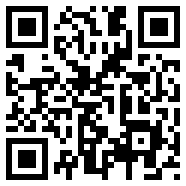
qr codeQR stands for Quick Response and they are  read by a QR reader app you can easily download to your cell phone. The app decodes the graphic and reveals the information they contain.

QR codes can point to a specific url, share phone numbers, text , send a text message (SMS),  share a vcard or vcalendar,  share social media profiles or  give Google maps location information,

This QR code points to my web site https://www.indigoimage.com

Creating a QR Code

Creating a QR code couldn’t be simpler. There are a number on free online generation site such as Kaywa which allows you to generate a URL, text, phone number or sms QR code, or QRstuff which gives you more options on which information you would like to share. QRstuff also offers a subscription service which give you access to high resolution QR codes suitable for printing.

Why use QR Codes

Simple reason because they make life easier, no more pen and paper to jot down information. With a quick scan the information you want to convey is electronically stored. QR codes offer another avenue with which to engage with your customers.

Where to use QR Codes

  • Business cards
  • Marketing material such as brochures and flyers
  • T shirts
  • Real estate signs
  • Promotional freebies
  • Product labels
  • Store fronts

©: 2011 Chicago Web Designer