More and more medical practices recognize the importance of developing a brand image. I have recently been working with St Louis Surgical Consultants in developing a logo and print collateral pieces as well as a web site. The web site is still in the works put the logo, business cards, letterhead and appointment cards are now complete.
Category: Chicago Graphic Design
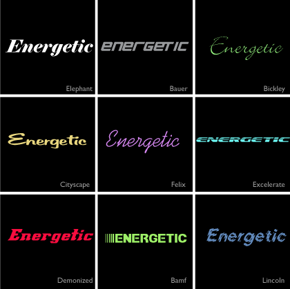
Emotions of a Type Face: A set of energetic fonts
Here is the next installment in my series “The emotions of a typeface”. Today’s set features energetic fonts.
They all convey a sense of movement, get-up-and-go, pep, animation, activity, liveliness and zing
Think “boot camp” – any one of these would work for branding elements.
Next time I’ll showcase a set of dreamy fonts. View the first in the series “playful fonts“
2010 © St Louis Web Designer
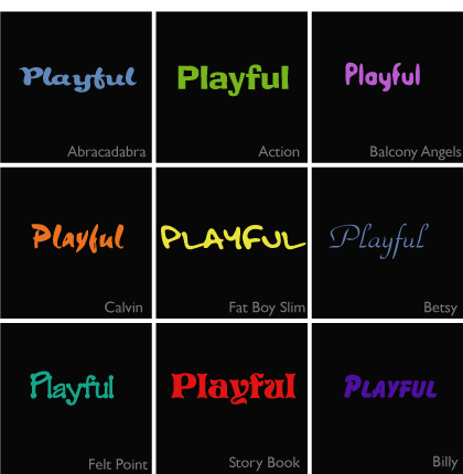
Emotions of a Type Face: A set of playful fonts
Ask any web or graphic designer how many type faces they have loaded in their font directory and you will be boggled by the number, they are important tools of the trade and we like to have lots!
Selecting the right typeface for a project, title, button, logo, banner, call to action, etc, can be a time consuming task. What sort of emotion will the typeface evoke and will it be the right emotion?
Today I am starting a new series, the emotions of a type face, and to kick it off lets start with a set of playful fonts.
These fonts all convey a relaxed, laid back emotion. They are fun, non confrontational but functional.
Next time I’ll showcase a set of energetic fonts
2010 © St Louis Web Designer
Eye of a St Louis web designer: Call to action
As a web or graphic designer one of our jobs is to create design elements that result in an action by the viewer. Whether it is a button to click on, a web site to visit (think banner ads) or creating an interface which is easy and intuitive to use we are constantly thinking about the “call to action” of our designs.
Nature does a fabulous job at this. Take a look at these beautiful purple flowers (anyone know what they are?) blooming in my garden. A flowers job or “call to action” is to entice insects to visit so they can cross pollinate. They do this using color, contrast, shape and scent to direct the insects to where it’s all happening the in center of the flower. We don’t yet have scratch and sniff monitors so scent is not one of the tools us web designers can use. Maybe it will be an internet technology of the future!

2010 © St Louis Web Designer
Free vector graphic from St Louis web designer
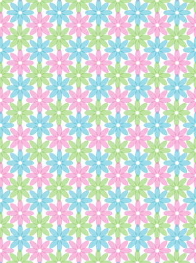
Inspired by a simple geranium in my St Louis garden just coming into flower, here is a spring vector graphic for you to download and use however you see fit. Enjoy
2010 © St Louis Web Designer
One of my most memorable business card designs
Fabulous design elements, creative use of color, usual shape, some funky die cutting?
No!
This is one of my most memorable business card designs. I discovered it yesterday during a spring clean, it is tatty and scribbled on but has a great story associated with it.
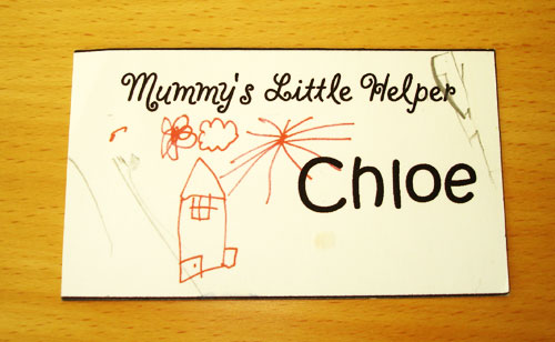
This card was created about 9 years ago and featured the artwork of my then 3 1/2 year old daughter, Chloe. I was going to a late afternoon small business trade show to do a little networking but had no sitter so decided to take my little one along. I thought it would be fun to make her some business cards to hand out. She drew me a picture which I scanned, quickly put together this unique card and printed a bundle out on my desktop printer.
Her cards were a huge success and contacts I have today from back then not only remember them but still have them. How many business cards do you have from 9 years ago?
2010 © St Louis Web Designer
Building a brand image
Last year I was contracted to build a brand image for an online small business radio start up. As a web and graphic designer, these are favorite types of projects and I have been fortunate to enjoy plenty over the last few years. From a designers standpoint the real beauty of a complete brand image project is that you get to start with a completely blank canvas.
Various circumstances meant that the Small Business Radio was unfortunately never launched but I thought I’d share with you today the elements I created.
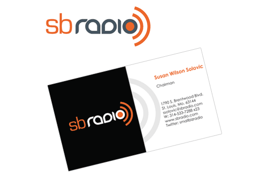
The starting point was naturally the logo which was then incorporated into a business card.
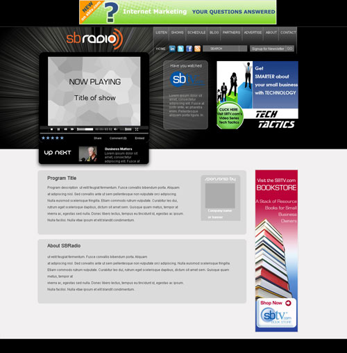
Then came the look and feel of the web site. It needed to accommodate a custom designed media player and a space for ads.
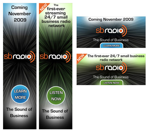
and lastly a set of banner ads to promote the site before and after it’s launch
It was a really fun project to work on and I was disappointed it never made it to the launch stage. I think it would have been a great resource for all of us small business owners.
2010 © St Louis Web Designer
New logo and business card for Lava Smith
It’s been pretty hard to have time to post to this blog over the last couple of weeks with a very healthy workload of projects.
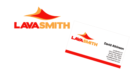
Here is one of our recent logo and business card creations for Lava Smith.
Visit our logo portfolio
2010 © St Louis Web Designer
The anatomy of a repeating pattern: Free vector download
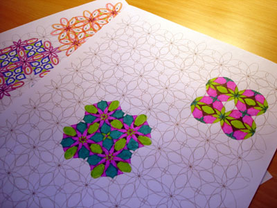
Looking to design a unique repeating pattern? It is easier than you think.
Start with a simple shape like an oval

Duplicate and rotate to form a flower shape

Duplicate horizontally
then vertically
Voila!
Printed out these are a great coloring project for kids.
Download repeating pattern here
2010 © St Louis Web Designer
Free Vector Graphic: Winter Theme Pattern
In honor of the “great snowfall” we are due over the next 36 hours, here in St Louis, here is a free vector graphic of a repeating pattern with a winter theme. The great land of Twitter is busy speculating inches. Snow anyone?
2010 © St Louis Web Designer


