Brand Image Tips for Small Business Owners

Developing a killer brand image is not something  reserved for big corporations such as Pepsi or Apple. A professional and memorable brand image is just as achievable by a small business,  here are a few tips to get you on your way.
brand image tips for small business owners

Define your brand image elements

A carefully crafted collection of brand assets will create an impression with your customers as to your products and services and in essence give them a “gut feeling” about your company. They should evoke something positive, unique and instant. A brand image is not built from a single element like a logo but a collection of elements including;

  •  Logo
  •  Icons
  • Color palette – with primary, secondary and tertiary colors,
  • Type faces
  • Type setting
  • Imagery
  • Tag Line

even things like

  • Scents – ever noticed a distinct scent when you enter a store such as Holister or even IKEA?
  • Texture- think about the texture of bags used in packaging
  • Sound – recognize this
  • Decor – In a bricks and mortar business does your decor enhance why your are trying to convey with the reset of your brand assets?
  • Writing Voice

Creating your brand asset collection is no small feat and is generally the result of extensive research into the market you want to serve and the type of image you want to portray and the experience you want your clients to have.

Create a Branding Style Guide

Once you have established you brand assets it is really useful to create a style guide to optimize the use of your branding elements. For example

  • Logo usage – minimum size, orientation, optimum white space border, use in black and white, position
  • Colors – color combinations, definition of colors in terms of pantone, RGB, CMYK and hex e.g ( #000000)
  • Type Face- Font choices, sizes, colors and line spacing
  • Imagery- styling of imagery- think borders, angles, image filters etc.

Used your brand elements consistently

Your brand image will be most powerful when you use your brand elements consistently, ensuring your clients  receive the same experience no matter how they interact with you.
Here are some of the places where you need to ensure it is used consistently

  • Web site
  • Social media profiles such as Facebook and Twitter
  • Business card
  • Letterhead
  • Email signature
  • Powerpoint presentations
  • Invoices
  • Sales collateral such as brochures/flyers
  • packaging
  • proposals
  • uniforms
  • sales tags

This list could go on and on but once you start down the road of applying your brand assets to your business tools it becomes easier to use your brand assets than not. Need help? Check out our Branding Services.


The Eye of a Chicago Web Designer

As a web and graphic designer my “design” eyes never seem to rest. If I am out and about driving, I am reviewing and critiquing logos on the sides of vehicles, if I am waiting at a clients office for a meeting to start I am analyzing the patterns in the carpet or on the wall coverings. Just sitting here as I type I can see patterns every where from the wood grain on my desk to the grill of my computer speakers.  I am constantly absorbing design all around me; patterns, textures,  shapes, color palettes, color combinations, type faces … to many it may sound exhausting …but to me it’s not!

Even at 30,000 feet the “Chicago web designers eye” is primed and ready. As I peered out of the window on a recent flight to Vegas I was greeted by an amazing patchwork of shapes and contours that had been highlighted by a sprinkling of snow.  How cool is that!

The eye of the Chicago web designer


Book Cover Design

As a graphic designer I have designed many things, logos, brochures newspaper ads, business cards, invitations, menus, graphics for t-shirts,  20ft banners that have hung on the side of a building, I could go on and on but I won’t bore you.

There is something however I have never tackled before and that is the design of a book cover, until now.

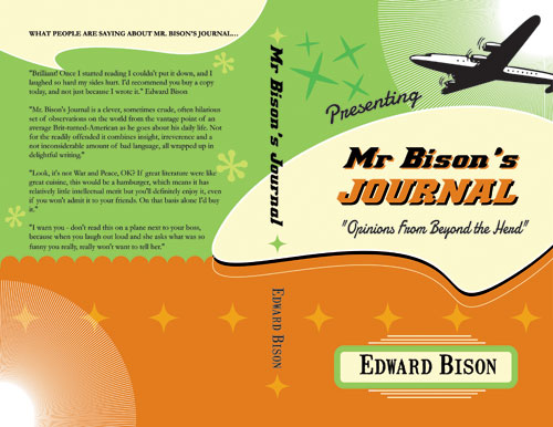
Here is a sneak peak at the cover of a new book by freelance writer Edward Bison

Book cover designBook cover design

The book is a funny, light hearted collection of observations and stories geared towards the adult market.

I was also commissioned to illustrate the book , which was another first.

A revamped website will be launched shortly to coincide with the publication.

Illustrating a Book

Web design is generally my bread and butter but occasionally I get a completely different project on my plate.

I am currently deep in the middle of an illustration project for a freelance writer who is just getting ready to publish his first book. The book is a compilation of 100 humorous observations and stories and I will admit has had me crying with laughter. It is hard to draw when you have tears running down your face.

Each of the stories require an illustration and have turned to my old faithful ink pen to illustrate the old fashioned way. It is quite a liberating experience to spend a day filling pages in a sketch book rather than staring at a computer monitor. I have about 75 illustrations completed already, a mere 25 to go.

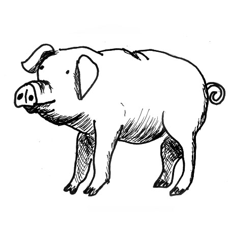
And as a little teaser here is a  sampling.


Line drawing of a pig

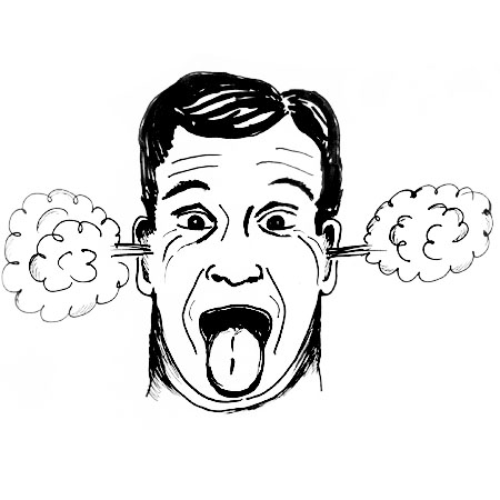
line drawing of mand with steam coming out of his ears

Line drawing if little red riding hood

The book is due for release around Thanksgiving.


2012 © Chicago Web Designer

A Geeky Side of Graphic Design: Security Printing

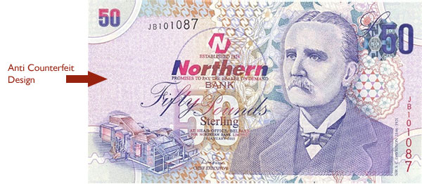
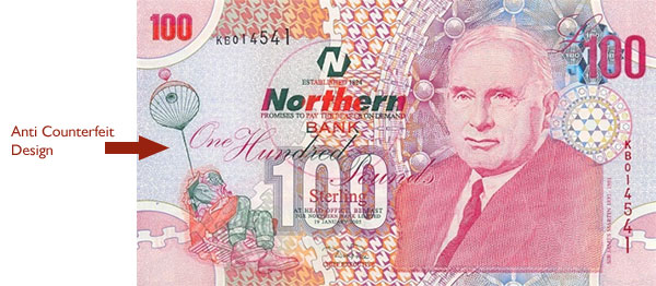
When I lived in the UK I worked for a security print company, creating anti counterfeit design elements. It was a fascinating one in a million job. My designs not only had to look good but more importantly they had to perform. They had to be difficult to counterfeit , which is no small task.

It was what I consider technical graphic design, which is one of the first things that attracted me to web design, as that too is a marriage of design and technical elements (think html, css,  javascript , cross browser computability …the list is endless)

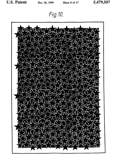
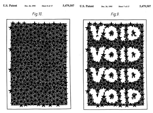
So I thought I’d share with you today a geeky side of graphic design and look at a design elements I created for security print. It is a design concept I invented (see patent) that is used to camouflage messages

Hidden in the following design is a message…scroll down to see what it is.

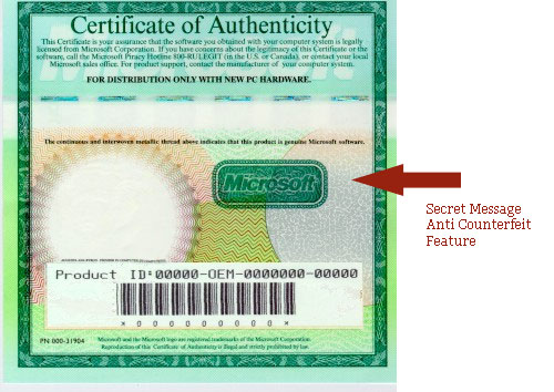
This concept was used for creating an anti counterfeit pattern that was used on a Microsoft certificate of Authenticity

and on Bank notes printed for Northern Bank in Ireland

anti counterfeit design element

anti counterfeit design element

© 2012 Chicago web design

Chicago web designer: Creative balance

The old saying goes “All work and no play makes Jack a dull boy” If all I did was work, work, work I know for certain my digital creativity would dry up. I keep my passion for web and graphic design alive by balancing work and play. You will NOT find my chained to my computer screen day and night. Oh, I also have no interest in having a data plan on my phone so I can check my email etc. where ever I am. When I step away from my computer I like to step away from the electronic world.

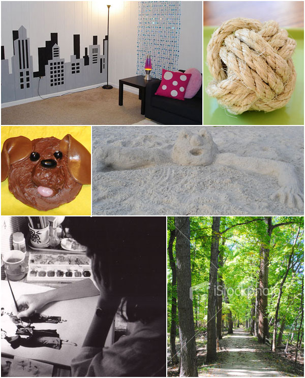
It seems however I am unable to step away from the creative world. Here are a few of the fun non computer creative things I have done in the last year.

  • Invested in an SLR digital camera, while my photos are far from professional I did qualified for a profile on istockphotos.com
  • Built some sand sculptures in the gorgeous white sands of Florida.
  • Learnt how to tie the fantastic monkey fist knot
  • Enjoyed the creative eye candy of down town Chicago. From the wonderful impressionist painting in the Art Institute of Chicago to the amazing reflections from “The Bean
  • Transformed a dungeon basement room to a teenage penthouse complete with painted  skyline mural
  • Made an igloo in the garden after the spectacular snow storm in February
  • Got creative with food with some doggy cookies …for humans.
  • Got inspired to  buy some watercolor paints after discovering a painting I’d started at age 17 and never finished. Brushing up on some seriously lost skills!
  • Planted a vegetable garden …that our resident garden critters enjoyed very much.

web designer creative balance

I am looking forward to many more creative adventures in 2012… digital or not.

©: 2011 Chicago web designer

Free printable birthday cards: Vectors

I get rather disgruntled sometimes when I go to buy a birthday card and I find nothing I like, is it just me?

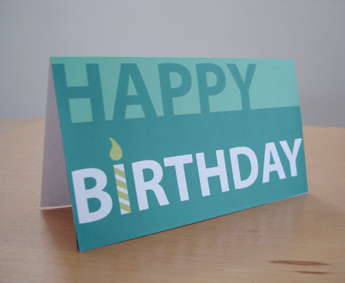
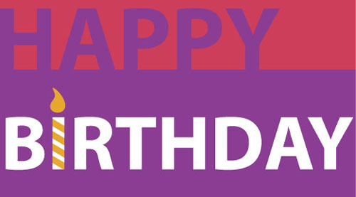
So I have put my graphic designs skills to use and created my own birthday card which can download for free.  I actually have this card on my personal blog ” Creative in Chicago” and was recently picked up by About.com, making it their number one choice in a list of 20 free birthday cards.

Free birthday card

The card comes in four color combinations and works well for men, women and teens. Click on the one you like and download the pdf.  Print it out on some good quality card stock and you are good to go.

green free birthday card

Free birthday card

free birthday card

free birthday card

© 2011 Chicago web designer