Rebranding for The Chicago Web Designer

It was time.

Our previous brand image has served us well but we have been wanting to shake things up and redesign it for over a year now. Finding time has been difficult but we have finally rolled out a new brand image for The Chicago Web Designer, Indigo Image.

Lets start at the beginning with the first thing we tackled … an update of our logo.

Logo Redesign

Chicago web designer logo

We have dropped our rectangular icon replacing it with a circle but the “pathway” shape remains the same, the color indigo is now complimented with a fresh blue. We also updated the typeface to a less boxy font. While the logo is not a million miles away from where we started it is definitely fresher. The circular icon is nicely compatible with the size and shape restrictions for many social media profile icons ( see what we mean by checking out our Google + page)

Website Re-design

One of the main drivers behind the redesign of our website is the fact there has been a huge surge in traffic from mobile devices such as tablets and smart phones. The growth is so massive it is actually predicted  web traffic from these devices is set to pass traffic from desktop computers this summer. While we had coded our previous design to react responsively ( see this blog post), time constraints meant that we didn’t redesign …just recoded. It was a good stop gap but needed fixing!

Both the design and the code has now been optimized for viewing on any device.
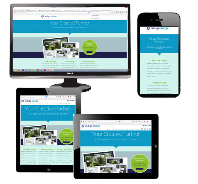
responsive design chicago web designer

The re design gave us the opportunity for some content re-organization. The main area we reworked was the portfolio section. It is now split into four categories

We used chunky tiles to navigate portfolio items and finger friendly navigation buttons to switch between portfolio galleries.
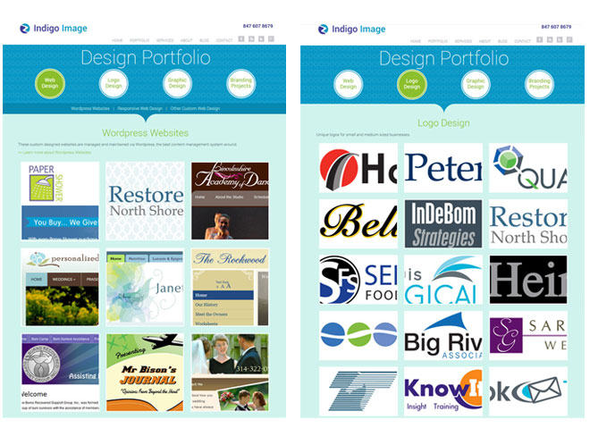
chicago web designer portfolio

Social Media

Our re-branding has been carried through to our social media profiles

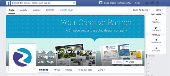
Here is our Facebook page

facebook branding

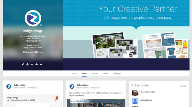
and our Goggle + page

Google plus branding

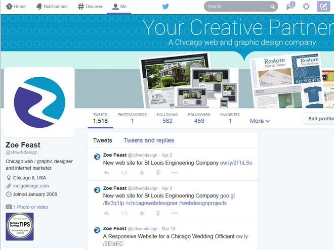
and a new look for our Twitter profile

Twitter branding

Graphic Design for Chicago Small Business: Paper Shower

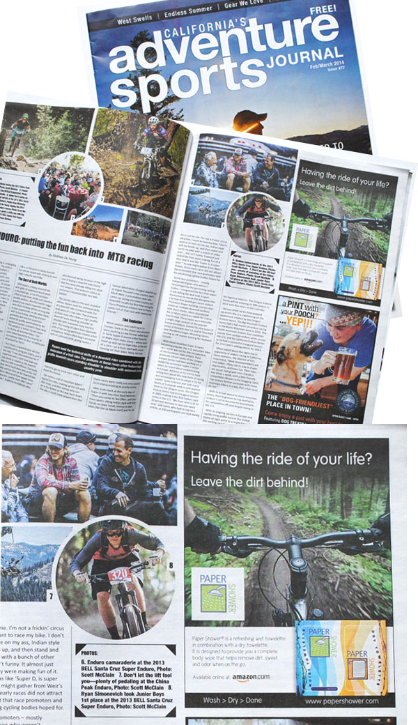
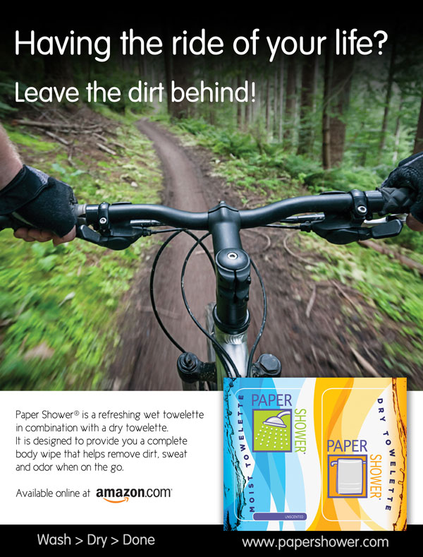
Back in the fall I created a print ad for Chicago based small business Paper Shower. Quite often when I create pieces for print I never get to see the finished product…which is fine, but I never turn down the opportunity to take a look at the end result.

The ad appeared in Feb/March edition of California’s Adventure Sport Journal.


graphic design chicago small business
..and after a quick scan through the magazine I now have a hankering to hike along the California coast. If I do I will be sure to pack the unique Paper Shower body wipe


Free Valentine Cards

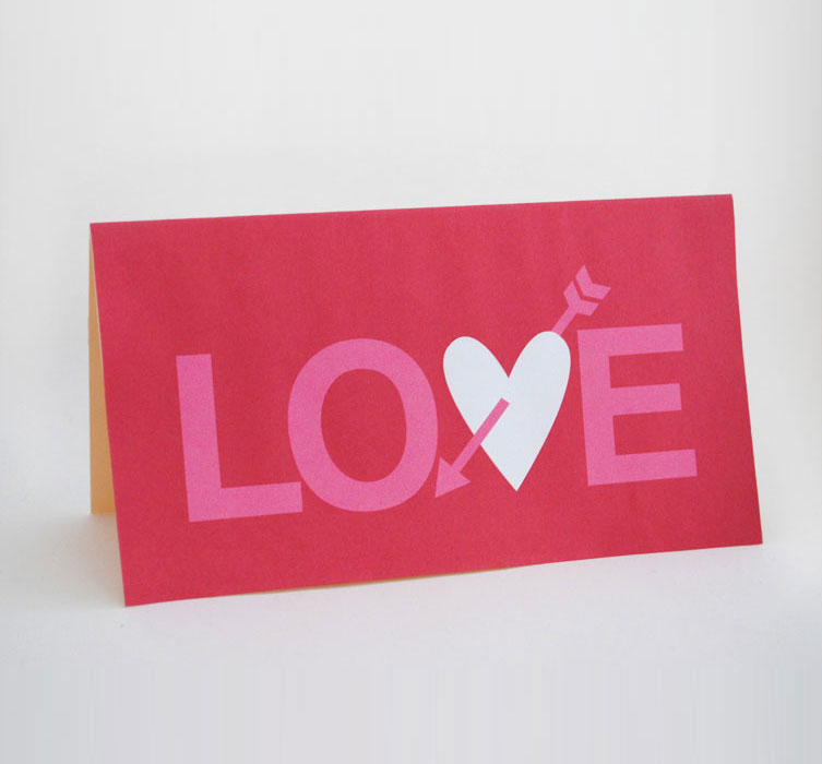
As a graphic designer I can get quite disheartened when buying greeting cards… there is just so much junk out there. So I have taken to designing my own and because I am sure a lot of you have the same issue when buying cards I am  sharing this latest Valentines card  with you for FREE .


free valentine card

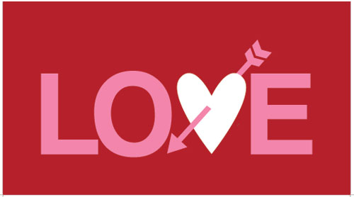
I have created the same design with three different color schemes. Just click on the design you would like, to download a pdf. Simply print on a decent card stock and you will be good to go.

free valentine card red free valentine card purple free valentine card gray

Heinzen Smith Properties Signage

I love it when clients send me photographs of designs  in their final product form.

This is a sign design I created for Chicago home builder, Heinzen Smith Properties. The sign encompassed a range of brand image elements I developed during the design of their web site.

It has been beautifully mounted between two black posts and is currently erected on the construction plot of a new home.

Chicago small business lawn sign design

Graphic Design for a Car Rear Window

Earlier this year I shared a post about the design of a car graphic for client Janet Summerfelt.

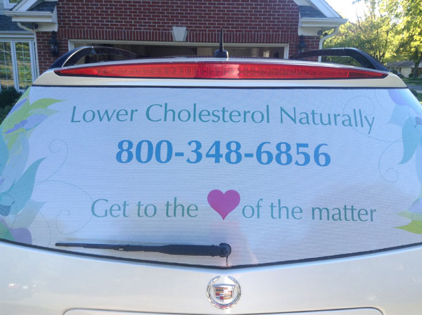
I followed up with her recently and was delighted to hear she was thrilled to bits with her rear window graphic. She sent me this photo

car decal design chicago

It is always tricky to render  a design that is going to be applied to a 3d surface, but as you can see from the proofing mockup I prepared prior to printing,  it was spot on.

rear window car graphic design

Thanks for sharing this photo Janet!

Graphic Design for a Rear Window Decal

It is always fun working with clients who are as passionate about their small business as I am about mine – Janet Summerfelt , a health and wellness consultant and an independent distributor for Reliv,  has such enthusiasm for her Chicago business. I have been working with her for about a year maintaining her web site and last month I gave a site a branding makeover. This month, I have taken the new branding elements and designed a graphic for the rear window of her car.

rear window car graphic design

Being able to spread projects out on a month to month basis is often a real benefit for small business owners, enabling them to maintain a healthy cash flow.

An Example of Small Business Image Branding

Here is another project which showcases the consistent use of image branding elements as I talked about in my post Brand Image Tips for Small business Owners.

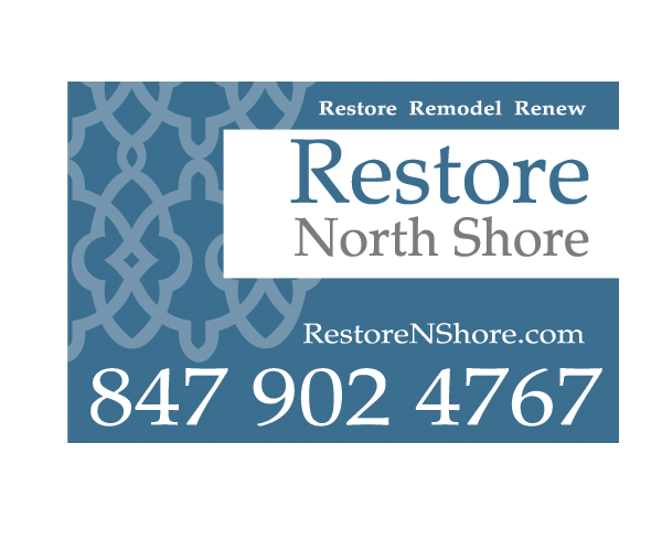
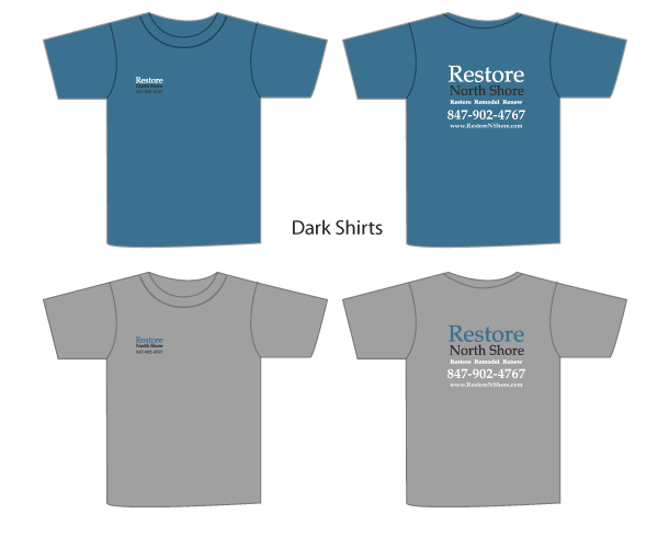
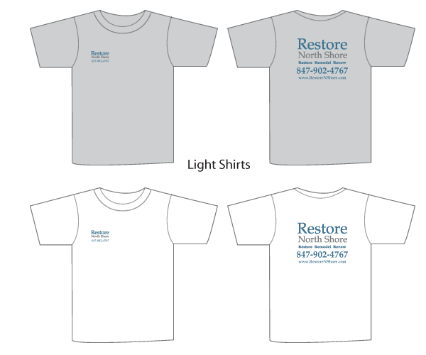
I started working with Restore North Shore, a Chicago remodeling company, a few years back …creating a set of basic brand image elements for them … logo, color palette, type face selection. These element were then integrated into a website and more recently I have created Lawn signs, Car Magnets and t-shirts, working from the elements I originally established.

branded car magnet North Shore ChicagoNorth shore Chicago t shirt design

north shore chicago t shirt design

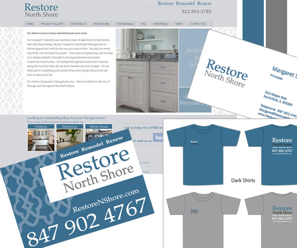
And here are the branding elements all working together, delivering a strong and consistent look for this small Chicago business.
restore north shore chicago branding

If you would like help building a branded image for your small business we are happy to help, learn more about our branding services or contact us today

Using Brand Image Elements Consistently

I talked yesterday about the elements of Brand Image and how building a style guide can help ensure your brand image elements are used in a consistent way thus ensure a strong brand image.

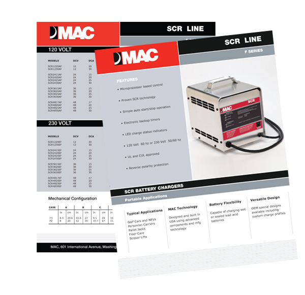
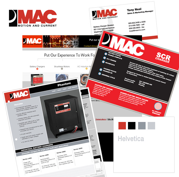
Well here is a great example of using brand image elements consistently, in this  piece of work I completed recently for MAC. The look and feel of this  product sheet fits in beautifully with the rest of their promotional pieces, website, business card etc. by using a predetermined color palette, typeface typesetting, layout and logo treatment.
Product Literature graphic design
Collection of other graphic design pieces produced for MAC
mac brand image