Using Brand Image Elements Consistently

I talked yesterday about the elements of Brand Image and how building a style guide can help ensure your brand image elements are used in a consistent way thus ensure a strong brand image.

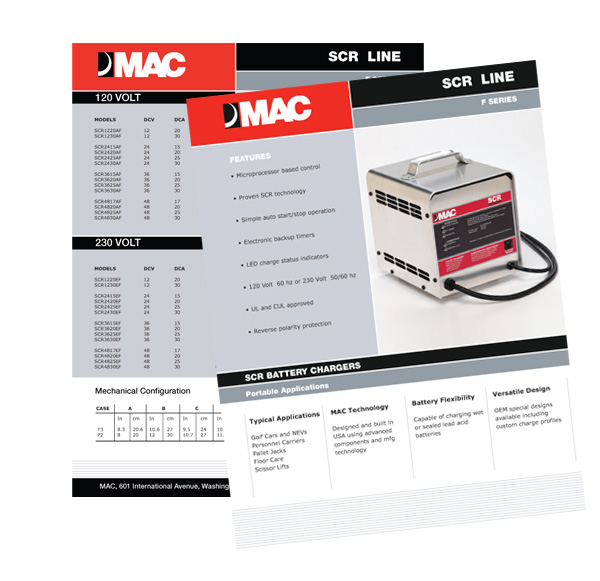
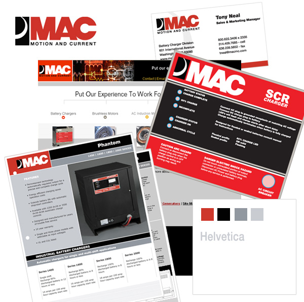
Well here is a great example of using brand image elements consistently, in this  piece of work I completed recently for MAC. The look and feel of this  product sheet fits in beautifully with the rest of their promotional pieces, website, business card etc. by using a predetermined color palette, typeface typesetting, layout and logo treatment.
Product Literature graphic design
Collection of other graphic design pieces produced for MAC
mac brand image

Brand Image Tips for Small Business Owners

Developing a killer brand image is not something  reserved for big corporations such as Pepsi or Apple. A professional and memorable brand image is just as achievable by a small business,  here are a few tips to get you on your way.
brand image tips for small business owners

Define your brand image elements

A carefully crafted collection of brand assets will create an impression with your customers as to your products and services and in essence give them a “gut feeling” about your company. They should evoke something positive, unique and instant. A brand image is not built from a single element like a logo but a collection of elements including;

  •  Logo
  •  Icons
  • Color palette – with primary, secondary and tertiary colors,
  • Type faces
  • Type setting
  • Imagery
  • Tag Line

even things like

  • Scents – ever noticed a distinct scent when you enter a store such as Holister or even IKEA?
  • Texture- think about the texture of bags used in packaging
  • Sound – recognize this
  • Decor – In a bricks and mortar business does your decor enhance why your are trying to convey with the reset of your brand assets?
  • Writing Voice

Creating your brand asset collection is no small feat and is generally the result of extensive research into the market you want to serve and the type of image you want to portray and the experience you want your clients to have.

Create a Branding Style Guide

Once you have established you brand assets it is really useful to create a style guide to optimize the use of your branding elements. For example

  • Logo usage – minimum size, orientation, optimum white space border, use in black and white, position
  • Colors – color combinations, definition of colors in terms of pantone, RGB, CMYK and hex e.g ( #000000)
  • Type Face- Font choices, sizes, colors and line spacing
  • Imagery- styling of imagery- think borders, angles, image filters etc.

Used your brand elements consistently

Your brand image will be most powerful when you use your brand elements consistently, ensuring your clients  receive the same experience no matter how they interact with you.
Here are some of the places where you need to ensure it is used consistently

  • Web site
  • Social media profiles such as Facebook and Twitter
  • Business card
  • Letterhead
  • Email signature
  • Powerpoint presentations
  • Invoices
  • Sales collateral such as brochures/flyers
  • packaging
  • proposals
  • uniforms
  • sales tags

This list could go on and on but once you start down the road of applying your brand assets to your business tools it becomes easier to use your brand assets than not. Need help? Check out our Branding Services.


Looking for a Chicago web design company?

A quick Google search for “Chicago web design company” producing a whopping 68,700,000 results. This is a big town and there are lots of players. Not every design firm will be right for every project and finding a company you are comfortable working with and a good fit for your project, can be a challenge.

Here is a brief snapshot of what we offer

  • Design Services
    • Web site design
    • Web redesign, we can rework what you already have to bring it up to date
    • Blog design
    • WordPress templates
    • Identity design, including logo, letterhead and business cards
    • Complete corporate branding
    • Graphic design for projects such as brochures, posters, trade show banners, advertisements etc
    • Presentations, powerpoint
    • Email templates
    • Banner ads
  • Web Services
    • Domain registration
    • Web hosting
    • Website coding – need a design turned into a working website?
    • eCommerce
  • Marketing Services
    • Search Engine Optimization ( SEO) and keyword analysis
    • Pay per click programs e.g Google Adsense
    • Social networking e.g Facebook, Twitter, LinkedIn
    • Video internet marketing

We have been in business since 2000 and have many very happy clients under our belt, see what some of them have to say here

We are located in Lincolnshire, in the North Shore area of Chicago.

© 2011 Chicago Web Designer

Is your brand image consistent?

I am working on a couple of branding projects at the moment, one is creating everything from scratch ( see the start here)  and the other is a brand consistency project.

Is your brand image consistent? Do your customers have the same experience however they interact with you. From visiting your web site, to paging through a brochure or even receiving and invoice, all these interactions offer an opportunity to convey your unique message. Lack of consistency creates confusion and sends conflicting messages to your clients.

For example your web site projects an air of professionalism and trust through design, a well thought out color palette, fonts, imagery and excellent copy. Does that image carry through to your brochures, folders,  flyers or whatever other marketing pieces you use, or have they been hastily put together with no thought as to what they communicate?

Here is brand consistency in action, from web site through to presentation folder and DVD labeling the client is getting the same message.

Professional website

DVD folder design

Interested in how we can give your collateral material a more branded and polished look? Checked out our Branding Services.

©: 2011 Chicago web designer

Blushing: The Chicago web designer

It is my objective to provide exceptional service for my clients and getting a recommendation like the one below on Linked In makes my face break out into a wide grin … and maybe even blush a little!

“Zoe has that rare combination of broad vision and tactical expertise, especially when it comes to careful listening. She is able to form the concept into a distinctive message, and then follows through with outstanding execution. Really knows her business. Zoe is as much an astute advisor as service provider.”

Top qualities: Great Results, Expert, Good Value

Peter Meder

I worked with Peter earlier this year on a web and branding project for his Chicago based headhunting company.

Thanks Peter, for taking the time to write such a flattering recommendation.
2010 © Chicago web designer

Top 5 Reasons for Redesigning a website.

We hear ” I need my web site redesigned” quite a bit these days.  While there are many reasons here are our top picks.

  1. I need my website to look more professional.
    Looks are everything and online you have just a few seconds to make that all important first impression. A well designed fast loading web site can do wonders to encapsulate your expertise and reach and engage your target audience.
  2. We need our content reorganized.
    If your site visitors are having click through page after page to get to the information they want, you are making then work too hard. A web site with intuitive navigation and well organized content = “a don’t make me think visitor”
  3. My web site is not doing what I want it to do.
    Whether you want your site to act as a lead generation tool,  a portal of information, or a selling platform, it is important to guide or funnel the site visitors exactly where you want them to go via “call to actions”
  4. I need to add some additional functionality
    Want to add a blog, additional pages, links to your social media networks? A well thought out web site will always be able to accommodate additional functionality without a complete redesign but sometimes there comes a point  when a redesign is the best options.
  5. I want my site to perform better in the search engines.
    The structure and design of a web site  bears a huge relation on how well a site performs in the search engines and a skilled web designer will know how to optimize all elements that make up a web site, for best search engine results.

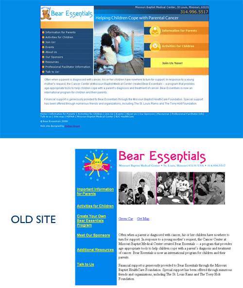
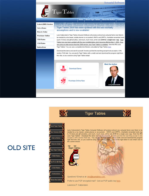
Now lets take a look at these  in action with three before and after web redesign projects.

Peter Meder and Company

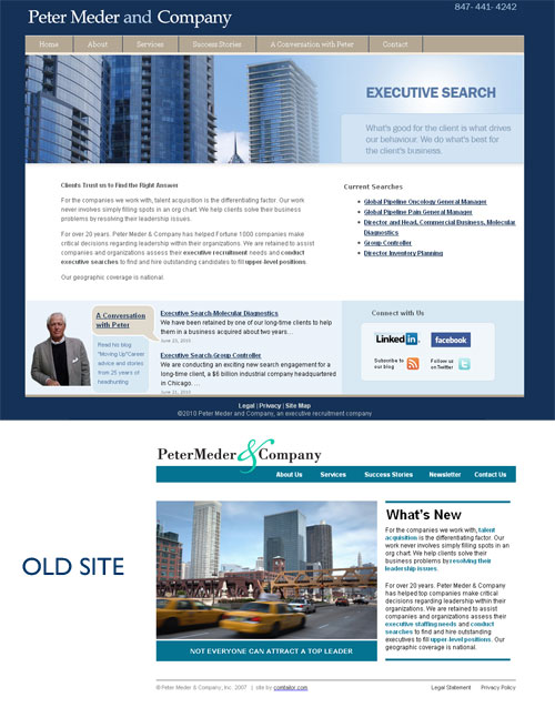
We addressed all 5 reasons in the redesign of a web site for Chicago headhunter, Peter Meder and Company.  The new site has a much more professional look/feel and immediately imparts the nature of the business.   Visitors have easy access to the current position searches which is a huge time saver for both client and job hunter.


Bear Essentials

Content reorganization was the main driver behind our redesign of the Bear Essentials web site. We produced a much more appealing user friendly site with clear call to actions.


Tiger Tables

A more professional look was the order of the day for our redesign of Tiger Tables with clear call to actions.

Do you have a web site that could do with a makeover? We’d love to have an opportunity to talk with you.

Call us at 847 607 8679

2010 © Chicago Web Designer