I am one of those people who dislikes having a messy desk, piles of paper and clutter distract my creative juices. So my office is a place of order and serenity
and in true creative fashion I have made all the artwork on the walls.
There comes a time in the life of every web site when a re-design is in order. This can be driven by a new brand image, making better use of advancing web technologies or simply the need to provide a better organizational structure.
Needing to re-organize was the driving force behind a design shake up of Creative in Chicago, a craft and home decor blog and the outlet for my personal creative endeavors.
When I first started this blog I opted for a quick and easy Blogger template, simply adding a custom header and working with the template designer to add a unique background and set the blog layout. It was fully functional but not the most appealing site in the world, but as I had no idea if it was something I was going to write on a regular basis, I didn’t want to invest a load of time in setting it up.
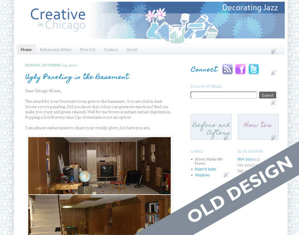
As it turns out the blog now has over 200 posts with over 30K visitor a month and was in dire need of a shake up, so it underwent a redesign . For regular blogging I generally recommend using WordPress but because I did not want to spend more time than necessary, I decided to stick with Blogger.
During the redesign process I wanted to address
In re-designing a site I wanted to keep some semblance of the original site so not to completely alienate my readers with something totally new and unexpected. I kept the background patterns and type face of “Creative in Chicago” the same but completely reworked the header, creating a little more pop with the use of color and simple design elements and also integrated social media icons and RSS feed subscription.
I also moved away from the full post format on the home and category pages. Instead the reader is now offered a summary of each post with an thumbnail picture. It is much easier to see at a glance the content of the site.
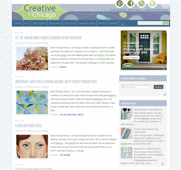
Although I had been using categories to define content there lacked a definite structure which I could use as navigational tool. I reassessed and ended up with five main categories : Art – Crafts projects – Decorating – Free Stuff – Garden projects and within these categories I defined a number of sub categories. For example the category Decorating has five sub categories: Before and Afters – Painting – Decorative Accents – Wall Art Ideas- Windows . The navigation bar was reworked to include these main blog categories, with drop down elements for the subcategories. A search bar was also prominently placed. Posts that were buried deep within the blog are now much more accessible.
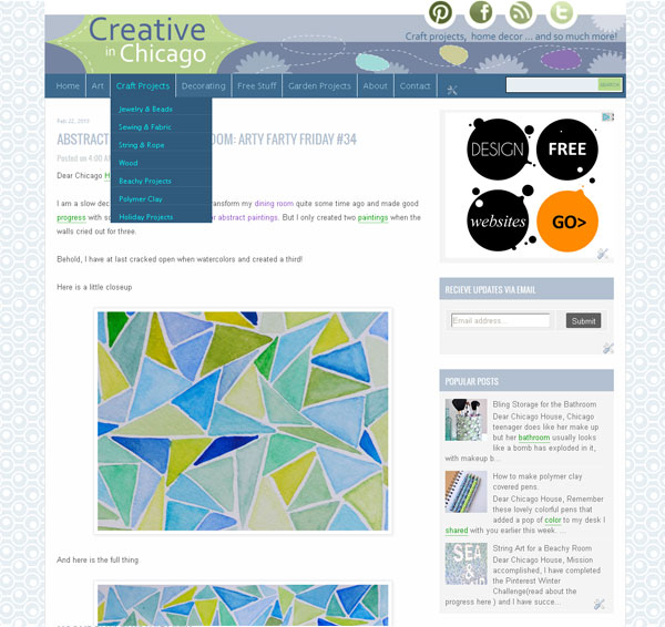
I decided to incorporate Google Adsense into the site and allotted a spot high on the sidebar for placement. I wanted a position that would work both well for click throughs but not to be too invasive for my readers. I am also experimenting with in-line advertising through infolink. Both are working nicely!
Fortunately Blogger makes this really easy and it is as simple as selecting a pre-made template to display when anyone accesses the site with a mobile device.
Here is a sneaky look at a new web site we are working on for a Chicago custom home builder.
The client has provided an abundance of photos and we have been spoiled for choice when it comes to selecting which ones to use. During the defining stage of the project we discussed color palettes and the idea of taking inspiration from a slate roof with copper gutter was born.
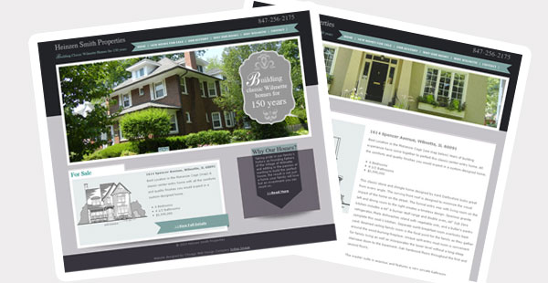
The project is in development stage of our process and should be live in a few weeks.
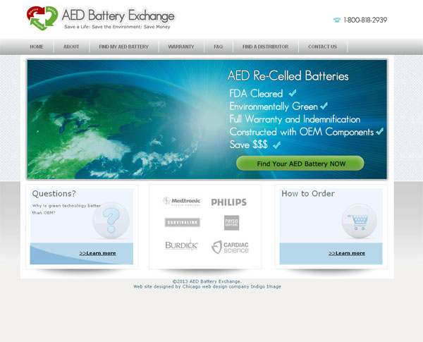
Launch today is a freshly re-designed website for AED Battery Exchange aedbatteryexchange.com. Located in the far north suburbs of Chicago, they are leading the way in re- celling batteries for Automated external defibrillators and wanted a web site which truly matched their innovative product.
Also on their want list was a professional looking site which was easy to navigate and appealing to their target audience.
We created a very clean look and feel, the home page featuring an eye catching Call to Action banner to “Find your AED battery”.
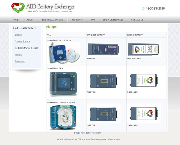
They batteries were categorized in terms on manufacturer and featured images which can be enlarged so the user can clarify the correct battery.
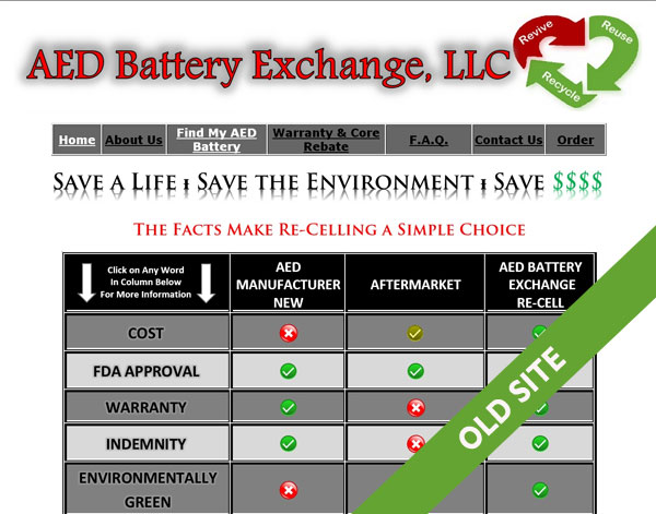
The site is definitely a step up from their old one
Here is another project which showcases the consistent use of image branding elements as I talked about in my post Brand Image Tips for Small business Owners.
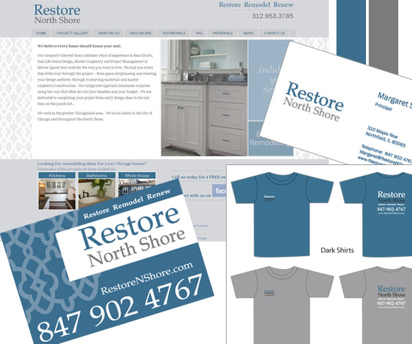
I started working with Restore North Shore, a Chicago remodeling company, a few years back …creating a set of basic brand image elements for them … logo, color palette, type face selection. These element were then integrated into a website and more recently I have created Lawn signs, Car Magnets and t-shirts, working from the elements I originally established.
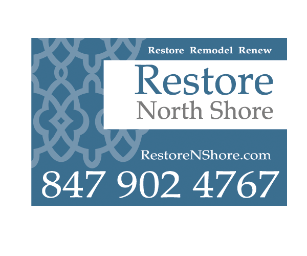
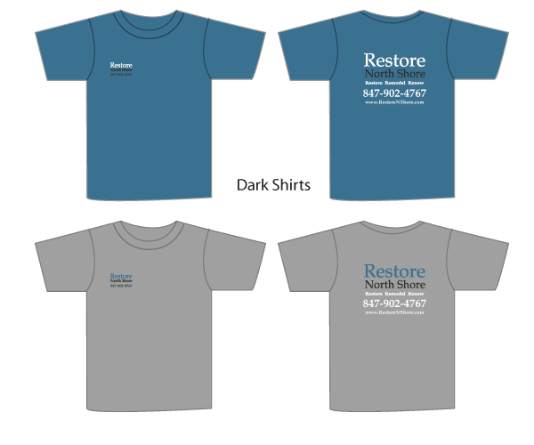
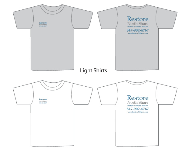
And here are the branding elements all working together, delivering a strong and consistent look for this small Chicago business.
If you would like help building a branded image for your small business we are happy to help, learn more about our branding services or contact us today
As a web and graphic designer my “design” eyes never seem to rest. If I am out and about driving, I am reviewing and critiquing logos on the sides of vehicles, if I am waiting at a clients office for a meeting to start I am analyzing the patterns in the carpet or on the wall coverings. Just sitting here as I type I can see patterns every where from the wood grain on my desk to the grill of my computer speakers. I am constantly absorbing design all around me; patterns, textures, shapes, color palettes, color combinations, type faces … to many it may sound exhausting …but to me it’s not!
Even at 30,000 feet the “Chicago web designers eye” is primed and ready. As I peered out of the window on a recent flight to Vegas I was greeted by an amazing patchwork of shapes and contours that had been highlighted by a sprinkling of snow. How cool is that!


How much does a website cost? If you are visiting this page looking for a definitive answer then I am going to disappoint because pricing a website can be a complicated process but it is a question on every potential client’s mind. The cost of a web site is a little bit like the cost of a house, the bigger and more complex the heftier the price tag. So lets break things down a bit to give you an insight as to where the costs lie and walk through some client scenarios.
Lets first consider the type of company quoting your project. A design agency with a portfolio full of fortune 500 companies and a trendy studio in a skyscraper in down town Chicago is going to charge more …well.. because they have to to cover their costs. If you are large company with mega$$ they may be a good fit. An offshore, say, Indian based web design company, may give you an unbelievably cheap quote but how comfortable are you doing business that way?
A good approach to selecting a company to quote your project is to take a good look at their portfolio and services and if their offerings match what you are after, they are worth a call. Also don’t be afraid to check out any testimonials.
Any decent web design company will lead you through a discovery process (ours is free) to understand what it is you want to accomplish with your web presence. Come prepared to talk about your marketing objectives, the type of functionality you’d like on your site ( e.g shopping cart, content management, video integration, social media, blogging capabilities etc.), who your customers are, who you competition is and what makes you unique. The more information you can provide at this stage the better, as the information will be used to create a comprehensive proposal which will outline the best plan of action to achieve your goals and a realistic price.
Whatever the goals of the project, the cost to create it can generally be broken down into the following categories
Design
Programming
Launch
Marketing
Now not every project is going to require all aspects of these categories so lets take a look at a few client scenarios
Client A: Online Brochure Website
A small interior design business requires a simple online brochure type website to market their services. They would like to set up a Facebook page, an email management tool so they can send out a newsletter and a Pinterst account to pin photographs of their design work. They serve a local area and would like to rank well for anyone carrying out a local search for an interior designer- they are not interested in paid advertising although this may change depending upon the site traffic. They already have an offline brand image but require a domain name. The site will be between 10 and 12 pages in total.
Project Estimate
Design: 12 hrs
Programing: 18 hrs
Launch: 4 hrs
Marketing: 10 hrs
Total: 44 hrs = $4,400
Client B: Content Management Website
A company offering summer camps wants a web site they can manage themselves. The would like to upload photographs of camp events and allow parents to register their children – they already have an online application to allow this through a 3rd party but this need to be integrated seamlessly into the site. They would also like to be able to write a blog. They have a Facebook profile already set up but this to be linked to the site. Most of their customers are by word of mouth but they would like a basic SEO and search engine submission. They have a comprehensive offline style guide and already have a domain name. The site will be approximately 25 pages.
Project Estimate
Design: 24 hrs
Programming: 50 hrs
Launch: 8 hrs
Marketing: 5hrs
Total: 87 hrs = $8,700
Client C: E commerce Website
A small business want to launch an online store to sell their products. They also want the ability for their clients to sign up for an e-newsletter which will offer monthly promotions. They need assistance in selecting a provider for these email blasts and a custom template designed for the newsletter.They already have a merchant account set up and are interested in paid advertising to generate traffic. They have a logo and all copy for the website ready.
Design: 35 hrs
Programming: 70 hrs
Launch: 20 hrs
Marketing: 20 hrs
Total: 145 hrs = $14,500
As you can see the price range for a website can vary dramatically depending on what you want it do do and want to achieve. If you would like us to quote on your next website give “The Chicago web Designer” a call at 847 607 8679, we may be a Chicago web design company but we don’t have a trendy studio in the city and don’t charge ridiculous prices!
As 2012 rolls to a close I like to take a look back at some of the projects I’ve worked on over the year. It’s been a real mixed bag but I must have enjoyed myself as the year has flown by. I have created websites, logos, brochures, illustrations for a book, power point graphics, car magnets, lawn signs, business cards, mobile websites, e commerce sites, an icon for one of the largest banks in America and even the cover for a book. My clients have been located both here in Chicago and a little further further afield… St Louis, Louisville, Wentzville and further away still … Belgium. There are no geographical boundaries for the Chicago Web Designer – your creative partner.
So here is a little showcase of my 2012 web and graphic work
January: Powerpoint graphics for a large national bank
February: Web concept project for a St Louis bank
March: WordPress conversion project for Ruth Hasser
April: Identity design for Select Food Sales
May: Community Website for the Humble Catholic
June: New website and branding elements for Restore North Shore
July: Refresh of Lincolnshire Academy of Dance
August: Rework of The Rockwood
September: e commerce site- Zagros Robotics
October: Illustrations and cover design for book: Mr Bison’s Journal
November: Responsive web site design for Mr Bison
December: Identity deign for InDeBom
I am looking forward to another bag of design challenges in 2013!
The name of this blog is “The Chicago Web Designer” but that doesn’t mean our clients are all based in Chicago or that we only offer web design.
Take this recent project for example; a logo and business card design for a company based in Belgium.
Web design makes up about 70% of the creative projects we undertake but in the last year alone we have seen projects ranging from icon creation for one of the biggest national banks in America to illustrating a self published book. We are more than happy to work with clients requiring traditional design skills, say for the design of a new logo, business card or brochure, but also never shy away from any creative project. Sometimes a client will call with a report or presentation that needs to look top notch and are looking for our creative input. No project is too small for the Chicago web designer.
View our complete logo portfolio
So yesterday I talked about the launch of a new website mrbison.com and how we had taken the opportunity to recode it as a responsive web site.
But what does that mean…what is a responsive web site?
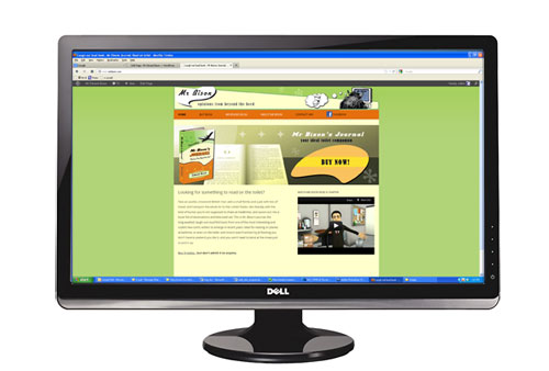
Simply put, it is a site that will give the visitor an optimal viewing experience regardless of what device they are using to access it- desktop, laptop, tablet or phone. And as I am all about graphics let me show you in pictures exactly what I mean.
Here is the site on a 24″ desk top monitor
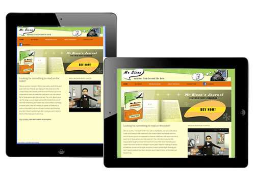
Here it is on an iPad – both portrait and landscape orientation
and here it is on an i Phone
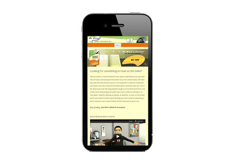
The way the site is coded means it automatically “responds” to what ever device it it viewed from. Here are some of the things that happen
You don’t have to view the site on all of these different devices to see this responsive nature in action, simply visit the site and re-size your browser window…getting smaller and smaller as you do.. see how the site changes?