New Web site for Burns Recovered

Launched this week is a brand new look for the Burns Recovered website
burns recovered non profit website

I have been working, pro bono, for this not for profit organization for the last six years. In that time I have help them move with the times, updating a very dated website and then making the web site responsive and even integrating a new logo.

This latest update was driven by the old website becoming very cluttered as it had become updated. The new look offers a much cleaner simpler look and features the stunning photographs from the book published by Burns Recovered “Beauty Is…” The site offers very clear call to actions and performs beautifully across all devices.

Here is what Lynn Heulsmann, Executive Director of Burns Recovered had to say

“Indigo Image created a dynamic, professional and engaging website for Burns Recovered/Midwest Children’s Burn Camp.  In addition to the site being desktop and mobile accessible, it is aesthetically pleasing  and we are thrilled with the outcome.”

New Website for Motor Appliance Corporation

We have been working with Motor Appliance Corporation for many years… mostly on the graphic design of technical products flyers and precision design of overlay stickers for their products.

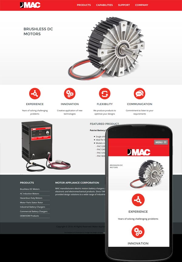
The re-design of their website was a project that had been on the back-burner for some time but just last week we launched a brand new shiny site for them. Visit it at macmc.com

macmc responsice website

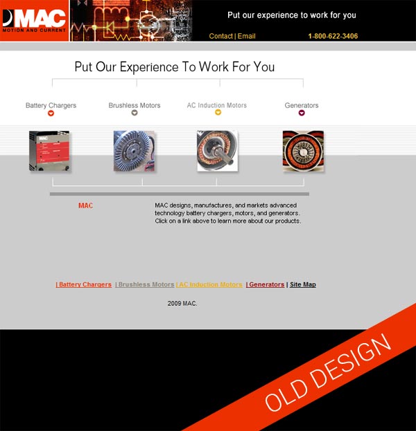
Web re-design projects are always really satisfying particularly when you take a look back. Here is the original site. It had served them well for many years but was looking rather dated and wasn’t working well on mobile devices

website redesign

The new website was built on the WordPress platform which will give the client much more freedom to self maintain. We offer full training on using WordPress in the form of screenshot videos in which we walk through a specific task. This approach works really well as they can be viewed and revisited as many times as as required.

The site itself is very clean, with power pops of red in keeping with the branding elements and is fully responsive.

New Website for Creative in Chicago

Creative in Chicago started life on the Blogger platform in September 2010. It that time it has seen amazing growth with monthly traffic regularly reaching 60K hits and a good steady revenue from advertising. While Blogger is a fantastic platform it does have it’s limitations and it was time to take to the site to the next level and convert it to a self hosted WordPress site. With over 340 posts this was no mean feat!

There were two really critical elements to the project.

  1. Maintain all the equity built up with the search engines and across social media platforms. It was important that the urls’s of all the pages remained the same so anyone clicking on a link would be delivered to the correct page and not be met with the dreaded “NOT FOUND” screen.
  2. A staggering 60% of the visits to the site come from mobile devices so it was imperative that mobile users have the best experience possible.

It was also time to give the site a fresh new look so the project also included a redesign element.

The home page now offers a featured project and fantastic photographs are displayed throughout.
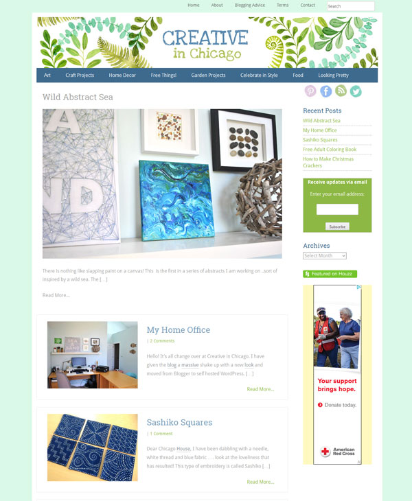
creative-in-chicago-wordpress-website
And the site has been carefully organized into categories which all give a photo overview and excerpt of each post.
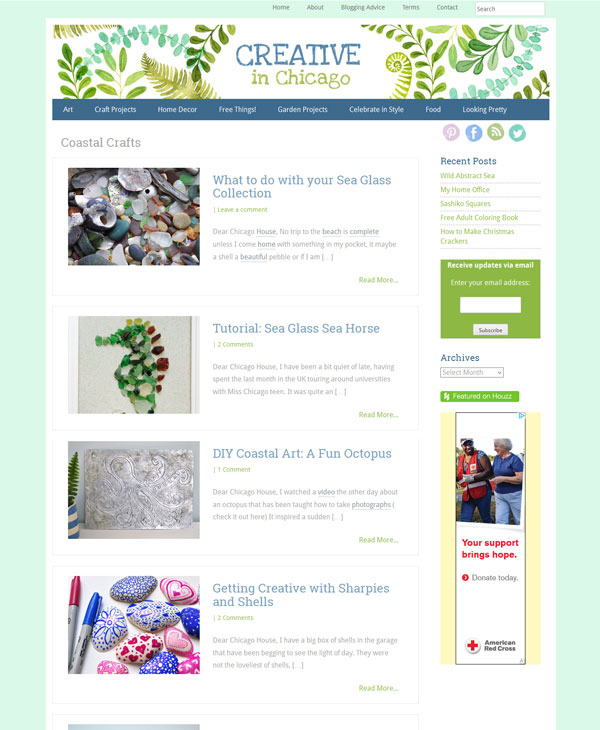
creative in chicago categories
and are easily accessible through a well thought out drop down navigation which converts nicely into a mobile friendly tool for mobile users
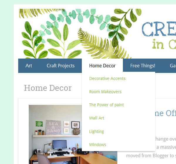
creative-in-chicago-wordpress-website-2

The site was launched with zero loss of performance – the traffic is steady and strong and advertising revenues constant.
New Website for Chicago Headhunting Company

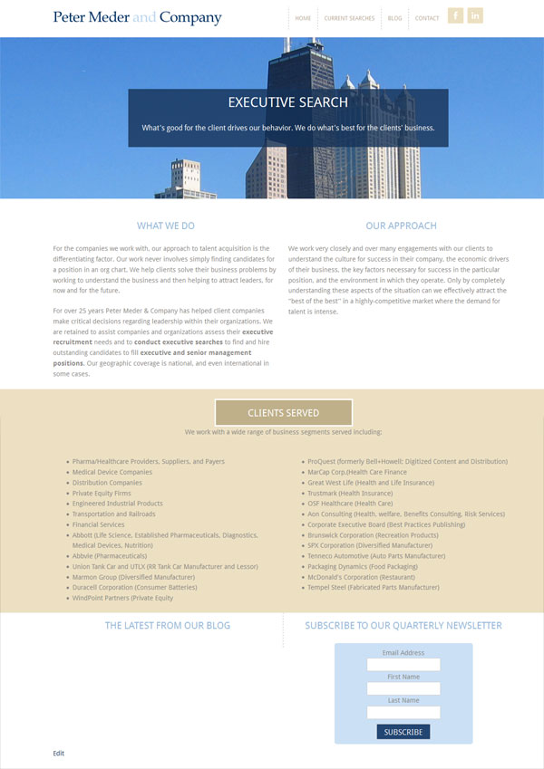
We have worked with Peter Meder & Company, a Chicago executive headhunting company, for over six years now. The original site we created had served them well, but was created before the popularity of smartphones … as a result it did not offer site visitors an optimum “mobile experience”.

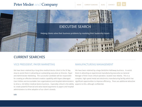
The new site, launched today, gives the company a brand new look which is more up to date and visitors can now have a good experience from whatever device they are using to access the site, desktop to phone. Check it out at http://pmedercompany.com/

new website for chicago headhunter

new website for chicago headhunter

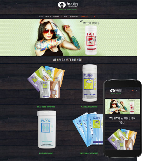
eCommerce website for Body Wipe Company

Launched today is a brand new e commerce website for Body Wipe Company

body wipe company website

The site sells all sorts of body wipes including a brand concept in wipes – Tat Towels. These wipes are specifically designed to moisturize and enhance older tattoos making them POP!

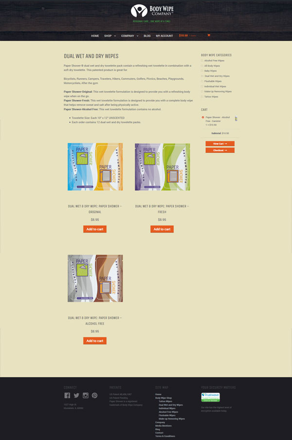
body wipe company ecommerce

The site has a hip look with no fluff. It was designed to keep the shopping experience as streamlined as possible, enabling shoppers to get in and out  quickly, with minimum clicks and fuss. It even gives them multiple options when it come to payment – credit card, Paypal or even payment through Amazon.  The site is of course mobile friendly.

Visit it at https://www.bodywipecompany.com/

body wipe shop ecommerce

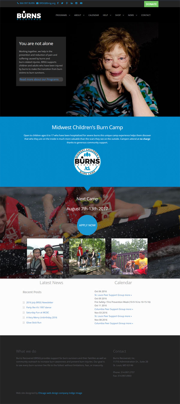
Mini Makeover for Burns Recovered Web Site

We have been providing pro bono web design work for Burns Recovered Support Group for over 5 years now and were delighted to hear, that late last year, they had won some additional pro bono marketing efforts though “Creatathon” The end result was a fantastic new logo.

Burns-Logo-Final

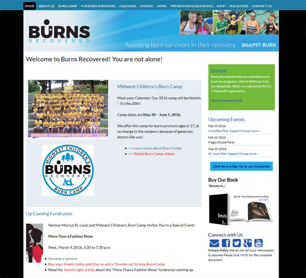
Just switching out the logo was not going to cut it so we gave the site a mini makeover. The color palette was updated to blue hues, the type face changed and the site generally given a more open feeling that was far more inline with the brand image.

wordpress website chicago

Here is what  Executive Director, Julie Peetz had to say

“We’ve had great feedback on the new look—the color scheme turned out great! I love the white space—it looks clean and fresh
Thank you so much!”

New Website For Senior Living Community

Redesign projects are always particularly satisfying for me, giving an old dated website a new lease of live with better functionality, is very pleasing all round.

One of our St Louis clients, The Fountains of West County, approached us needing a revamp of both theirs and a sister web site.

The first of these went live this week.

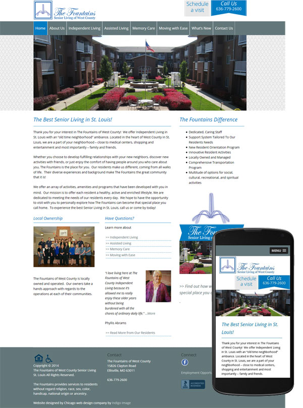
senior-living-st-louis-website-mobile

We gave the site a fresh new look and took advantage in the redesign process to improve the site architecture making it easier for users to find exactly what were looking for easily. The site was built on WordPress and is mobile friendly.

senior-living-st-louis-website-inner

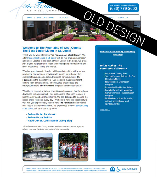
And for a peep back in time because who does love a good before and after, here is the original site.


re-designed-web-site

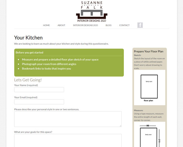
New Website offering Online Interior Design Service

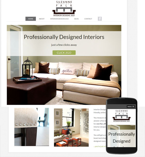
Launched today is a new website, Interior Designs 2GO – an online interior design service. The site is the brain child of HGTV kitchen Crashers designer, Suzanne Falk.

online interior design service chicago

Users need only measure and photograph their space, answer a room specific questionnaire. A professional designer will interpret it all and create a new custom look for their room.

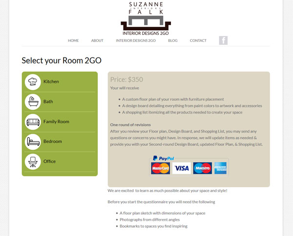
online-interior-design-service-website-chicago-2

online interior design service chicago

The design of the site was kept clean and simple and the process of purchasing the service, short and sweet.

The site was built on the WordPress platform and is mobile friendly.

Making your Website Mobile Friendly

A client recently contacted me with a problem they were having with their site. They had  understood the need to be mobile friendly but had taken the approach of having all mobile users directed to a stand alone third party app. The problem was it  had been built for them by a company that had now gone out of business and they were unable to make any changes.  Mobile users visiting their site were be directed to an app which had outdated information, including that all important telephone number! Considering now that mobile devices make up for more traffic than desk top devices, this was turning into a huge problem for them.

My solution to their problem was two fold.

  1. Firstly I stripped out all the code in their site that was causing mobile visitors to be directed to the defunct app, better to reach a site with correct information even if it isn’t mobile friendly..
  2. Secondly I did some major “under the hood” work on their WordPress template, converting it to a template that responds beautifully whatever device is being used to view it.

roberg-tax-solutions-mobile-website

The design of the desktop version of the website stayed almost identical …they were more that happy with that aspect of the site and didn’t want to change it.

Mobile friendly problem solved! Check out their new mobile friendly responsive web site