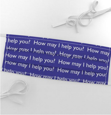
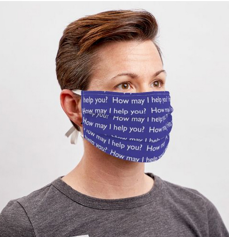
Branded Pattern Face Mask Design

Let’s face it no one is whopping with joy at the thought of a wearing face masks. But for the time being they are here to stay.

So why not put a positive spin one them.

They are a new way for your employees to interact with your customers so it makes sense to utilize your brand image assets.

And here is where we can help you stand out from the crowd by designing a custom pattern in keeping with your brand image and message.

It can be as simple as a pattern featuring your logo icon
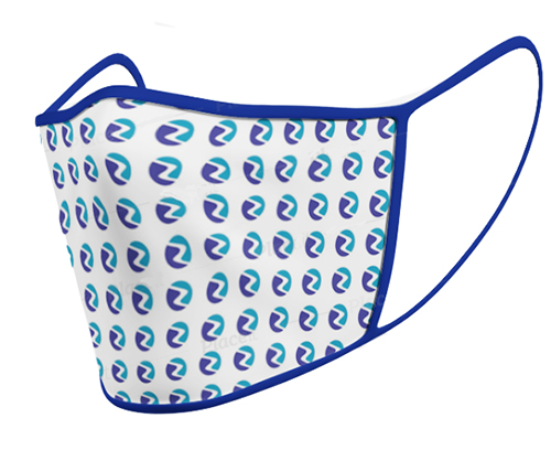
branded face mask with logo

Or maybe a message

Or even promote a new service
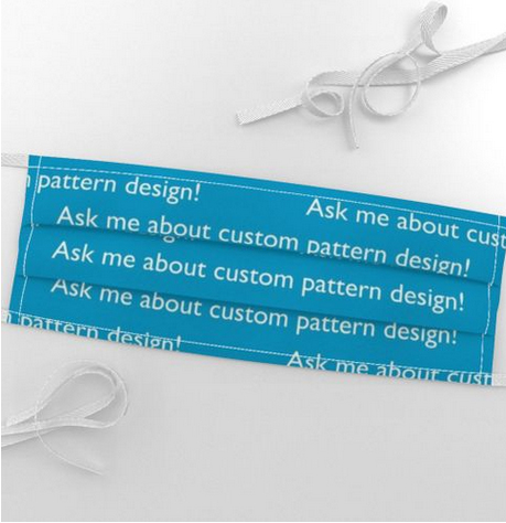
ask me about custom pattern design

These are very examples but we can produce a custom pattern as complicated as you require and help you keep your brand message consistent.

Interested?

A Small Business Brand

Creating an effective brand image for your small business can “up your game” and let you compete with the bigger players in whatever arena you operate.

Are your customers having the same experience however they interact with you, or are they faced with mixed messages a mishmash of graphics and just general confusion?

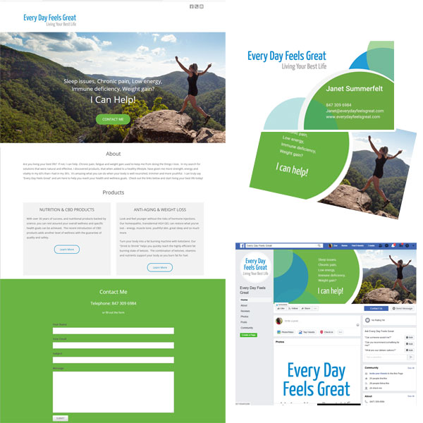
We have just completed a project for a Chicago based small business, Every Day Feels Great, who came to us looking to create a brand for their wellness business.

The project started with brainstorming a tag line which summed up what they want for their clients. Once the was established we worked it into a very simple text logo.

We then went on to design a business card, a simple one page website and graphics for Facebook.

Consistency is king here. The same color palette, imagery, graphics and voice ensure a flawless branded experience.

Check out the website at

https://everydayfeelsgreat.com/

Rebranding for The Chicago Web Designer

It was time.

Our previous brand image has served us well but we have been wanting to shake things up and redesign it for over a year now. Finding time has been difficult but we have finally rolled out a new brand image for The Chicago Web Designer, Indigo Image.

Lets start at the beginning with the first thing we tackled … an update of our logo.

Logo Redesign

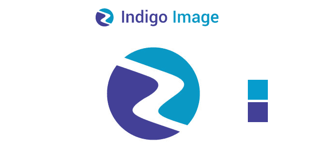
Chicago web designer logo

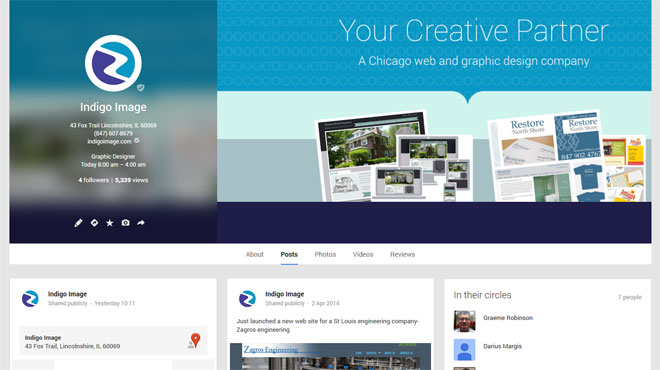
We have dropped our rectangular icon replacing it with a circle but the “pathway” shape remains the same, the color indigo is now complimented with a fresh blue. We also updated the typeface to a less boxy font. While the logo is not a million miles away from where we started it is definitely fresher. The circular icon is nicely compatible with the size and shape restrictions for many social media profile icons ( see what we mean by checking out our Google + page)

Website Re-design

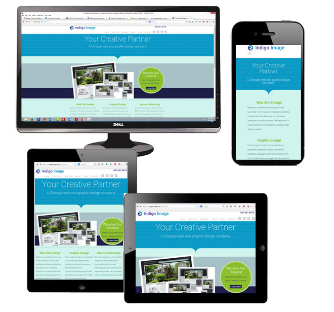
One of the main drivers behind the redesign of our website is the fact there has been a huge surge in traffic from mobile devices such as tablets and smart phones. The growth is so massive it is actually predicted  web traffic from these devices is set to pass traffic from desktop computers this summer. While we had coded our previous design to react responsively ( see this blog post), time constraints meant that we didn’t redesign …just recoded. It was a good stop gap but needed fixing!

Both the design and the code has now been optimized for viewing on any device.

responsive design chicago web designer

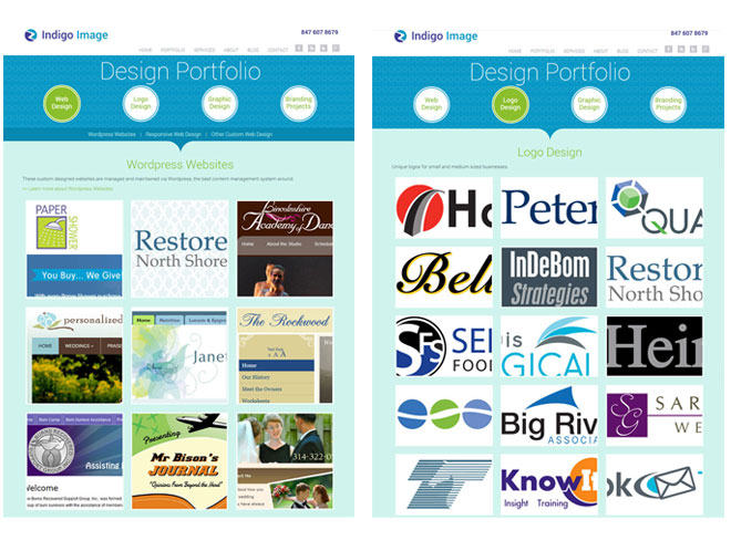
The re design gave us the opportunity for some content re-organization. The main area we reworked was the portfolio section. It is now split into four categories

We used chunky tiles to navigate portfolio items and finger friendly navigation buttons to switch between portfolio galleries.

chicago web designer portfolio

Social Media

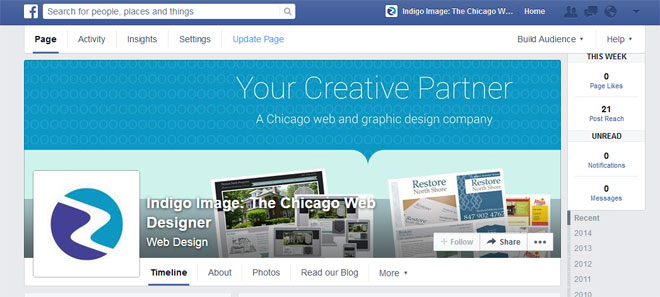
Our re-branding has been carried through to our social media profiles

Here is our Facebook page

facebook branding

and our Goggle + page

Google plus branding

and a new look for our Twitter profile

Twitter branding

Graphic Design for a Car Rear Window

Earlier this year I shared a post about the design of a car graphic for client Janet Summerfelt.

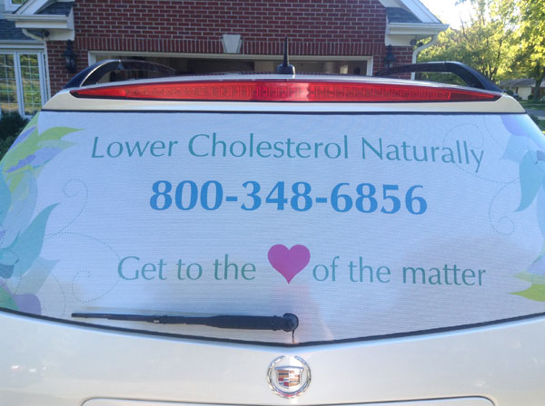
I followed up with her recently and was delighted to hear she was thrilled to bits with her rear window graphic. She sent me this photo

car decal design chicago

It is always tricky to render  a design that is going to be applied to a 3d surface, but as you can see from the proofing mockup I prepared prior to printing,  it was spot on.

rear window car graphic design

Thanks for sharing this photo Janet!

The Secret of Brand Image Elements

If you are a small business owner are you getting as much bang for your buck from your brand image elements as you would like?

Confused by what your brand image elements actually are?

Think logo, color palette, type faces and  imagery.   If your marketing materials are using a hodge-podge of colors and the look and feel of any printed materials don’t match the look and feel of your website, you are missing out on the chance of building that all important factor of  “recognition” which is such a big part of branding.

Not quite sure if you are achieving this? Pull up your website, dig out your brochure, business card, an invoice, flyer, newspaper ad, etc. Do all of these materials look like they came from the same company?

Using your brand image elements effectively is not rocket science, the secret is defining them and then using them consistently.

Take a look at this lawn sign we have just created for Chicago small business, Heinzen Smith Properties

heinzensmith.com lawn sign

and compare it to their web site

Home builder wilmette IL Chicago

It is quite obvious with just a cursory glance that these two marketing pieces are from the same company, the logo is the same, they share a color palette and both use similar design elements.

If you would like help building a comprehensive collection of brand image elements we are happy to help, learn more about our branding services or contact us today