WordPress may be the preferred blogging platform for many but Google Blogger is still hugely popular.
Over the years the administrative dashboard has changed very little but yesterday a much needed and completely new design to the dashboard for Blogger Draft was implemented .
I use Blogger in Draft for a personal blog I write “Creative in Chicago”
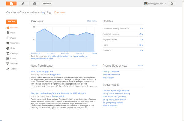
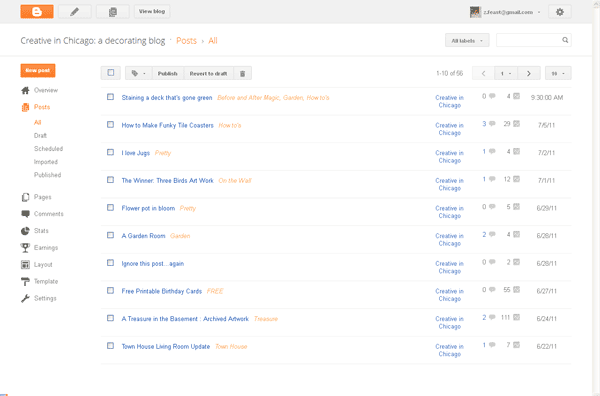
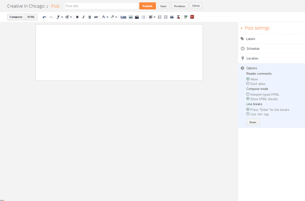
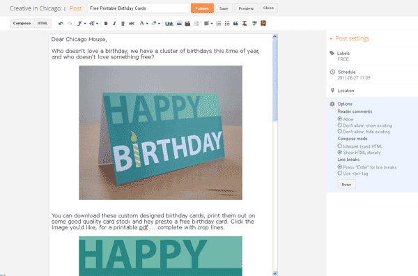
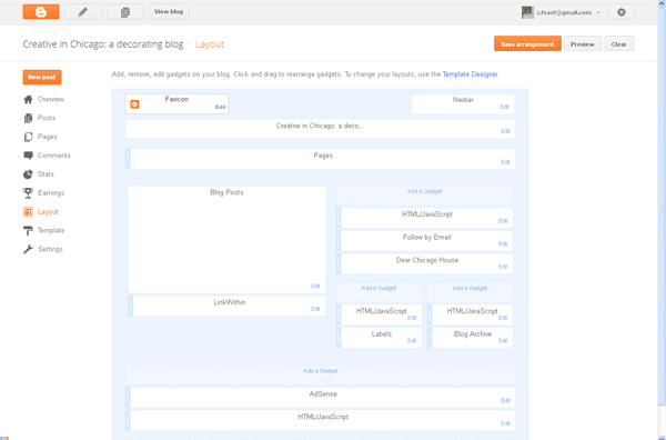
The overall appearance is a very clean and sleek design with a lot of the clunkiness of the old dashboard gone. A top navigation has been replaced by a left hand side drop down tool with intuitive little icons and a simple color palette is easy on the eye.
Here a a few screenshots
Dashboard Home
Post Page
Layout Page
As with any new release it will take a bit of getting used to, especially as I have been using the old interface for over six years. From what I have seen so far I like the direction Google has taken in this redesign.
© 2011 Chicago Web Designer


