Hands up if you like looking at before and after projects? Me!
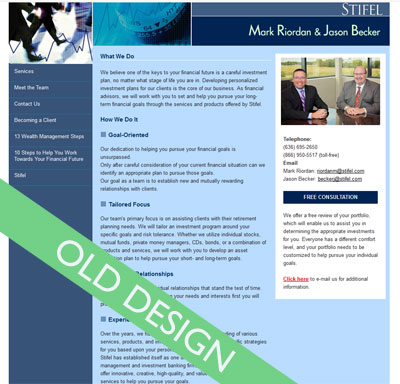
Here is a mini redesign project I did for St Louis financial advisors, Mark and Jason. The site before

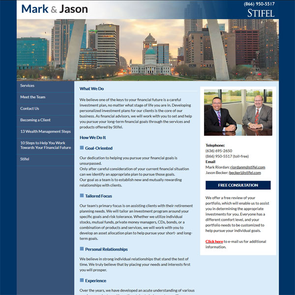
and after

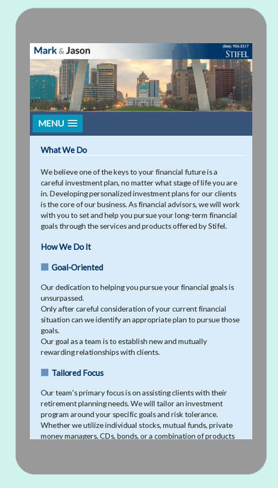
I added a new logo, tweaked the colors, reworked the header and used a more modern font for the copy.
The result a much cleaner and inviting site… mobile friendly too!


