Need Help with a Wix Website?

I market myself as “A Creative Partner for your Small Business” and if your small business website is built using Wix, I can help by making it not only look wonderful but perform seamlessly too.

The Wix platform offers a drag and drop interface and is described on their site as “easy for any person to create websites – no design skills needed”. While it certainly offers plenty of tools to make a site look pretty, you really do need an understanding of how best to present your content to engage your users and encourage them down certain paths. This is where tapping in on the experience of a professional web designer can help take your Wix website to the next level.

This was exactly what Malorie Blake,a registered dietitian based in York PA, was looking for her website Wholesome365.com

The re-working of her Wix site involved re branding with her new logo and complimentary color palette and font choices.

We also

  • Reorganized navigation for better content flow and usability and built out footer elements
  • Re-worked home page for improved information and call to action. e.g. Detailing major services and lead generation via a free phone consultation
  • Improved the design and added better call to action on inner pages of site e.g. Booking appointments or purchasing packages
  • Ensured design elements were consistent throughout site
  • Optimized pages and file names for SEO purposes

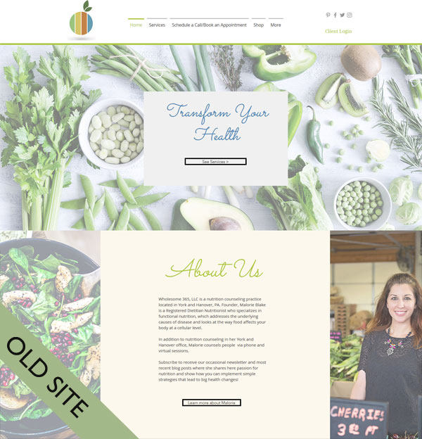
Here is the finished home page
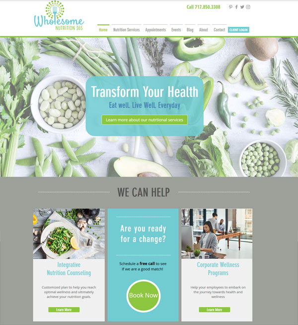
wholesome nutrition wix website


Compared to where we started from

As you can see the site is now far more focused on the user and how they can be directed to specific areas easily without having to think. The eye is effortlessly drawn in to the Call to actions

If you need help with a Wix website I am here to help. Give me a call at 636 795 7988 or contact me via email

WordPress Template Customization for Labor Ad Network

I have been in business a long time and have built hundreds of websites. Websites come and go, they get redesigned or disappear altogether but a site I built for Labor Advertising Network in 2005 was still in use. As you can imagine it was looking rather dated and lacked modern day functionality.

I have kept in contact with the client and last month got a call from them saying they were ready to bring their website to present day standards but were on a very tight budget. They wanted it converted to a WordPress website so they would be able to edit it themselves and also ensure the new site offered mobile friendliness to their users.

Recognizing their budget considerations, the most cost effective approach for them was to use a ready made WordPress template.

After installing and configuring WordPress on their server I selected the Twenty Seventeen template to customize. It is a very clean template, lends itself to small uncomplicated sites and is of course, beautifully mobile friendly.

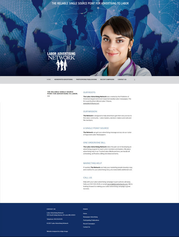
The Labor Advertising Network is a network is designed to help advertisers get their story across to the Labor community. This distribution network is conveyed in three custom designed graphics which feature in the huge banner area on the home page. Each banner features a different professional and they are randomized so a different one displays each time the home page is visited.


twenty seventeen larger banner

twenty seventeen larger banner

Here is the home page in action

labor ad network wordpress website

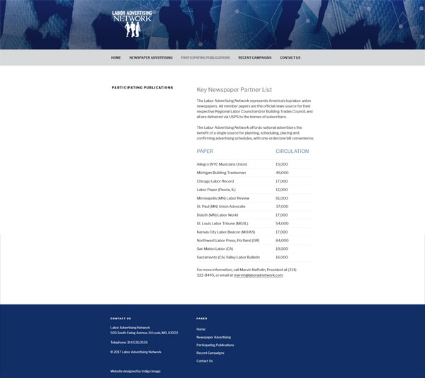
and the inner pages of the site were configured to display a custom header

abor ad network twenty seventeen

A few lines of custom CSS added a color to the navigation bar and footer.

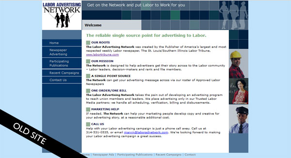
It’s always fun to take a look back, here is the old static site.

labor ad network old site

Their new site certainly brings them up to date.

labor ad network wordpress websiteVisit LaborAdNetwork.com