I am always thrilled to have repeat business from a client and was delighted to be given the chance to redesign the website for Fair Market Inc. The site went live last week. Visit it at http://fairmarketinc.com/
I am always thrilled to have repeat business from a client and was delighted to be given the chance to redesign the website for Fair Market Inc. The site went live last week. Visit it at http://fairmarketinc.com/
We recently launched a new website for a Naprapathy doctor, Dr Daryl Newman – www.chainreflex.com
Based in the North Shore area of Chicago, Dr Newman offers unique treatments and programs to help patients move better and feel better. Naprapathy is a non invasive method for treating and managing pain, everything form back aches to carpal tunnel and Dr Newman combines treatment with custom exercises unique to a patient’s problem.
He also offers customized fitness training – Chain Reflex, and wellness programs including weight loss, pre and post natal and sports nutrition.
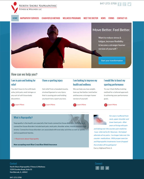
Given that most people do not have a clue (me included when I first met Dr Newman) what naprapathy is, we approached the creation of the website based on how treatment could help specific problems. The home page features a slideshow with distinct patient scenarios leading to targeted call to actions. We also included a section titled “How can we help you” with more scenarios such as ” I am in pain and looking for relief”. As the visitor delves deeper into the site a better understanding of what naprapthy is and what to expect are gained. The site is sprinkled with an amazing set of testimonials that speak volumes of the skill Dr Newman offers.
The design is clean and uplifting reflecting how patients feel after a treatment session. It is built on the WordPress framework which will allow Dr Newman to easily update, he is also going to be writing a regular blog – a great way to market a site.
It is also completely mobile friendly.
Visit it a www,chainreflex.com
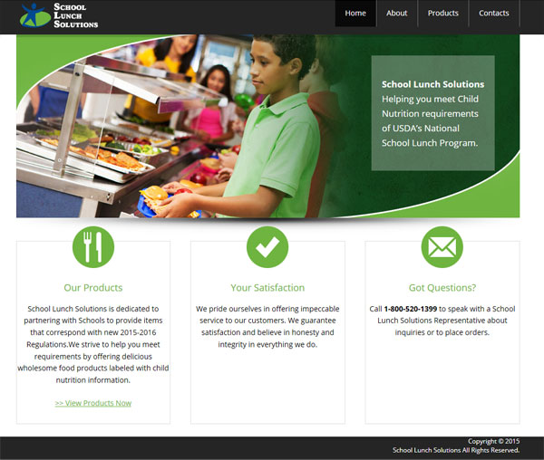
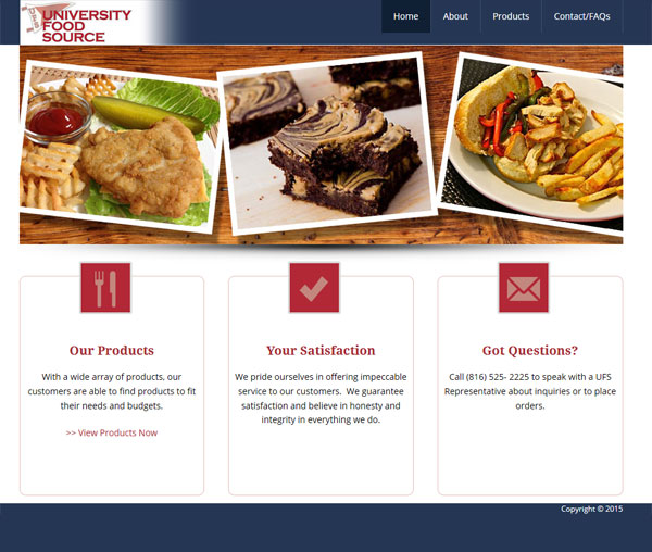
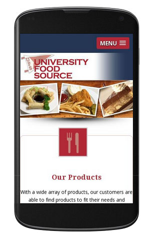
Last week I launched three new web sites… and they were all related to food., what more I have another three foodie websites in the works. Is this why I always seem to be hungry at the moment? I have already blogged about new mobile friendly web site for a Deerfield personal chef, but today it is the turn of a pair of wholesale food distribution site, School Lunch Solutions and University Food Source.
Both sites act as online catalogs for an inventory of wholesale food, one is geared towards the schools and the other the University market.
We built them on the WordPress platform which will allow the client to easily update products and nutritional information, up to this point it has been a cumbersome process!
The look and feels were similar.
Here is School Lunch Solutions
and here is University Food Source
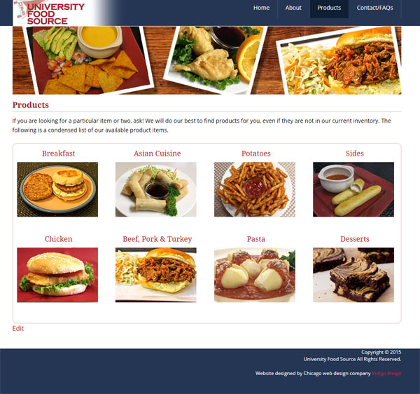
Both sites are mobile friendly.
I was recently contacted by a personal chef looking for someone to update her website, she had been let down by her previous web designer and was now looking to work with someone local.
Her website was clean and nicely designed but needed some content updates and to be converted so it would be mobile friendly.
Keeping the look and feel almost identical we did a lot of “under the hood” work recoding it so it is now more friendly for the search engines and performs beautifully on mobile devices.
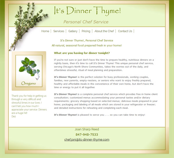
We also added a gallery of the type of food she prepares which is definitely worth checking out! Visit http://its-dinner-thyme.com/
Here is what Joan had to say
“Please know how grateful I am for your help in updating my website”