SEO Tips for WordPress Blog Posts

I received a call today from our client  Paper Shower, thrilled to bits, that their website is currently ranking on the much sort after “first page” of Google, for one of the main key phrases we had targeted.  Proof is in the ranking and by achieving the elusive “Page One” placement this SEO/SEM project is a 100% success.

Getting there is a complicated process but one of the things that can really help is to write regular blog posts and if you apply some basic SEO  (search engine optimization) to those posts you can improve the likelihood that those posts will rank well, even more.5-tips-google-ranking
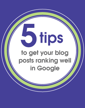
 

5 SEO Tips for WordPress Blog Posts

  1. Download and activate a SEO plugin – one of the best is All in One SEO Pack
  2. Before writing your blog post decide what key words or key phrase you would like to target, a bit of research can go a long way here (Try a simple Google search or go deeper with Google Adsense analysis tools)
  3. Incorporate your key words or phrases. The trick here is to avoid obvious key word stuffing as you will fail to engage your readers… nobody wants to read a post that is bloated with apparent “junk” A well crafted blog post is a balance of content that will appealing to the reader and  to the search engine. Good places to use your keywords/phrases include
    • Post Title
    • The Permalink
    • Main body copy of blog post
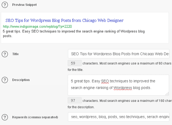
    • Fields in SEO Plugin

    Keywords incorporated into Title and Permalink
    seo tips for wordpress blog post- permalinks

    Populating SEO Plugin Fields
    seo plugin wordpress tips

  4. If your blog post includes images, name them so they include elements of your key phrases and also reflect this keyword rich naming in the alt tag.
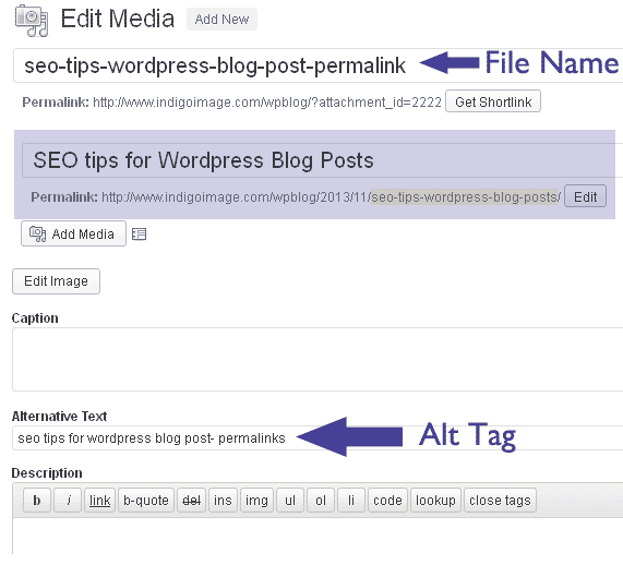
    seo-tips-wordpress-blog-posts
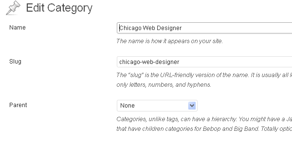
  5. Finally, use categories to organize your posts and give the categories key word rich slugs. The example below shows how my category Chicago web designer has a url of  https://www.indigoimage.com/wpblog/category/chicago-web-designer/category slugs fpr seo


Heinzen Smith Properties Signage

I love it when clients send me photographs of designs  in their final product form.

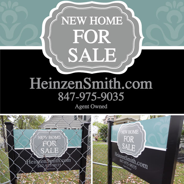
This is a sign design I created for Chicago home builder, Heinzen Smith Properties. The sign encompassed a range of brand image elements I developed during the design of their web site.

It has been beautifully mounted between two black posts and is currently erected on the construction plot of a new home.

Chicago small business lawn sign design

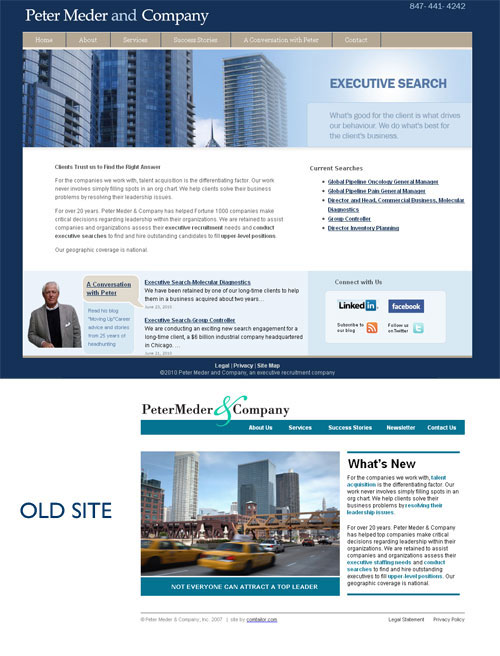
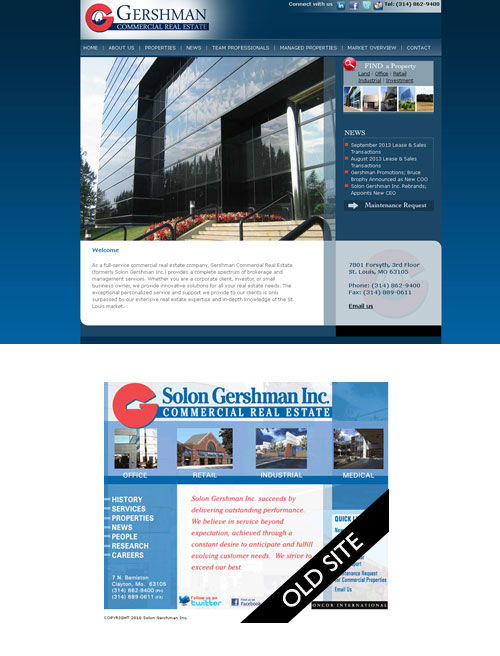
Website Redesign: A Gallery of Before and Afters

There is something very satisfying about looking at before and after transformations regardless of the medium.  Think about the TV shows ” What not to Wear”,  HGTV’s  “Devine Design” and even “Hoarding-Burried Alive”  They are all about transformations – making something or someone look and feel better.

Now as a website designer I can’t make a site “feel” better but I can make the user experience more enjoyable and less fraught.

Amateurish to Professional

Site visitors will form an opinion of your site within the first 3 seconds of looking at it. It is important to make those seconds count with a professional look/feel.

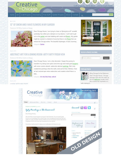
chicago_website_redesign_5

chicago_website-redesign_1

chicago_website_redesign_6

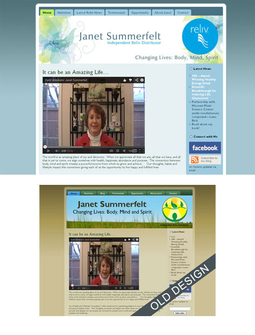
Drab to Fab

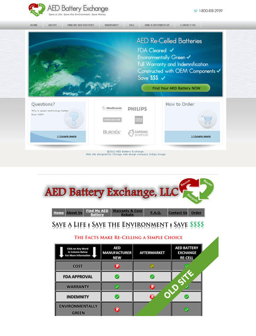
A simple shift in color palette and a few graphic tweaks can make a site go from drab to fab. This site was transformed into a more fresh and invigorating experience, which was much more appropriate for the products it promotes.

chicago_website_redesign_3

Getting the visitor to do something

A call to action or getting a visitor to engage and do what you want them to,  in this case donate.

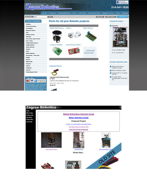
chicago_website_redesign_4 Content Reorganization

The bigger the site the more important it it to have a well thought out navigational system ensuring your site visitors can find what they are looking for quickly and with the minimum of effort.

chicago_website_redesign_7

chicago_website_redesign_2

Don’t Make Me Think

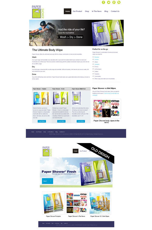
If your visitors have to work too much when on your site, then you have a problem-they will be hitting that back button.   The same is true if they don’t understand what you are offering as was the case with the original Paper Shower web site.


chicago_website_redeisgn_8