How much traffic is my website getting from devices like ipads and smart phones?
While you may not know the answer, I can guarantee it is more than you were getting a few years ago. A quick look at the statistics for our own web site shows a 100% increase in the amount of traffic we are getting from mobile devices in just the last 12 months. A personal site I write, creativeinchicago.com, derives 40% of it’s 35k monthly traffic from mobile devices. Numbers like these are difficult to ignore and there is no doubt that mobile access is a growing trend that is here to stay.
What does my site look like on mobile devices?
There are quite a few online tools that have popped up that emulate how a site will look on a particular device and while they can’t guarantee how you site will behave on any given device they do provide a quick snap shot. You can test your site on a simple emulator HERE . It will show you what your site looks like in different window widths, which is a simple but effective simulation technique – to see which window size corresponds to which device click on the device sizes button.
A responsive website will adjust itself depending on the size of the window (or type of device) as shown with our site. This means that the site will be easy to use and offer the user an optimum experience regardless of what type of device they are using to visit from.
 .
.
A site which is not responsive will not adjust as illustrated in the site below. The simulator will display horizontal scroll bars in this case.

Most tablets and smart phones will actually shrink the website down to fit their screen instead of making the user scroll horizontally so the simple simulator used above is not accurate in that respect.
A more rigorous simulator to try is Mobile phone simulator .
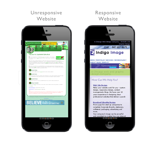
Here are the same two websites plugged in.

The responsive site has adjusted to offer the user and optimum viewing experience but the unresponsive site offers tiny text and unreadable navigation. These can be magnified of course but the site makes the user really have to work to see it.
Can my website be converted to a responsive web site?
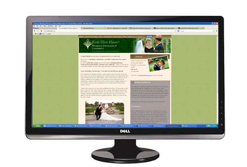
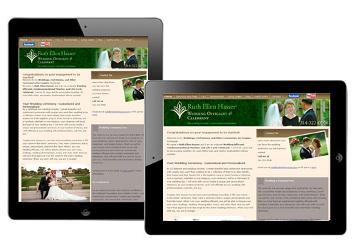
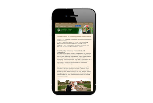
To behave responsively a website needs to be coded in a unique way. In many cases the existing design can be used, as in the case of a recent responsive conversion we carried out for ruthellenhasser.com. We made almost no changes to the overall design of the site but completely revamped the code powering it


I am ready to move forward with a mobile friendly website
If you are looking to move forward either building a new website that is mobile friendly or converting an existing web site to behave responsively we are here to help. Call 847 607 8679 to get started today.


