Website Design Testimonial

I always appreciate testimonials  from clients and this one from Burns Recovered Support Group for pro bono web design work almost has me blushing. Today I am blowing my own trumpet and without further ado …….

Dear Zoe,

The two words “thank you” seem inadequate at this time.

It amazes me… I wrote to you in May and explained that Burns Recovered Support Group is a small nonprofit and asked for your help – pro bono – in totally redesigning our web site

You kindly and graciously contacted me and said that you would be happy to do this for us as part of your commitment and concern to the “community at large”.

Much to my astonishment, here we are 2 ½ months later and our beautiful web site is now on-line.  You designed a user friendly site for our visitors to use.  You designed a visually attractive site for everyone to see.  You have taught this “barely computer literate” woman how to manage the site on her own!  I have already had people contact the office to say how great they think the site looks.

So, instead of two words…      THANK YOU, THANK YOU, THANK YOU, THANK YOU, THANK YOU…. and, many more “thank you’s”  You have given us a gift worth more than you can ever know.


Yours truly,

Linda Hansen

Executive Director

2010 © St Louis Web Designer

Eye of the Louis web Designer:The five senses

Do you allow you customers to experience your brand through all five senses?

  • Sight
  • Sound
  • Touch
  • Smell
  • Taste

Not one medium allows  indulgence in all five. Take web sites for example, here we are limited to just two, sight and sound. These limitations  definitely affect my actions. When in come to buying things like sheets I abandon my online shopping experience and head out to a store. There are some things I just need to touch before I buy.

Talking of the five senses take a look at this fabulous sculpture, The Awakening, near the Mall in Chesterfield.  He was made to be touched!

New web site for Burns Recovered Support Group of St Louis

Remember this post ” Pro Bono Web Design” at the beginning of June? Well the web site for Burns Recovered Support Group is now live. Visit it here www.brsg.org

We went from an outdated this:-

to a slick, all singing and dancing this:-

A fresh new look and feel, the design of the site has  focused on getting the site visitor to where they want to go quickly and without making them think, via simple drop down navigation and bold buttons on the home page.  Built on the WordPress platform, the client is able to easily update the site, whether it is adding a new event or a batch of photographs. Burn camp 2010 is just three weeks away so stay tuned to see new photos of all the happy campers.

2010 © St Louis Web Designer

Social Networking Overload: Tips to Prevent Insanity!

Facebook, Twitter, Linkedin, blogging. Are you getting bogged down in managing your social networks? They can become like black holes consuming your precious working hours, sucking away minutes here and minutes there. Before you know it you have spent half your working day tweeting about this and that and checking your Facebook page.

Here are a few tips to keep your sanity.

  1. Set aside  specific time(s) maybe once or twice a day to engage in your social networks. Once your time is up, shut them down and get on with your work. Set a timer if that helps.
  2. Configure each application so updates are not emailed to you, this can be very distracting.
  3. Use an application like Hootsuite which allows you to manage  multiple social network profiles. You can also  monitor particular key words/phrases, and even pre schedule tweets and status updates.
  4. Relax! Social networking is not about how many followers you have, how often you tweet or how fast you respond. Ask yourself why you take part in social networking, what is your master plan? Stick to that plan.

2010 © St Louis Web Designer

Emotions of a Type Face: A set of energetic fonts

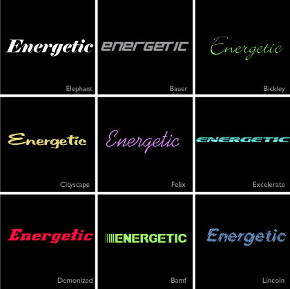
Here is the next installment in my series “The emotions of a typeface”. Today’s set features energetic fonts.

They all convey a sense of movement, get-up-and-go, pep,  animation, activity, liveliness and zing

energetic fonts

Think “boot camp” – any one of these would work for branding elements.

Next time I’ll showcase a set of dreamy fonts. View the first in the series “playful fonts

2010 © St Louis Web Designer