Keeping your website fresh

I have been working as a web and graphic designer for 10 wonderful years now (wow!) and in that time I have noticed a few trends in clients requests.

The start of any year always brings in an abundance of requests for web site overhauls, it must be that “New Year lets get things in order” kind of thing.The revamps can be anything from simply adding  a few pages or swapping out photographs, to a completely new look and feel. It’s all about keeping the web sites fresh

2010 has been no exception to the trend.

This week we re-launched Stroco.com having given it a new look and feel and updated much of the copy.The site is built around a new color palette which is more in keeping with the products they manufacture and features a section of “product placement” photographs.

Here is what the client had to say

“We are so pleased with the website…it looks really sharp! Thanks again for all your help with getting this project complete!”

There is nothing better than hearing these sorts of words from my clients!

2010 © St Louis Web Designer

A ROI Website Success Story

Anyone starting a new business venture understands the importance of having a website, it can be tool to showcase their products or services, streamline their business operations or act as a lead generation platform.

Depending upon the complexity of the site it can be a sizable investment and the return on investment (ROI) is high on the agenda for any savvy business owner.

Last year we launched for a website for Ruth Hasser, a St Louis wedding Officiant and she has seen a huge increase in her business as a result.
Here is what she has to say

“Last year at this time, pre-website, I had one wedding scheduled for 2009. By the end of the year I had done 25. Right now, I already have 17 weddings scheduled, and I have been receiving an average of one lead per day since the beginning of January- outstanding!”

You gotta love those leads!

The site ranks very well in the search engines thanks to excellent search engine optimization (SEO), a successful link building campaign and Ruth’s regular blog posts.

2010 © St Louis Web Designer

Can you see bluish yellow or reddish green?

While at the airport on my way to Chicago last weekend I picked up the Feb issue of Scientific America. It’s always a good read and I was particularly intrigued by an article on impossible colors, colors that we are not supposed to see. Can you imagine a reddish green (greenish red) or yellowish blue (bluish yellow).

You can read about the theory here but cut to the chase and do these simple tests below to see the colors for yourself.
Instructions

  1. Click on each of the graphics below, this will bring up a much larger image in a new browser.
  2. Hold a finger in front of your nose and focus intently on it. This will cross your eyes.
  3. Slowly remove your finger from view
  4. On your screen you will see three boxes. The middle box will show the impossible color, a bluish yellow or a reddish green. Make sure the crosses line up.

Can you see yellowish blue?

bluish yellow

Can you see reddish green ?

reddish green

It took me a while to master the visualization technique but it is a bit like doing the magic eye pictures. The key to seeing the colors is to hold the cross steady. They are pretty unstable and seem to flick in and out but they are definitely colors I have never seen before.

How about you, can you see them?

2010 © St Louis Web Designer

Eye of the St Louis web designer in Chicago

I have had an incredibly busy week, working on web and logo projects and meeting with five new prospective clients. All is good but only now on Friday afternoon have I found a few minutes to write a blog post.

I spent a fabulous few days in Chicago last weekend and the view from the place I stayed was definitely eye candy for the St Louis web designer (or should that be “the Chicago web designer”)
You can see lake Michigan in the distance which was encrusted with “icebergs”


2010 © St Louis Web Designer

How to work with your web designer during the design phase of a project

Last week I talked about How to Hire a Web Designer , today lets tackle what to expect and how to work with your web site designer during the design phase of a project.


What to expect

  • Your designer will create a look and feel of key pages of the site and you will be presented with jpegs of these pages. Nothing will be “clickable” at this stage.
  • The site will most likely be populated with Lorem Ipsum. This is because the designer needs you to concentrate on the graphical elements and layout of the site and not get bogged down in copy.
  • The design phase is a very collaborative phase, expect a few rendition of a design based on feedback you give.
  • You will be given a time frame in which to critique. Imperative to keep your project delivery date on target.

How to Evaluate

  • How do you feel about the overall look and feel?
  • Does the color palette work for you?
  • How about the white space?
  • Are there intuitive navigational elements
  • Are there obvious call to actions?
  • To what element of the design is your eye drawn?

Giving Feedback

Don’t be afraid to be brutally honest in your feedback. If the design is not working for you on any level it is much better to be upfront. However a simple “I don’t like it” is no help. Your designer needs to understand what it is about the design that is “not floating your boat” and will help guide your evaluation process to fix on the elements that need to be addressed. For example, imagine you have a real aversion to the color purple and the inclusion of a purple element is causing “tunnel vision” Sometime just tweaking the color palette of a design can have the effect of ” I don’t like it” to “I love it”.

In short being able to articulate  your likes and dislikes will ensure you end up with a design you absolutely love.

Signing Off

Once your designer produces the “winning” design” you will be asked to sign off on the design. Making drastic design changes after this point can effect the coding efforts during the next stage of the project and typically incur additional costs.

2010 © St Louis Web Designer

How to hire a website designer

Hiring a web design company can be a daunting task. Here are three steps to make it a little easier.

The Planning

  • What are your internet goals. Setting your objectives is the foundation of any project and creating a web site is no exception.
  • Create a “must have” list. For example it may be really important that your site include a blog or that it is configured so you can maintain it yourself.
  • Got some ideas on the architecture of your site? Get out a pad of paper and pencil and create a rough sketch
  • Don’t be intimidated to do a little research, e.g Check  Godaddy to see if can you get the domain name you want.
  • Get online and start browsing, bookmark sites you like, they don’t have to be in the same sector as your business or organization but this exercise will help determine what appeals to you and also enable to articulate your design preferences.
  • Check out your competition

The Search

  • Try a simple Google search for your area. Here are the results for St Louis web design.
  • Word of mouth, ask members of your business network if there is anyone they can recommend.
  • Found a web site you really like? Very often a web design company will have a simple link at the bottom of the site directing visitors to their web site.
  • Draw up a shortlist of design companies you would be interested in meeting.

The Meeting

  • Arrange to meet three design companies.
  • The research you have already done will put you in a great position to talk about the specifics of your project.
  • Do they seek to understand your business?
  • Are they goal/objective driven?
  • Do they listen?
  • Ask to see a portfolio of their work. Does it show a diversity of style or does everything look the same? 
  • Do they know their limits or will they try and sell you “everything”
  • Discuss the creative process they follow. Is it flexible?
  • Do they seem like a good fit for your project, do you feel a connection?
  • Will you enjoy working with them?
  • Ask them to put together a comprehensive web design proposal which outlines all the specifics of your project, pricing and terms and conditions.

You’re Hired!

The contract is signed, the deposit  paid and the project  is well underway. Is it time to site back and relax? Next time I will talk about how to work with your web designer.

2010 © St Louis Web Designer

Color palettes and web design

Last week I talked about  how color can be used in website design.

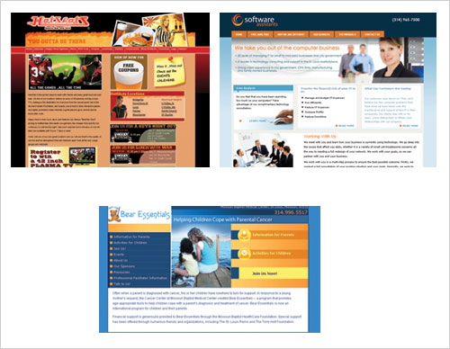
Quick pop quiz. What do the follow three web sites have in common?

The answer is ORANGE

Does the use of orange in these designs conjure up the same emotions or associations?  Lets take a look at a breakdown of their color palettes.


The color palette used in this site results in a cozy and friendly feeling. The use of orange here really adds warmth.


Teaming orange with cool blues produces an invigorating pop which not only helps guide the eye but also adds an element of energy.

Here again orange has been teamed with blue but in this case the use of yellow and orange adds a sense of friendliness and approachability.

So three designs and three different emotions, warm and friendly, invigorating and approachable.

2010 © St Louis Web Designer