The icons of Halloween and a bit of design fun by the St Louis web designer.

The icons of Halloween and a bit of design fun by the St Louis web designer.
Here is a graphic which illustrates what happens when you do an idential enlargement on pixel generated and vector generated circles.
The pixel generated graphic goes all blurry and not too nice at all. The vector one however stays crisp and clean.
![]()
Now imagine you want your logo enlarged 20 times and put on a banner on the side of a building. Which format would you want your logo to be in … pixel or vector?
Any logo we develop is always generated in the vector format so it will perform however you want to use it.
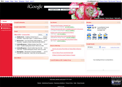
Last week Google implemented changes to iGoogle. While some of the functionality aspects are good (like giving full gmail operation within the realms of the iGoogle page) the new navigation placement is not.
They have switched from top tab navigation to a left side bar navigation, and in essence have lost the cleanliness of design which is one of my favorite elements of the Google brand.
This is how my iGoogle page looks now.
I have held off writing this for a few days, giving myself time to acclimatize to the new layout, but almost a week later I still don’t like it. And I am not alone click here
I hope that in future developments Google offers different layout options.
We have just finished redesigning a web site for Pharmaceuticalsales.com and launched it yesterday to coincide with the publishing of the 10th anniversary edition of “Insight into a Career in Pharmaceutical Sales 10th Anniversary Edition” by Anne Clayton
Visit the site at http://www.pharmaceuticalsales.com/

We are currently working on a new web site for C. Marshall Friedman, Attorneys at law
http://www.marshallfriedman.com
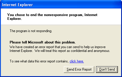
I lose count of how many times I see this message. I don’t think a day goes by without Internet Explorer crashing. The thing is I have no desire to send an error report to Microsoft ..EVER. Does anyone know how to shut off this window for good?
Adding an interactive map to a web site can be a great feature. I am currently working on a new web site for Saint Louis Associates in OBGYN and needed to add a map for their two locations.
Google Maps allows the creation of customized maps and I tried this out for the first time today, successfully generating a map that delivers exactly what I wanted it to show.
You can view the map I created here
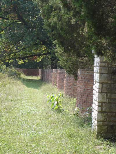
Here is a quiz from the St Louis web designer. Where in the St Louis area would you find this wall?