We are currently working on a new web site for Goley Insulation

The site will be launched mid summer
We are currently working on a new web site for Goley Insulation

The site will be launched mid summer
Fabulous purple flowers on a beautiful late spring day in St Louis

I came across this free ebook a few days ago while visiting sitepoint.com. They publish a really great selection of books relating to the design and development of web sites. One of my favorites is “Designing without Tables using CSS
The freebie on offer, while it doesn’t teach me anything new, it is a great reference to those new to photoshop, so I thought I would share. Here is what they say about it:-
“The Photoshop Anthology: 101 Web Design Tips, Tricks & Techniques is the ultimate Photoshop compendium for web designers.
It’s brimming with tried and tested real-world Photoshop solutions that will add impact to your next web design project. If you’ve ever been stuck for inspiration, have puzzled over just how to create a shiny aqua-style button, or wanted to create that seamlessly tiling background image you saw on a site recently, you need download this book. “
The book is available for download for a limited time so if you want it act fast.
Re-design is a natural cycle of having a web site. What worked well …say eight years ago, may not be performing up the mark for you today. While many changes can be made by a little web maintenace here and there, there comes a time when only a full scale redesign is going help you accomplish your objective.
But how do you know when that time has come? Here are four tell-tale signs that the time has come to re-design.
If any of these senarios describe your web site contact us at info@indigoimage.com to see how we can help bring you up to date in the web world.
We are facing another rainy day in St Louis today and greeted by a rather gray sky again this morning it got me thinking about color and mood. For me gray is most definately a mood downer. I like bright vibrant colors and a blue sky with bright sunshine is an instant pick me up.
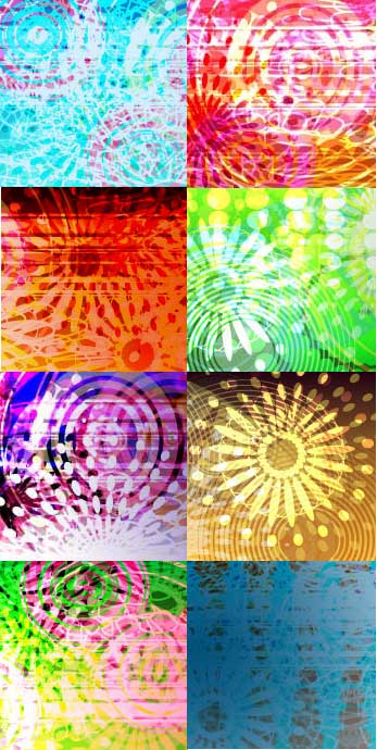
So if the St Louis weather is not going to cooperate today how about this for a digital pick me up. This was designed using Adobe Illustrator and is currently being incorporated into a dynamic iGoogle theme called color punch. It is not yet in the Google themes directory but you can get it via inthemes

If you are interested in Meaning and Associations of color read one of our previous posts
We started our blog in June 2005 and nearly three years later are still going strong.
You may find this blog intresting if you are looking to hire a web or graphic designer, you are interested in web site usability and search engine optimization or are a web/graphic designer looking for some tips and tricks.
Today I am going to talk a little about the sort of subjects we cover here for any of our new readers. Each of our posts are given one or more label to categorize them so I thought it would make sense to talk about our categories:-