iGoogle and search results

I read an intresting article recently on the ranking of search results querried from a personalized iGoogle home page. The article described how a small business owner had been such a frequent visitor a competitor’s site that when he typed in an appropriate key phrase the competitors site was out ranking his own. However using the same key phrase on a unpersonalized Google search his site outranked his competitor. The clever iGoogle algorithm was assuming because of the multitude of visits he had made to his competitors site it made sense to display it higher up the list.

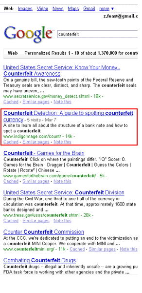
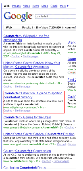
To illustrate the effect I did a serach using the keyword “counterfeit” to see how our site on “counterfeit detection” faired. As you can imaginge it is a site I visit more frequently than most.

My iGoogle search ranked the site as second while a standard Google search ranked it as third … I got the reult I expected the personalized iGoogle search ranked the site higher then regular Google … not a hugh difference but a difference all the same.
This personalized ranking of sites creates an intresting senario when measuring the success of an internet marketing campaign! Any ideas on the approaches to take?

New web site for St Louis retirement Community

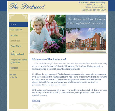
“The Rockwood” is a retirement community based in Old Webster Groves, St Louis and they contacted us about six weeks ago looking to get a website online ASAP. The site went live today

www.therockwood.com

The site features an important usability option allowing a visitor to easily adjust the size of the type on the page. This is particularly important considering the typical demographic of a visitor to the site.

We welcome your feedback on the site

Product Complexity

How easy is it to understand your product line? Let’s say a potential customer wants something that you offer – can they readily determine from your brochure, website or other collateral what is right for them? If you read Forbes magazine, you may have seen a small article about the problems Chrysler has with product complexity; more than 150,000 possible combinations of features for one model alone, compared with less than a hundred for a competitive vehicle. In this age of mass customization you might think that offering more choice would be a good thing for consumers, but if you’ve ever tried to figure out the combinations of features on some of these vehicles you very soon realize that sometimes less is more.

This isn’t just a matter of complexity – people’s attention span is lower than it has ever been. If you don’t seem to have what they want the chances are that they’ll be on to the next website in a click. Remember this when you’re thinking about organizing your information – put yourself in the position of the user and ask yourself what they would like to know if they were in the market for your product. As the saying goes, you only have one chance to make a first impression – better make it a good one, because if you don’t someone else will.

Give your brand image a polish with a Favicon

A Favicon is a little custom icon that appears next to a website’s URL in the address bar of a web browser. If a site is bookmarked (Internet Explorer (“IE”) 5.0 and above) the icon is also associated with the entry in the favorites menu…this makes a site easy to locate in a long favorites list.

See our favicon – it is based on our logo and imprints our brand image just that little bit further

Creating a favicon is quite a design challenge as you are working with a design canvas of 16 pixels square ..which is very small and does not allow for detail. Once the graphic is created it is saved as an ICO format and uploaded to the server.

A small snippet of HTML is added to your web pages

<link rel="shortcut icon" href="/favicon.ico" type="image/x-icon" />

and you are fully branded with a custom Favicon. If this is something you would like to add to your branding mix contact us here

And now for a little pop quiz

Can you name the organizations behind each of these Favicons? All but one of them are based in St Louis

Our blog gets a shake up

This blog is nearly two years old …and 176 posts later I thought it was about time it had a little more order.

Having reviewed it’s common themes it has been categorized into the following:-

All posts from now on will also be open for comments

Are you using iGoogle?

As a web designer I spend a lot of time online and Google continues to make those online hours easier.
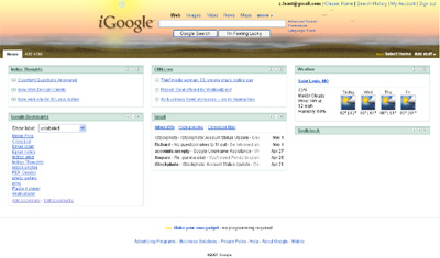
They have recently introduced iGoogle which allows users to personalise their searching experience and create a talyored interface with user defined content. I have the feeds from my favorite blogs, bookmarks to expediate my work process, St Louis weather forecast and a spell checker. The variety of “stuff” you can add to your home page is huge, tools such as a translator, windows short cutes, a To-Do list, feeds, joke of the day ….the list is endless.

iGoogle also offers the opportunity to add a theme to your home page. I selected beach …a dynamic theme in which the sun moves throughout the day mirroring the position of the sun at my Zip code! There is also a bus stop theme which matches your local weather.