In the wake of Hurricane Katrina gas prices all over the US including, St Louis, have jumped.
Save money by driving the amazingly designed smart car..it gets 80 miles to the gallon!
No Need to Click Here – I’m just claiming my feed at Feedster
In the wake of Hurricane Katrina gas prices all over the US including, St Louis, have jumped.
Save money by driving the amazingly designed smart car..it gets 80 miles to the gallon!
No Need to Click Here – I’m just claiming my feed at Feedster
Did you know that around 10% of men have some form of color blindness? The majority of our clients are men and color blindness is certainly something we have encountered.
It can be quite a challenge to design and get critique on creations the client can’t necessarily see!
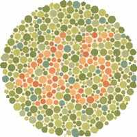
The most common form of color blindness is red/green…Can you see a number in the circle below?

To view more on color blindness click here
Ingredients
Dell Dimension 9100 computer
Adobe Photoshop
Adobe Illustrator
Dreamweaver
FTP client
1 domain name
1 hosting account
1 creative brain
1 technical brain
20 cups of coffee
Directions
Enjoy!
Search engine Optimization or SEO is the general term used to describe specific techniques that can be used on websites in order to rank favorably with search engine.
It can take many forms from enriching a site’s content with keywords, ensuring pages have appropriate titles, to fixing technical issues which cause problems with certain search engines.
It seems a day does not go past without us getting a spam email promising SEO heaven ..and we are not alone. This comes from Google.com
“Be wary of SEO firms that send you email out of the blue.
Amazingly, we get these spam emails too:
“Dear google.com,I visited your website and noticed that you are not listed in most of the major search engines and directories…”
Reserve the same skepticism for unsolicited email about search engines as you do for “burn fat at night” diet pills or requests to help transfer funds from deposed dictators.”
As a web designer and a graphic designer an understanding of human visual perception is important. The use of a contrasting color to draw the users eye to a particular area is a simple example of how we can make use of the perception of contrast
However human perception is not always as straight forward! Take these 2 examples
The St Louis Arch
The Arch is as high as it is wide ..get a ruler out and measure it if you don’t believe me!
Then how about this
Do you see movement? Well there is none ..this is a completely static illustration!
Here is a little something that does not pertain to web site design but an interesting find on the web
For sale:
Kjan Indigo Image: A black filly born 4/28/04
Here is a senario:-
Shopping online, you have found the perfect designer wallpaper in a St Louis based store, time to checkout..but where is the checkout button..on the top, on the side where? This is a site where the checkout button is not intuatively postioned.
Don’t make me think!
As a site visitor you are being asked to do too much visual processsing to complete your order.
Good web design is all about producing an interface which interacts with the site visitor in an intuative way. In an e-commerce site excellent and easy to use navigation is crucial. The bad positioning of a checkout button can mean a shopping cart is abandoned and a sale is lost.
Logos first appeared in the 19th century as the industrial revolution and printing processes gained momentum.
Up until this time products had been generally made locally and on a small scale often by hand. With the invention of machines the same products could be manufactued faster and cheaper. It was the first time products were made on a large scale in a central location and distrubuted far and wide.
For manufacturers to succeed in this newly competitive and anonymous marketplace it was important that their products could be easily differentiated, but at that time, a significant part of the population was still illiterate. The solution was to include a symbol, sign, or emblem on their products, labels and packages, so that all the buyers could easily recognize the product they wanted. Hence the birth of the modern logo!
4,500 miles away from St Louis and the creative eye of the St Louis Web designer is still active. There is beauty even in a common garden weed.