Vertical scroll no no.

I have ranted before about the horizontal scroll no no… bad webdesign and coding requiring your user to scroll horizontally. Well I have a similar opnion about vertical scroll.

A certain amount of vertical scroll in a web site is acceptable and vertical scrolling is an intuative action for web users. However there is a limit.

There are some web sites out there where so much information has been stuffed onto a pages that it seems you have to scroll to the center of the earth to reach the end.

A lot of times this boils down to poor content organisation. For example a web site has a navigation button called ” Services” which leads to a single page. This is fine as long as the company offers a few services or summarizes their services in a concise way. But when they have multiple services and have everything on one pages we are entering the realm of vertical scroll no no!

A far better approach is to split the services and offer the site vistor a more user friendly way to access the information.

If your website suffers from vertical scroll no-no contact us today at info@indigoimage.com to see how your website can be better organized to give your users a headache free visit

Is your company email me@aol.com?

A marketing survey released by Interland last month had some interesting statistics about the email habits of small businesses.

72% said they use email to communicate with exisiting customers. This rose to 87% for business to business companies (b to b). 61% of B to B companies also said that email was critical to their business.

In trawling through the internet I often come across small businesses still using an e.g @aol.com or @hotmail.com, as their principle contact email.

For a marketing tool critical to their business why not take the professional route and use an email account driven by the company domain.

If this is your company scenario contact us today at info@indigoimage.com for help in giving your company that professional image.

How are the search engines ranking your website?

Have a web site?… great!
How are the search engines ranking it for a relevant keyword querry? page 1 …page 9… page 103?

As a web site designer there are many important aspects I have to take into account when creating and building a website … does the image created fit with the company brand, is the navigation intuitive, is the information presented in a logical way, load time, browser issues …I could go on and on.

One of the more important aspects in the forefront of my mind during the coding of a site is Search Engine Optimization (SEO) ..or configuring the code so it is optimized with pre determined keywords and phrases relevant to the content of the site.

Getting that all illusive top spot is tricky ..no two search engines “decode” sites in the same way … to use a technical term they all have different algorithms. Optimization techniques that give a page 1 listing in Google will not necessarily yeild a page 1 listing on MSN.

However without search engine optimization you are likey to find you site listed on page 103 ..with optimization your odds certainly improve.

Web design St Louis

The design services of Indigo Image range from simple web sites, right through to full electronic commerce and dynamically driven sites. They include services that go beyond just the web, such as logos, stationery and business cards, so your company’s image can be powerful and consistent no matter how you interact with your customers.
The image your company presents, whether it be by a full internet presence or a stand alone logo, is a powerful marketing tool.

Contact us today for a quality result on your next web or print design project.

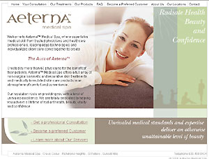
Launch of new website for Aeterna Medical Spa

We have recently designed a brand new web site for St Louis based Aeterna Medical Spa.

Aeterna Medical Spa is in the business of “attainable beauty” and required a web site which portrayed just that. Delivering information on their new venture and providing incentives on becoming a preferred customer were other important aspects of the site.

We also provided a content management system so the client could create their own promotional pages.

aeterna

Visit them at www.aeternamedspa.com

Money by Design

As a graphic designer I am interested in many applications of my art. I have a particular fondness in the use of graphic art in currency.

The design of currency is fascinating . Design elements or “security features” not only have to look good and stand the test of time but they have a very specific function…. they must be difficult to counterfeit…no small task considering the technology available today to would be counterfeiters.

To learn more visit the website we created
A guide to counterfeit detection